Friday, February 7, 2014

Japanese Stocks Are Furthest Along in the Correction

We've argued on a number of occasions recently that stock markets around the world are generally not as oversold as they were in periods that preceded the largest subsequent gains (April 2010, August-October 2011, June 2012). However, the MSCI Pacific Index, which is mostly composed of Japanese stocks, is getting there quickly. Below we show some charts of market breadth that indicate the MSCI Pacific Index is approaching washed out territory (at least temporarily). We caution that this state of affairs can persist for some time and further price declines can be sharp. Our only point is that market breadth is the weakest in the Pacific region and so it might be further along in its corrective phase.

image

image

image


German Industrials

After a somewhat weak industrial production data release, we thought we would review what is-- and isn't-- working in the MSCI Germany Industrial sector.

image

Overall, the average Germany Industrial company's stock has actually not performed poorly over the last month, leading all sectors (with the exception of Utilities where both constituents outperformed on buyout/ upgrade news):

image

More than half of the MSCI Germany Industrial sub-industries have outperformed the MSCI World over the last month:

image

The Industrial Conglomerates' underperformance can be traced to downgrades of Siemens, in spite of the company beating earnings expectations:

image

On an absolute basis, Siemens appears to be turning back down from resistance established in 2011-- the question is whether the bullish support line will hold, allowing for another attempt at a breakout:

image

When we look at the point-and-figure chart on a relative basis, however, the stock appears to be breaking out from a solid base and defying the downtrend line:

image

Turning to the most positive performer in the MSCI Germany Industrial sector, we have Lufthansa-- which is breaking out above long-term resistance on a absolute price basis:

image

Versus the MSCI World, we see a picture with a lot more resistance:

image

Labor Participation Rate & Inflation

One of the disappointing features of the current recovery is the weakness in the labor participation rate. While last month the participation rate rose .2% from multi-decade lows, it is still down over 4% from the peak in 2001.  An increasing participation rate has historically been inflationary while a falling one exerts deflationary pressure on the US economy.  In the chart below, we plot the labor participation rate against inflation, and it is easy to see the historic relationship.  In the 1970s, the rate rose over 3% and generated accelerating inflation into the 1980s.  In the 2000s, as the rate began to fall, so has inflation, dropping from 4% in 2006, to near 1% currently.

image

From a slightly different point of view, we show below the year over year change in the consumer price index (CPI) plotted against the five year moving average of the year over year change in the participation rate.  The drop in the this longer term view of the participation rate suggests that the weak labor markets are exerting a strong deflationary force.

image

S&P500 P/E Expansion May Be Difficult Over The Next Few Quarters

Over the past 10 years the S&P 500 Price to Earnings ratio and the real trade-weighted dollar index have had a nice correlation. As the dollar has strengthened P/E ratios have expanded (with a three quarter lead for the dollar). The level of the dollar has been relatively steady for the past 8 months which may mean, at best, P/Es will remain where they are today over the next few quarters.

image

Small Caps Underperforming Over the Past 2 Weeks

Since the start of the bull market in March 2009, the S&P Small Cap 600  stocks have outperformed the S&P 500 by 32%. However, over the past two weeks small cap stocks have underperformed by about 3%.

image

Thursday, February 6, 2014

Health Care, Industrial and Information Technology Sectors Remain Resilient Thus Far

So far this year Health Care and Tech stocks are the only North American sectors that have managed to keep 80% or more of their stocks trading above their 200-day moving average. The Industrial sector has hung in there as well as the latest reading shows over 70% of the stocks are trading above their 200-day moving average. This is not the case, however, for Consumer Discretionary and Financial stocks. For the Consumer Discretionary sector, this is a noticeable change in trend from 2013 where for practically the entire year 80% or more (and in May 97% of stocks!) were trading above their 200-day moving average. Financial stocks have really taken a hit in 2014. For the first 5 months of 2013, 90% of stocks were trading above their 200-day moving average. 2014 is starting off on a much different foot as only 46% of stocks are above their 200-day moving average. Finally, contrarians take note: Telecom and Utility sectors have been washed out the most. Neither has reached the 20% level that we like to see but the downside risk in these sectors seems much lower than the others. Charts of all 10 sectors are below.

image

image

image

image

image

image

image

image

image

image

Commercial Traders Very Long US Treasury Bonds

Even after decent gains in US Treasury bonds since the beginning of the year, commercial traders--the so-called smart money--are still carrying a large long exposure to bonds.  Each week the Commodity Future Trading Commission (CFTC) releases data detailing the position of several classes of traders participating in various contracts.  Recent data shows that commercial traders are as long bonds as they have been over the last few years.  And, this applies across the maturity spectrum from 5 year bonds to 30 years bonds.  This suggests large commercial traders--those involved in interest rate markets as a course of business--are betting on lower interest rates.

image


image


image

ECB Interest Rates Unchanged

Though Draghi stands ready to 'take further decisive action if required', interest rates in the Eurozone remain unchanged today:

image

As for the €...

image

A quick look at our factor scoring model reveals that companies more correlated with the € tend to have performed poorly when compared to companies that are less correlated.  Overall, however, the admittedly weak correlation has fallen steadily over the last year:

 image

Does this relationship give us any insight into sector performance?

The sectors with the highest 65-day correlation to the € are Consumer Staples and Utilities, while the sectors with the lowest association are Consumer Discretionary and Information Technology:

image

In general, those sectors with the higher correlation have underperformed while those sectors with lower correlation have done better over the last few months:

image

However, with a slightly above average correlation to the € (and, therefore, an expectation for less robust performance), the Health Care sector's domination would seem to indicate that, at least for now, the strength in the currency holds little influence over the average MSCI Europe stock.

Wednesday, February 5, 2014

Abenomics Not All It's Cracked Up to Be

We were reminded again today of one of the unfortunate realities of Abenomics, namely that devaluing your currency when 51% of your imports are inelastic to prices causes real wages to fall.

In the first chart below we show that imports of food, raw materials and fuel (all things that are relatively inelastic to prices) compose 51% of total imports (black line). Thus, when the domestic currency falls, these items (of which Japan produces little domestically so there are few substitutes) rise in price. Unless there is a commensurate fall in domestic prices or rise in wages, disposable income and wages adjusted for inflation will fall.

Unfortunately, that is exactly what we are seeing currently. Real wages for December were just released today and showed another YoY decline of 1.1%. In the second chart below we show the relationship between real wages and changes in the JPY/USD exchange rate. We observe a strong positive relationship (i.e. when the yen falls relative to the USD Japanese real wages end up falling with about a two year lag) suggesting even more pain ahead for the average Japanese worker in the coming months. Perhaps this is one reason PM Abe's approval ratings have hit the skids?

image

image

image

Risk Adjusted Returns Come Early In Bull Markets

While most are familiar with the concepts of risk and return, very often investors overlook the risk component when looking at stock returns.  For instance, when considering equity returns, it would be very easy to make the statement that the S&P 500 at 1750 is up 400 points (or roughly 30%) from its March 2011 levels of 1300.  While true, it is a statement that doesn't consider risk.  The best proxy for equity risk is the CBOE Equity Volatility Index (VIX), which captures the implied volatility of the stocks comprising the S&P 500.  

Below is a chart showing the S&P 500 relative to the VIX.  While the S&P 500 was indeed up 30% from March 2011, at the same time, equity volatility has risen from 15% to 20% recently.  So, while returns were +30%, risk was +33%, resulting in no net increase in the risk-adjusted performance of the S&P 500 in almost three years.  

image

From July 2011 to October 2011, the risk adjusted S&P 500 fell roughly 70%.  Off the October 2011 lows, the risk adjusted S&P 500 rose 300% into the spring of 2012.  From that point to today, risk adjusted performance is actually down by 3-5%.  

image

This simple calculation of risk adjusted performance helps illuminate when the equity market is adequately compensating an investor or taking equity risk, or not.  Off the lows in March 2009, the risk adjusted S&P 500 rose almost 500% into the spring of 2011, reminding us that the majority of the gains in a bull market com in the first two years off the lows. 

image

European Retail Sales Disappoint (Again)

Contrary to the consensus for a 1.5% y/y gain in December, European retail sales fell (-1.0% y/y) and November's gain was revised to a more modest 1.3%-- the only year-over-year rise since April 2011.

image

Unsurprisingly, yields in Germany fell back to levels previously seen in July/ August of last year.

image

PMI's Indicate That GDP Remains On New Normal Track

The ISM Non-Manufacturing Survey came in at 54 for January, just above consensus of 53.9 and slightly higher than in December (53). On Monday, the ISM Manufacturing survey disappointed as it came in at 51.3 vs expectations of 56. We like to look at a approximately GDP-weighted combined series. This series is indicating the the US economy remains on the "muddle through" growth track that the economy has been on over the past 4 years.

image


Tuesday, February 4, 2014

MSCI Europe: Today's Best and Worst Performers

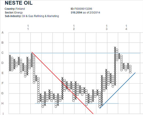
Following a very strong earnings report, Neste Oil gained almost 9% today.  The good news would seem to be that the 45-degree bullish support line (BSL) is holding.  But look out for long-term resistance at 'C'-- this stock could just be testing the upper bound of its trading range:

image

On the opposite end of the spectrum, ARM Holdings was down more than 5% today after the semiconductor supplier to Apple's iPhone and iPad reported less than stellar growth in royalty revenue.  It would seem to be a safe bet that the current column of o's continued down, through the (high performance) support line.  Next stop: support at the 45-degree BSL?

image

Note that these point-and-figure charts are relative to the MSCI World Index.

Stocks Approaching Medium-Term Oversold, But Not There Yet

Last week we posted in Developed Market Stocks Are Down, But Far From Oversold, that although major indices across the globe have suffered setbacks so far this year, stocks weren't quite at the level we'd consider to be "oversold" on an intermediate-term basis. Given the continued decline we wanted to update that analysis. We find that generally stock markets are closer to an intermediate-term oversold condition, but we are not currently seeing the same level of capitulation we saw in the selloffs in 2010, 2011 or 2012 that all preceded large gains. As always, our universe used in the analysis is the roughly 1600 stocks that comprise the MSCI World Index.

We first note that the percent of stocks trading above their 50-day moving average currently stands at 27%. Good lows that have led to large subsequent gains have seen less than 20% of stocks trading above their medium-term moving average.

image

The percent of stocks making new 50-day lows, which usually spikes when emotions run high, reached 30% on yesterday's selloff. We'd prefer to see a reading of closer to 50% to signal that the majority of the rout is behind us.

image

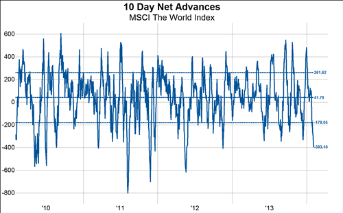
The 10-day moving average of the number of advancing stocks minus the number of declining stocks stands at -393 compared to readings under -500 at the best emotional lows of the last 4 years.

image

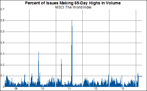
The percent of stocks making new 65-day highs in volume has elevated to 10% over the last few days, but is nowhere near the readings of >30% we saw at the good lows of 2010 or 2011.

image

So, while we are getting closer to something we'd consider an oversold condition (which by the way can persist for quite awhile) our battery of indicators still suggests we are not there yet.

Early Cyclicals Starting to Show Some Cracks In The Facade

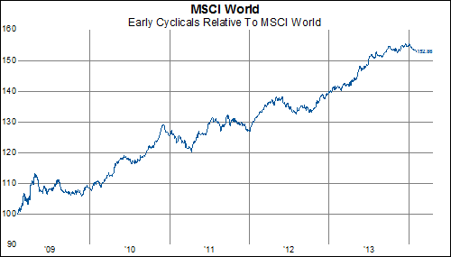
Early cyclicals--ie, the MSCI Consumer Discretionary sector--have been standout performers for the last five years, having outperformed the MSCI World index by over 50%.

image

But, we are starting to sense come cracks in the facade of early cyclical leadership.  To illustrate the trend, below--using our relative strength based point and figure technique--we select some well known consumer discretionary names that appear to be breaking down. This list constitutes a group of stocks we would avoid.

image

image


image

image

image

image

image

image