Nearly two-thirds of stocks in MSCI Europe have fallen more than 10% from their highs over the last 200 trading days:
In the past, as the blue line has gone down (representing a rise in the percentage of companies with falling prices), the MSCI Europe (red line) has also fallen. While the overall index declined in the month of July, it has since stabilized-- in spite of more constituents generating increasingly negative performance. It seems only logical to conclude that there is decent potential for a more broad-based sell-off in European equities on the horizon.
Friday, September 19, 2014
Thursday, September 18, 2014
Is the Surge in Chinese Stocks All But Over?
MSCI China has outperformed the developed market stock index (the MSCI World Index) by about 11% since the middle of March. Over that period the percent of stocks outperforming the World Index increased from a paltry 14% to an elevated 79% (blue line in the chart below). In the past, when the percent of stocks in the MSCI China outperforming the MSCI World Index reached around 80% the relative outperformance was all but over and a new downtrend resumed. We are careful not to call for a renewed downtrend in Chinese stocks, but perhaps they are ready for a breather.
Is Emerging Market Stock Volatility Set to Rise on Stronger USD?
One of the ways we measure volatility in the stock market is to calculate the average realized volatility for constituents in various indexes. It's no secrete that volatility has been muted pretty much everywhere, with the emerging markets being no exception. Indeed, by our measure of average 65-day trailing volatility the MSCI EM index is at the lowest level as far back as we have data, at 27% annualized. With the US dollar strengthening by the day, however, we wonder if this trend of lower and lower volatility is set to reverse?
In the chart below we show the trailing 65-day average volatility for constituents in the MSCI EM index (blue line, left axis) plotted against the nominal trade weighted USD index (red line, right axis). We see a fairly consistent positive relationship between the two series (higher USD coincides with higher volatility). Given that the USD index appears to be breaking out of a 5-year long trading range, it might be time for a reversal in the trend of lower volatility in EM stocks, if history is a good guide.
Asset Allocation Shift In Emerging Markets Post Fed Meeting
For the last five years, early cyclicals have been the best performing group in the emerging markets as abundant credit flowed into these markets. In the chart below, we show an equal-weighted basket of EM early cyclicals (consumer discretionary stocks). These stocks have outperformed the broader MSCI Emerging Market index by 148% over the last five years.
The second best performing segment of the emerging markets has been the growth counter-cyclical basket of stocks, comprised of health care and consumer staple companies. As shown in the chart below, these stocks have outperformed the MSCI EM index by 54% over the last five years.
The market reaction in the emerging markets today after the Fed meeting yesterday suggests investors are turning away from the early cyclical group of companies and turning toward the counter-cyclical areas. Today, as shown in the table below, EM health care stocks are leading the performance table, up .7% while EM early cylicals are the worst performing group, down 1.7%.
Wednesday, September 17, 2014
New Video: Introducing the GaveKal Knowledge Leaders Indexes
Steve Vannelli discusses the world's first family of strategic beta-style indexes to track innovation.
GaveKal Capital Unveils New Innovation Indexes
Firm Launches First Strategic Beta-Style Index Family to Track World's Leading Innovators
DENVER, Colo.,
September 17, 2014 – GaveKal Capital today introduced the GaveKal Knowledge Leaders
Indexes, the first family of indexes designed to track the world’s leading
innovators. The strategic beta-style indexes identify the world’s most
innovative companies using the same proprietary process as the firm’s flagship
GaveKal Knowledge Leaders Strategy.
The GaveKal Knowledge Leaders Developed World Index (KNLGX,
KNLG) measures innovation among mid- and large-cap stocks in North America, developed
Europe and Asia. The GaveKal Knowledge Leaders Emerging Markets Index (KNLGEX,
KNLGE) measures innovation among stocks from Latin America, emerging Asia and
Europe.
“Companies that choose to invest more on innovation develop
rich stores of assets that directly impact stock performance,” said Steven
Vannelli, Managing Director and Portfolio Manager, GaveKal Capital. “Yet
today’s conservative accounting standards make them nearly invisible in the
stock market. The GaveKal Knowledge Leaders Indexes reveal these companies,
allowing investors to unlock a new opportunity hiding in the world’s most
innovative companies.”
The new strategic beta-style indexes were designed using the
firm’s proprietary process for identifying Knowledge Leaders. The firm
constructs the indexes first by capitalizing corporate investment in intangible
assets -- such as research and development, brand development and employee education
-- for all companies in the universe to create an intangible-adjusted
historical set of financial accounts going back to 1980. Based on this adjusted
financial history, the companies are screened
for knowledge intensity, profitability and return on capital. Those that pass
the screen are identified as Knowledge Leaders and included in the GaveKal
Knowledge Leaders Indexes.
Performance
For the GaveKal Knowledge Leaders Emerging Markets Index, cumulative performance from April 2007 through August 2014 exceeded the MSCI Emerging Markets Index by 84.3%, or 8.59% on an annualized basis. The consistent outperformance resulted in an annualized alpha of 7.63% since 2007. The GaveKal Knowledge Leaders Emerging Markets Index also presents a unique risk profile, offering a 76.65% active share compared to the MSCI Emerging Markets Index, also an active share higher than many actively managed funds.
Both equal weighted indexes are
available in total return and price return formats. They rebalance twice a
year, in March and September. Learn more about the GaveKal
Knowledge Leaders Indexes.
About the GaveKal Knowledge Leaders Strategy
The strategy is based on the idea that knowledge is an
undervalued asset. The investment team targets knowledge leaders, the world’s
leading innovators with deep reservoirs of intangible capital. These companies
often possess competitive advantages such as strong brand, proprietary
knowledge or a unique distribution mechanism. The strategy identifies the best
among global companies that are tapping deep reservoirs of intangible capital
to generate earnings growth. By measuring corporate knowledge investments and
applying a proprietary process to analyze knowledge spending, the process is
designed to identify attractive long-term opportunities. The investment team
has combined more than 25 years of institutional knowledge, advanced technology
platforms and thousands of development hours to design the intellectual
property behind its process.
About GaveKal Capital
GaveKal Capital is a US registered investment advisory firm
that has created the GaveKal Knowledge Leaders Indexes and manages the GaveKal
Knowledge Leaders Strategy, including the GaveKal Knowledge Leaders Fund
(NASDAQ: GAVAX, GAVIX), the GaveKal Knowledge Leaders UCITS Fund (BLOOMBERG:
GAVPLAT) and separate accounts. For more information please visit GaveKal Capital or email us. Follow the GaveKal Capital Blog and follow us on
Twitter @GaveKalCapital.
Connect to our LinkedIn
Company Page.
###
The MSCI World Index is a free float-adjusted market
capitalization weighted index that is designed to measure the equity market
performance of developed markets. The MSCI Emerging Markets Index is a free
float-adjusted market capitalization index that is designed to measure equity
market performance in the global emerging markets. One cannot directly invest
in an index.
The GaveKal Knowledge Leaders Indexes are the first index
family designed to track the world’s leading innovators, according to our
research.
An investor cannot invest directly in an index.
Active Share
is the percentage of stock holdings in a portfolio that differ from the
benchmark index. Active Share determines the extent of active management being
employed by mutual fund managers: the higher the Active Share, the more likely
a fund is to outperform the benchmark index. Researchers in a 2006 Yale School
of Management study determined that funds with higher Active Share will tend to
be more consistent in generating high returns against the benchmark indexes.
Alpha is a
measure of the portfolio’s risk adjusted performance. When compared to the
portfolio’s beta, a positive alpha indicates better-than-expected portfolio
performance and a negative alpha worse-than-expected portfolio performance.
Tuesday, September 16, 2014
More than Half of EM Stocks are Down At Least 10% From Their High
The MSCI Emerging Markets Index is down about 4% from its recent high, but the average stock has fared much worse. By our count more than than 50% of EM stocks are down at least 10% from their 200-day high. The trend of more stocks being down at least 10% from their recent high can be seen in all regions, but is clearly most prevalent in Latin America, where the number has increased from 22% to 60% in a week.
In the charts below we show the percent of stocks in each MSCI regional index that are down more than 10% from their 200-day high (blue line, left axis) against the price in USD of that index (red line, right axis).
"Beware the Use of the Word 'TOO'." -- Clay Allen
As we noted earlier today, the Energy sector has certainly been the stand-out worst performer in Europe so far this month (and quarter, and year!):
Though the group may have reached oversold territory, we can hear the voice of a long-time mentor whispering, "there is no such thing as TOO cheap."
Energy constituents spend the least on R&D and Advertising as a percent of sales, resulting in one of the lowest stocks of Intellectual Property of any sector:
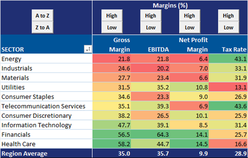
European Energy companies have the lowest margins and nearly non-existent free cash flow:
Earnings estimates seem to reflect these fundamental shortcomings fairly well:
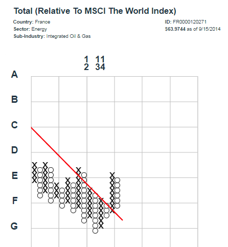
Finally, among the 24 constituents of the MSCI Europe Energy sector, we can find just ONE chart in our point-and-figure methodology that looks even remotely hopeful:
The rest look something like this:
It could be some time yet before this particular group offers many promising investment opportunities.
A Few European Investment Ideas For Those Who Believe In Mean Reversion
Looking over our charts and data, there are a few areas that seem like decent ways to play a mean reversion trade. Over the last 100 days, many large European countries have experienced large technical corrections. In charts below, we show the percent of companies trading above their 100 day moving average in the UK, Germany, France and Italy.
Next we display the performance of the sectors within each country in an effort to show which sectors have dragged down performance the most and are, in turn, the places to look for mean reversion ideas.
Performance MSCI UK
Performance MSCI Germany
Performance MSCI France
Performance MSCI Italy
Next we display the performance of the sectors within each country in an effort to show which sectors have dragged down performance the most and are, in turn, the places to look for mean reversion ideas.
Performance MSCI UK
Performance MSCI Germany
Performance MSCI France
Performance MSCI Italy
New Lows in Stocks are Picking Up Across the EMs
New 65-day lows in stocks are picking up across emerging markets. We've written a few times over the last week here and here about how the strong USD might affect emerging market company prospects to their detriment, so seeing a pickup in stocks making new intermediate term lows is not all that surprising. While new lows in Latin America are the highest of any region with 16% of stocks making new lows, new lows in Asia are at a level not seen since March. We'll be keeping our eye on these indicators as the USD continues its trend higher.
US Same-Store Sales Growth Reach 9-Year High
The ICSC-UBS/Goldman retail chain same-store sales is a useful weekly indicator of general merchandise spending which accounts for roughly 10% of the US retail market. Because it is a weekly data point, this series can look noisy. To help trends stand out more, we like to look at the one-quarter moving average of the year-over-year change. As you can see in the chart below, same-store retail sales have been gaining steam since early April. The one-quarter moving average of the year-over-year change is just below 4% and is at it's highest level since 9/16/2005.
Monday, September 15, 2014
Cash Levels On the Rise for the Average European Company? Not So Much.
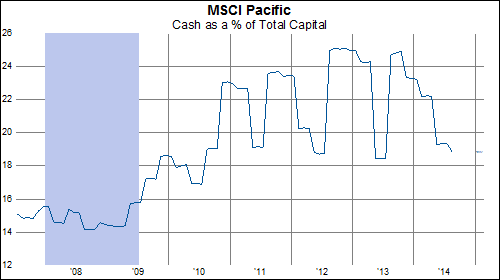
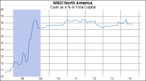
An article in the Financial Times (subscribers, see here) prompted us to ask ourselves, 'Really??' and take a high level look at cash (and debt) levels in the various regions of the MSCI World. Compared to the Asia-Pacific and North American regions, the trend in cash as a percent of total capital is actually not so great for European companies, on average:
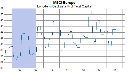
Similarly, the trend for debt among constituents of MSCI Europe is less encouraging than that in the other regions:
Sure, individual companies have made progress in strengthening cash cushions on their balance sheets. On the whole, however, it seems that European companies have more work to do here.
Does A Weaker Yen Suggest A Flatter Yield Curve?
Over the last decade there has been a pretty decent relationship between the value of the Japanese Yen and the shape of the US Treasury yield curve. When the Yen strengthened, the US yield curve steepened--presumably based on the conclusion that a stronger Yen makes Japan less competitive internationally and thus helpful to US economic growth. When the Yen weakened, the US yield curve flattened--presumably on the opposite belief that a weaker Yen made Japan a more formidable competitor, thus pressuring US economic growth.
In the last couple weeks, the Yen has broken down below 107 to the weakest levels since 2008. Will this put pressure on the US yield curve? At present levels, the Yen suggests that the steepness of the 3 month to 10 year US Treasury curve should be near the 2012 lows of 1.5% rather than the current 2.6%.
Boom-Bust Barometer Not Keeping Pace With S&P 500
The Boom-Bust Barometer (CRB raw industrial index divided by jobless claims) made a high on July 16th. It has subsequently fallen to two month lows as the S&P 500 began to rally in mid-August. If the US dollar continues to rally, this may hold back commodity prices and thus, hold back the Boom-Bust Barometer.
Surveys vs. Hard-Data
Industrial production in the US came in below expectations for the month of August (-0.1% vs consensus estimate of 0.3%) and Capacity Utilization fell to a six month low . Meanwhile, the Empire State Manufacturing Survey surged past expectations for the September (27.5 vs consensus estimate of 15.9). While we are not trying to make a mountain out of a molehill, recently there seems to be a disconnect between the hard data (today's IP and capacity utilization report, nonfarm employment, mortgage applications, jobless claims) and the multi-year highs in the surveys (today's Empire State Manufacturing Survey, ISM manufacturing, ISM non-manufacturing, Markit's PMI survey and Markit's Services survey). Perhaps the surveys are leading indicators and the economy is on the precipice of stronger growth. Or perhaps the surveys are overstating growth prospects and the underlying economy is weaker than most believe. Unfortunately, as with most questions in economics, the answer probably lies somewhere in between and only time will tell which data points were more prescient. However, it is something that we are keeping a close eye on at the moment. A few interesting charts of the today's US data releases are below.
'