Friday, May 29, 2015

US Corporate Profit Margins Are Coming Back Down To Earth

Today wasn't the best day for US economic releases. The 2nd revision of 1Q GDP was (unsurprisingly) revised down from 0.2% to -0.7%. The release that caught our eye, however, was the initial release of corporate profits in the US for the first quarter. After-tax corporate profits did rise by 2.7% year-over-year in the first quarter but this was on the heels of the 2014 4Q revision that reduced the growth rate of corporate profits from +2.9% to -2.5% during that quarter. Corporate profit margins have now dropped below 8% for the first time since 2009. Margins, as measured by after-tax profits divided by nominal GDP, hit an all-time record of 10.06% in 4Q2011. Margins have since steadily fallen to the its current level of 7.97%.

image 

image

image

Thursday, May 28, 2015

Inflation Expectations Are Turning Back Over In The US

TIPS derived breakeven inflation expectations have started to fall once again in May. For a little context, starting in last June, breakeven inflation started a steady march lower that lasted until January of this year. Since that time, we have seen a rebound in inflation expectations. For example, five-year TIPS derived breakeven inflation fell from 205 basis points on June 25th, 2014 to just 105 basis points on January 13th, 2015. Inflation expectations rebounded over the next several months and five-year TIPS derived breakeven inflation eventually hit 172 basis points on May 5th, 2015. Since then, inflation expectations have fallen back towards 154 basis points. The story is similar using 10-year TIPS and 30-year TIPS.

image

One of the Fed's preferred inflation measures, the 5-Year, 5-Year Forward Breakeven Inflation Rate, remains at the low end of its range over the past 12 years. It currently sits at just 2.06%. It is interesting to note that while TIPS derived inflation expectations were increasing for most of this year, they were increasing across different time dimensions (i.e. the 10-year TIPS and 5-year TIPS) at relatively the same rate. Consequently, the 5-Year, 5-Year Forward Breakeven Inflation Rate only rose as high as 2.16% on May 5th.

image

Wednesday, May 27, 2015

Knowledge Leaders Are Outperforming YTD

In our white paper "The Knowledge Effect: Excess Returns Of Highly Innovative Companies", we identified a stock market pricing anomaly in highly innovative companies.  The tendency of stocks of highly innovative companies to experience excess returns can be traced back to two main factors:

  1. A surge in the pace of knowledge produced catalyzed by the release of the first commercially available semiconductor in 1971. Due to the cumulative nature of knowledge, this acceleration has resulted in an exponential increase in humankind's total knowledge.
  2. A mandate by the US Financial Accounting Standards Board in 1974 which ruled that companies must expense knowledge investments in the period incurred. This deprived investors of relevant financial information on corporate knowledge spending at the dawn of this massive surge in pace of knowledge production. 
Based on 20 years of academic research, we have captured the Knowledge Effect by using a proprietary process designed to overcome the informational shortcoming of traditional financial statements. As regular readers know, we view the world through an "intangible-adjusted" lens. We have created two indexes, that are priced daily, to track the performance of Knowledge Leaders. One index tracks Knowledge Leaders in the Developed Markets and the other tracks Knowledge Leaders in the Emerging Markets. In the first chart below, we plot our Gavekal Knowledge Leaders Developed World Price Index (red line) against the MSCI World Index (green line).  It has outperformed the MSCI World Index by a little over 3% YTD. In the second chart below, we plot our Gavekal Knowledge Leaders Emerging Market Price Index (red line) against the MSCI Emerging Market Index (green line). So far our Gavekal Knowledge Leaders Emerging Market Index has outperformed the MSCI World Index by a little over 2% YTD. 


image

image

Another way we can look at performance is by splitting up the global equity universe into companies that follow a strategic innovation strategy (Knowledge Leaders) and companies that follow a strategic mimicking strategy (Knowlegde Followers). Developed Market Knowledge Leaders have returned on average about 9.2% YTD while Developed Market Knowledge Followers have returned on average about 6.9%. In the emerging markets, Knowledge Leaders have returned about 9.1% YTD while Knowledge Followers have returned about 8.6% on average YTD.

Developed Market Knowledge Leaders Performance By Sector
image

Developed Market Knowledge Followers Performance By Sector
image

Emerging Market Knowledge Leaders Performance By Sector
image

Emerging Market Knowledge Followers Performance By Sector
image


Decline in Sentix Euro Break-Up Survey

The 1,000 or so participants in Sentix's monthly survey of whether or not a country will leave the euro collectively decided that the risk has subsided (slightly):

image

The decline to 41% (from nearly 50% in April) was mostly attributable to risks related to Greece's membership in the common currency (black line):

image

Cyprus (in grey) was also determined to be less likely to exit the Euro zone, while the number of respondents who believe that Italy (in light blue) might exit rose ever so slightly:

image

Tuesday, May 26, 2015

San Francisco Real Estate Is 75% Above Housing Crisis Lows

The latest (March) Case-Shiller Home Price Index was released this morning and there were several noteworthy data points in the report. First, our 3-month diffusion index that measures the number of cities where prices are higher now than they were three months ago increased by six cities in March to a six-month high of 18. This means that 18 of the 20 cities tracked by Case-Shiller HPI have higher prices now than they did three months ago. All 20 of the cities have higher prices now than they did a year ago according to our yearly diffusion index. Second, Dallas and Denver remain the only cities that have increased past their housing bubble peak price point. However, Boston, Charlotte and San Francisco are only a few more strong months away from making new highs. Finally, speaking of San Francisco, house prices there have been booming. San Francisco house prices are now a staggering 75% higher than they were at the bear market low in March 2009. No other city comes close in mounting such a rebound off of the housing crisis lows.

image

image

image

image

image

Friday, May 22, 2015

European And Asian Stocks Are Approaching Overbought Levels

Unlike the majority of this six year old bull market, European and Asian stocks are outperforming North American stocks in 2015 (yes even measured in USD). Asian stocks are nearly 12% higher, European stocks are nearly 10% higher and North America stocks are just about 3%. This surge in Asia and European are starting to hit overbought levels judging by the the % of stocks above its 100-day and 200-day moving average.

Three weeks ago, 89% of Asian developed market stocks were trading above its 100-day moving average. This has fallen back a bit, to 76%, but still remains at an elevated level. 75% of Asian stocks are trading above its 200-day moving average.

image

image

83% of European developed market stocks are trading above its 100-day moving average. This is basically the highest level reached for European stocks in a year and a half. 76% of European stocks are trading above its 200-day moving average.

image

image

Finally, we have the bull market leader North America. Here we are seeing a slight breakdown in momentum. 65% of North American developed market stocks are trading above its 100-day moving average and 66% of stocks are trading above its 200-day moving average.

image

image


Thursday, May 21, 2015

Longer Term Trends Have Reasserted Itself In May

Remember back in April when we noted how equity trends had completely flip-flopped during the first several weeks of the second quarter and we wondered aloud whether this was a trend change or simply a counter-trend rally? Well, so far in May the market is signalling that equity trends observed in April may have just been oversold (and well overdue) bounce.

To quickly review, at the end of April the performing sectors were energy, telecom and materials. These had been three of the worst five performing sectors over the past four years. Conversely, tech, consumer discretionary and health care were the three worst performing sectors in April. Meanwhile, they had been the three best performing sectors over the past four years.

Through yesterday, bull market leadership has reasserted itself. The best performing sectors MTD are health care, tech, and consumer discretionary. And the two worst performing sectors? You guessed it, energy and telecom. Materials have bucked the trend so far in May and are the fourth best performing sectors in May.

Even with the weakness in the energy stocks in May, the energy sectors continues to have the best performance in the second quarter. However, YTD, the energy sector is still the second worst performing sector just ahead of utilities and just behind telecom. As we approach the final month in the second quarter, it will be interesting to see if long-term leaderships continues with its May momentum.

Equity Returns As Of Tuesday, April 28th
image

Equity Returns As Of Tuesday, May 20th
image

Smart Money Most Committed to Falling Rates Since The Last Peak in Long Bond Yields

Commercial traders (AKA the smart money) has massively flip flopped their positioning since the end of last year with respect to the long bond. In aggregate, commercial traders have moved from a net short position (benefiting when rates rise) of about 50K derivative contracts to a net long position (benefiting when rates fall) of 22K contracts. This is a delta of about 72K contracts in about six months. Aside from the rapid change in positioning, the commercial traders net long position in derivatives is the largest since the last peak in rates at the beginning of 2014, which led to a 1.8% decline in rates over the course of a year.

image

Wednesday, May 20, 2015

A Precarious Association

When the ECB announced plans for its own asset purchase program back in January, we commented on the big difference in the relationship between those purchases and equity performance when comparing the U.S. and Europe.  As the MSCI Europe Index hovers near decade highs (and asset purchases appear poised to expand at an accelerated pace over the next few months), this chart has us wondering whether or not we should brace for a rather unpleasant period in European equities:

image

Tuesday, May 19, 2015

Dr. Copper Is Down, Not Out

While it is too early to really get our hopes up, it is worth noting that Dr. Copper has clawed its way back above the long-term support that it violated earlier this year:

image

And though its efforts to overcome the downtrend seem to have faltered a bit today, the metal with a Ph.D in economics has clearly taken a peek at the view out above resistance:

image

As we said, this does not guarantee a sustained breakout (especially in light of our discussion about its rally and the relationship with Chinese growth)-- but the forces of accumulation have to start somewhere...

Breakdowns in the Health Care Sector

Health care stocks have been the leadership sector in the MSCI World, and many (such as biotech) have reached some pretty elevated valuations.  Most stocks in the sector have been in multi-year bull markets trends, outperforming the MSCI All Country World Index  significantly.

In our relative strength point and figure charts we take the daily price in USD of the individual stock and the MSCI ACWI.  We calculate the ratio and the measure changes in 2.5% increments.  Each X is a 2.5% relative outperformance and each O is a 2.5% relative underperformance.  We impose a 3-box reversal meaning that in order to shift from and ascending column of Xs to a descending column of Os, we must see a 7.5% shift in relative performance.  By measuring price movements in this way, we remove two sources of noise in the fluctuations in stock prices: the movements of a stock attributable to movements in the market as a whole (the beta) and the noise inherent in the movement of individual security prices.  Because trend reversals are a function of changes in relative price trends, time is not a variable.  A reversal can take 3 days or 3 months.  Time is marked in the top of the y-axis and as can be seen, the amount of reversals vary year by year. Generally a stronger bull market trend has fewer reversals in the midst of an uptrend.  Reversals are a proxy for risk, so these point and figure charts measure relative price vs. risk, rather than price vs. time like most charting techniques.

The benefit of our charting system is that it gives us an objective standard of performance.  All stocks are bought with the best of expectations and good fundamental reasons for the investment.  After the investment is made, none of this matters much anymore.  The only thing that matters once one owns a stock is how it performs.  A portfolio of chronically underperforming stocks is bound to underperform.  Managing the performance of a portfolio is relatively straight-forward with a systematic method of measuring the performance of the stocks in it.  Every stock has a role to play in a portfolio, and measuring how it is performing this role is an important element of portfolio management.

There are a handful of health care stocks that have recently broken down.  These stocks have been in multi-year uptrends and so are likely widely held in portfolios.  These stocks appear to be undergoing a major reversal of trend from a structural relative uptrend to a structural relative downtrend.  These stocks should be strongly considered as sources of funds.

image


image

image


Monday, May 18, 2015

Monetary Movements & Economic Mirage

While we entered 2015 with the Federal Reserve talking confidently about lift-off and how many rate increases there would be by the end of the year, the markets didn't seem to buy it.  As weak economic data began to surface, the Fed seemed to quietly backtrack first on the date of lift-off and then on the trajectory of the expected hiking cycle.

We always believe that Fed actions speak louder than words, and for this reason we measure high frequency monetary movements.  In the last couple months, the Fed seems to have arrested the decline in its balance sheet that began in 2014.  This has had positive impacts on liquidity in the banking system.  In the first chart, we show the three month change in total Fed assets.  The latest reading of $4.5 billion is in contract to the negative readings we have seen most of the year.

image

 In the second chart, we show the relationship between Fed assets and commercial bank liquidity.  Movements in commercial bank non-borrowed reserves mirror movements in Fed assets, but with more volatility.  So, in the last few months, as the contraction in Fed assets has ceased and turned positive, commercial bank liquidity experienced a much more dramatic swing.

image

This reversal in liquidity trends have fueled the latest stock market movements.  In the next chart, we show the same three month change in non-borrowed reserves as shown above, but this time we overlay the percent of stocks in the MSCI World index that are above their 200-day moving average. Clearly liquidity trends have a big impact on equity movements.

image

Will recent favorable liquidity trends be enough to propel stocks out of the current consolidation relative to bonds?  In the chart below, we show the total return of the S&P 500 compared to the total return of the JP Morgan 10 Year Government Bonds Index.

image

Two economic readings have us skeptical.  First, in the chart below, we show the S&P 500 compared to lumber prices.  Lumber is a good proxy for the strength of the housing market and, in turn, the housing market is a good proxy for the strength of the economy.  The plunge in lumber prices would suggest investors are skeptical on the strength of the housing market and, in turn, the economy.

image

Next, the Citi Economic Surprise Index keeps deteriorating.  The current reading of -73 is the weakest since the fall of 2011... and a 20% correction in stock prices.  We keep a one year running total of the Citi Economic Surprise Index, and its keeps falling.  Another month of weak data, and it is likely our indicator takes out the lows last seen in October 2011.

image

If the Fed has quietly decided to not only abandon any prospect of rate increases, but begin expanding its balance sheet again (in some stealth QE), stocks probably do propel out the year long relative strength consolidation with bonds.  But, if not, then stock managers should be particularly attuned to monetary movements and the economic mirage in the US.  Our simple model of the change in Fed asset compared to the total return of stocks vs. bonds, suggests the potential for significant bond outperformance if the Fed sticks to its plan of a 2015 lift-off.

image


Does the Pause in USD Strength Imply Stronger Equities?

As the U.S. Dollar takes a breather from its surge upward since the middle of last year...

image
image

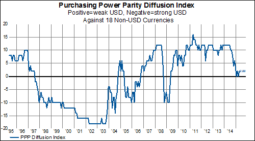
And our diffusion index of purchasing power parities versus 18 other currencies hovers in neutral territory...

image

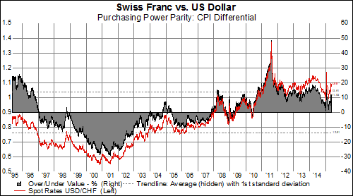
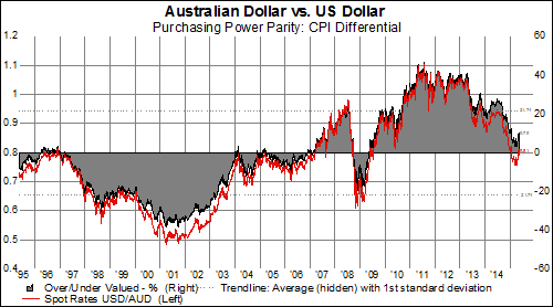
While individual PPP trends shift ever so slightly...

Europe
image
image
image

Asia
image
image
image

North America
image

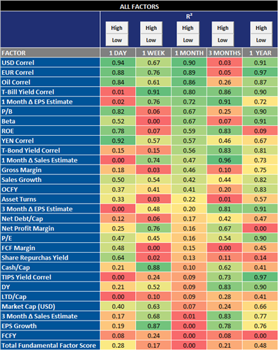
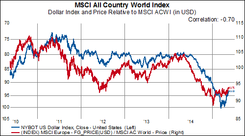
Correlation with the USD has been the single most important factor in equity performance throughout the world over the last month:

image

If the relative importance of the correlation to the USD persists, this has noteworthy implications for various regions around the world.  North American equities, which tend to outperform during periods of USD strength, have languished in the face of a weaker dollar.  Meanwhile, Europe and EMEA--with the strongest negative correlations to USD performance-- could benefit from a pullback or further consolidation.

North America
image

Europe
image

Pacific
image

Latin America
image

EMEA
image

EM Asia
image