Friday, March 13, 2015

To Catch A Falling Knife

From nearly every perspective, MSCI Europe Energy sector valuations look rather tempting compared to any other sector in the region:

image

image

image

The issue, then, becomes whether or not the decline in prices has stopped:

image

image

Our point-and-figure methodology comes in handy here, enabling us to track relative performance versus the MSCI All Country World Index for the Energy sector's constituents.  With just one possible exception (Neste Oil), all of these charts would seem to indicate a high likelihood that the downtrend in European Energy stocks will remain in effect for some time to come.


Charting The Winners And Losers Of The Latest Surge In The USD

On March 4th we wrote in The Dollar Is Breaking Out Again And What It Means For Stocks that "for a variety of cyclical and structural reasons...stocks in North America tend to be the relative beneficiary of USD strength while stocks in other regions generally, but not always, tend to underperform. The negative correlation is especially strong for European stocks." Well, since then the USD has surged another 6% so we thought we'd review how things have played out. 

In the six charts below we plot the ICE USD index (blue line, left axis, inverted) against the relative performance in USD of each of the six MSCI developed and emerging market regions relative to the MSCI All Country World Index (red line, right axis). Here is a breakdown of the relative performance since our post last week:

  • Relative performance of North American stocks has improved, though has not broken out to a new high
  • Relative performance of Europe has suffered, but has not broken out to a new low 
  • Relative performance of the Pacific region (which is mostly Japanese stocks) has continued to improve - this may have something to do with the fact that the yen has been stable
  • Relative performance of EM Asia has deteriorated just slightly
  • Relative performance of EM EMEA has suffered and is close to making a new cycle low
  • Relative performance of EM Latin America has suffered and has made a new cycle low

So it appears that Europe and ex-Asia EMs are taking the brunt of the pain while North America and Japan are benefiting from this latest bout of USD strength.

image

image

image

image

image

image

PPI and Trade Prices Weakest Ever In An Expansionary Period

With the release of (the plunging) producer price index today, we thought we would take a look at some of our latest PPI and trade price charts (i.e. February data point) that have been released in the last two days.  Unfortunately, we don't get the latest CPI numbers until March 24th but if these releases are any indication I think we can all guess which direction the CPI series will be moving.

The headline PPI for finished goods fell to -3.5% YoY%. This is the third lowest level in the post-war period and the lowest level ever recorded when the economy wasn't in a recession. The good news is the core-PPI reading remains positive, and fairly steady, at 1.54% YoY%. PPI for consumer goods has also fallen to its third lowest level in the post war period as it is down nearly 5% YoY%.

image

image

image

The year-over-year change in import prices ex-oil has been negative since December and the decline looks like it is still in its early stages given the move in the US dollar. The YoY% change in the headline export price is nearly -6%. Going back to the 1984 which is when the data series begins, this is the second largest drop and is only surpassed by the fall in 2009.  Currently, the year-over-year change in Autos, Parts & Engines is -1.3%. This series has been negative on a year-over-year basis since May 2013. This 21 month streak is the longest such period going back to 1982 when this series began. The year-over-year change in the export prices of Autos, Parts & Engines remains just above the zero line at 9 basis points. It will be worthwhile to keep our eye on this series in subsequent months as it has only once (briefly) dipped into negative territory since 1981 (October 2009). The 26 basis point one-month change in February is the third largest one-month change since 1990.

image

image

image

image

image

Thursday, March 12, 2015

Pop Quiz: What Is The Best Performing Regional Sector YTD?

The recent focus of the financial world (including for us) has been on the massive currency moves going on in the forex markets. By this point, everyone and their grandma knows that the US dollar has been on an explosive move higher. Since we are in a stronger US dollar environment now that must mean the US stock market has been outperforming in US dollar terms, correct? Not so fast. 

In the table below, we show the equal-weighted, US dollar based returns of the ten MSCI sectors across the Pacific, European, and North American regions. Somewhat astonishingly given that the nominal trade-weighted dollar is up about 8% year-to-date, the top three performing sectors are all from the MSCI Pacific Index. MSCI Pacific health care is up an impressive 15% YTD, while the MSCI Pacific materials sectors is the only other sector up over 10% in USD terms. Out of the top 11 best performing sectors, only 1 (consumer discretionary) comes from North America.  And if we shift our focus to the worst performing sectors this year, six out of the ten worst performing sectors come from North America. MSCI North America utilities is by far the worst performing sector as they have fallen by 5.5% year-to-date.

image
image
image

With MSCI Pacific's outperformance this year, we aren't surprised to see that our Gavekal Knowledge Leaders Developed Market World Index (KNLG) is outperforming the MSCI World INdex. KNLG has managed to return 3.53% so far this year compared to the MSCI World Index's return of only 7 basis points. KNLG is uniquely positioned as it has a structural tilt towards Japan and a structural tilt away from the United States relative to the MSCI World Index. Our KNLG index also structurally favors consumer discretionary, information technology and industrial firms while structurally underweights financials and energy. 

image

image

image

For more information on both of our Knowledge Leader Indexes please click here.


Wednesday, March 11, 2015

The Market Is Pricing In Two Rate Hikes In 2015 (And Four In 2016)

According to Fed Fund futures, the market currently expects about 2 rate hikes by December 2015 (assuming the Fed raises rates by 25 basis points each time). Fed Funds futures is pricing the Fed Funds Rate at 54 basis points by December 2015. The market was most optimistic regarding delaying fed hikes in mid-January when the market was pricing in only about one and half hikes for 2015. It is interesting to note, however, that in first 10 months of 2014 the market was expecting roughly three hikes in 2015 so expectations have still fallen somewhat.

image

The market is currently pricing in a Fed Funds Rate of 141 basis points for the end of 2016. Expectations for higher rates in 2016 have increased significantly since the beginning of February. On February 2nd, the market was pricing in a Fed Funds Rate of only 104 basis points by December 2016.

image

Q: How Many Stocks Trade for Below Book Value? A: 12%

Surprising as it may seem, only 12% of stocks in the MSCI World Index trade for less than 1x book value. This is compared to more than 30% in 2012 and nearly 50% in 2009. How the times have changed!

In the second chart below we show the percent of companies in the MSCI World trading for under 5x cash flow. The current reading of 6% compares to nearly 50% in 2009.

image

image


Leadership Reversion In Europe

In the last week, as the European Central Bank began asset purchases, yields on German bunds have plunged from 35bps to 17bps as of this writing.

image

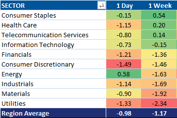
While European cyclicals had a brief window of outperformance, leadership trends appear to be reverting back to counter-cyclical leadership as we speculated in Long-Term Relative Performance Trends in Europe.  Over the last week, consumer staple companies have led European performance, while health care and telecom have followed closely behind.  In USD terms, these are the only three sectors with positive performance since Euro QE has begun.

MSCI Europe Sector Performance in USD
image

Over the last five years European counter-cyclicals have outperformed cylclical sectors by 28% cumulative.  As the chart below illustrates, at the end of January, the relative performance of European counter-cyclicals vs. cyclicals broke out to hew highs.  We have had a minor pullback, but given the move in German rates, we maintain that counter-cyclicals will continue continue to outperform cyclicals in Europe.

image

Of particular interest, should German rates continue to fall, are growth counter-cyclical stocks--those in the consumer staple and health care sectors.  The plunge in German rates over the last years from 2% to 20bps has provided a lot of fuel for another big leg of growth counter-cyclical outperformance.

image


You're Not Imagining It.

The recent (more than 10% QoQ) slide in the euro is a two-standard deviation event, the likes of which we have not seen since 2010.


And, as we can see in the chart above, the only time the euro has declined more versus the USD was back in 2008.

Tuesday, March 10, 2015

Who Says Tracking Error Isn't Predictive of Performance and Alpha?

The extremely well greased PR machine promoting passively managed index funds as the best thing since sliced bread has gone to great effort to convince the investing public that money cannot be made through active strategies. Outperformance is illusory they say, not predictable, not repeatable, subject to change, and the search for outperformance is a risky endeavor. If only that were true everyone's investing lives would be much easier. We'd all buy the market capitalization weighted investable universe packaged into one nicely wrapped ETF charging 0.1% and our quest to be average would be complete.

Unfortunately for the efficient marketers - but fortunately for anyone who wants to be above average - there is plenty of evidence to suggest otherwise. We'll be hitting a lot more on this topic in the weeks ahead, but for now we simply present the following table showing the correlations between annualized performance and annualized alpha to tracking error (tracking error is the standard deviation of return differentials between the fund and a blended stock/bond index) for all 482 balanced funds available to US investors that have a four-year track record.

Efficient marketers want everyone to believe that buying funds with higher tracking error to one's benchmark (i.e. not holding the "investable universe") is super risky and unlikely to result in material performance differentials over time anyways. This empirical evidence shows otherwise. Tracking error doesn't guarantee outpeformance, but it is a prerequisite.

image

Beware the Ides of March?

MSCI World equities are off to a rough start for the month, with 8 out of 10 sectors in negative territory so far:

image

The percentage of stocks above their respective moving averages has fallen:

image

And the number of stocks making new lows has jumped to 33% from 0% for longer time horizons:

image

Whether this pullback develops into something worthy of the drama with which the Ides of March are historically associated remains to be seen.  It could turn out to be as innocuous as the actual meaning of 'Ides', which was simply a Roman designation for the 15th day of the month in March, May, July, and October.

Monday, March 9, 2015

Obfuscated Intangibles

Recently, we have taken a closer look at the effect that our process of capitalizing intangibles has on individual companies' balance sheets (see When $75 Billion In Intangible Capital Goes Unnoticed as well as How Advertising Creates an Economic Asset).  As these specific examples illustrate, there is a great deal of investment that is under-appreciated by the current accounting regime.  In fact, for the constituents of the entire MSCI All Country World Index (~2500 companies, both developed and emerging), there are literally trillions of dollars in unrecognized, intangible capital spending.

By economic sector, Consumer Discretionary and Information Technology exhibit the greatest discrepancy in intangible-adjusted versus actual assets.  The Health Care sector is not far behind, with more than $520 billion in intangible investment-driven assets that we do not see when using conventional accounting standards:

image

When we drill down further, however, we find that the sub-industry with the highest level of unrecognized (intangible) assets is the Pharmaceutical group. Collectively, these companies have nearly $400 billion MORE in assets when various forms of intellectual property are correctly accounted for:

image

Among the top 20 companies, those with the most under-reported assets are mostly domiciled in North America (~$370 billion) and Europe (~$215 billion), while those from the Asia Pacific region are 'missing' somewhere in the neighborhood of $160 billion in assets as a result of accounting standards that do not recognize intangible investment:

image


How Advertising Creates An Economic Asset Or Why Coke Has $190 Billion Market Cap

As we never tire of pointing out, the massive levels of intangible assets on multinational corporations' balance sheets is one the most overlooked drivers of profitability by the investor community.  Since the early 1970's when the information and communication technology (ICT) revolution began there has been a dearth of information for investors regarding a company's innovative activities. This lack of information has been partially caused by the (in hindsight) oddly timed decision by the Financial Accounting Standards Board (FASB) in 1974 to force companies to expense all research and development (R&D) costs in the current year. They also eliminated the option for companies to use their discretion in capitalizing R&D as they saw fit (see SFAS #2). Since that ruling, there has been copious amounts of research into this topic on whether or not innovative activities are investments (if you like to read academic research please contact us for some of our favorite pieces on the topic). As regular readers know, we firmly believe that a company's innovative activities is an investment in the future and our Knowledge Leader Indexes have shown that knowledge continues to be an undervalued asset.

The research over the past 40 years have identified five different categories of intangible assets: 1) computerized information 2) scientific R&D 3) non-scientific R&D 4) brand equity 5) firm-specific resources. For our post today, we wanted to look #4 and #5, brand equity and firm-specific resources, which are sometimes combined into a category called economic competencies.

Firm-specific resources primarily refers to investments companies make in their employees. Worker training programs are vital in order to speed up the learning curve of new employees and make current employees more productive in order to produce "more with less".  Brand equity is the knowledge and value embedded in brand awareness and recognition. A positive association of a brand has become ever more important as the marketplace for goods has gone global. Outside of a few select goods and services, an inept local producer can no longer remain competitive simply due to the fact that he or she is located closest to the end consumer. Competition is fierce and there has been a premium placed on quality and consistency by many consumers. This means that brand equity is more important than ever. Building brand equity isn't just about portraying a message to potential new consumers, it is about reinforcing the message about utility and quality to current customers so that they continue coming back to the product again and again. Over time and with continual reinvestment, these intangible investments create a unique economic asset that a company uses to increase future cash flows. Perhaps no company has better shown the economic value of brand building as the Coca-Cola Company (Ticker: KO) has.

Everyone who has ever watched a Super Bowl knows that KO has been a believer in the economic value of brand building for a long time. However, it may be a surprise to know that KO has an extensive employee training program as well. KO's employee training program is called Coca-Cola University. This curriculum "provides a wide range of courses through classroom learning, e-learning and field training to help associates develop personally and professionally.  [Coca-Cola University's] learning portfolio focuses on leadership; marketing; human rights; ethics and compliance; diversity; sustainability; finance; and other competencies." According to KO's website, more than 27,000 associates participated in 1,720 classroom sessions worldwide and 39,100 participated in e-learning courses (for more information click here).  KO has spent billions of dollars on these intangible investments and spent an industry-leading 11.3% of its sales on brand building and firm-specific resources last year.  Over the past 20 years, KO has invested almost 12% of its sales in intangible assets on an annual basis. This may come as a surprise to many but KO actually spends over twice as much on intangible investments as they do on traditional tangible investments.

Intangible-Adjusted Investment Profile
image

This focus on intangible investments has led to long-term asset of $9 billion at depreciated, historic cost on KO's balance sheet according to our intangible-adjusted data. This is a rather sizeable 10.5% of KO's intangible-adjusted balance sheet that currently is completely overlooked by investment community. Brand building and firm specific resources tend to have a quicker depreciation rate than R&D or tangible investments. In accordance with the latest research, we depreciate these intangible assets at a three year rate with zero residual value.

Intangible-Adjusted Balance Sheet
image

Over the past 20 years, KO's investments in intangibles has helped it maintain a large global market share and grow sales at an industry best 6.4% per year. KO has increased its earnings per share at 8% per year, book value per share at 9.9% and cash flow per share at 7.3%. All the while, it has increased its dividend by 9.6% per year for the past two decades.

Intangible-Adjusted Growth Rates
image

We frequently mention Warren Buffet's "economic moat" concept. It is term that refers to a company's ability to sustain competitive advantages over its competitors and protect its long-term profits and market share. This is exactly what an investment in an intangibles asset delivers. It allows companies to have a self-financed, self-created, unique economic asset in order to maintain its competitive advantage and long-term profits. Most managements around the world understand that investing in innovation activities is not only important for future growth but it is in fact a necessity in order to simply stay in business. However, traditional conservative accounting practices continue to treat these investments in the future as current period expenses. This creates a large information mismatch between insiders and outsiders and this mismatch can be exploited if one shifts their focus to unearthing the value of intangibles.


No Matter How You Slice It, Stocks Everywhere Are Just Downright Expensive, Especially in DM

It's no secret that we think stocks are expensive. Indeed, over the last few months we've written extensively about what we think are high valuations for stocks everywhere. See Are EM Asia Equities Really That Cheap?Navigating High Stock Valuations in a Deflationary WorldValuation Update: Stocks are (Still) Expensive EverywhereStocks Selling at a Discount to Book Value is a Thing of the Past, and Stock Valuations Jumped Again in December.

Along those same lines we thought we'd provide an update on valuations with data through February, only we'll take a slightly different tack. In this post we will show stock valuations from three different perspectives:

  1. Median price to cash flow based on trailing data
  2. Normalized median price to cash flow based on the five year average cash flow
  3. Forward market capitalization weighted price to cash flow
We've chosen to show the price to cash flow because the denominator, cash flow per share, is much harder for companies to manipulate than EPS. Also, we've chosen these three metrics for very specific reasons. The median ratio is by definition not market capitalization weighted and thus filters out distortions created by a small group of extremely large stocks. Normalized valuations smooth out fluctuations in the denominator caused by boom and bust years, thus giving a clearer sense of cash flow generation over the course of the business cycle (though 2008-2009 cash flow would have dropped off by now). Finally, forward market cap weighted valuations incorporate analyst estimates of future cash flow and also the distortions created by large stocks. We think there are many flaws with market cap weighted valuations based on forward estimates, but the world looks at them and so we do, too. 

For each of the three valuation metrics listed above we'll show the ratio for all six of the MSCI developed market and emerging market regions - Pacific, Europe, North America, EM Asia, EM EMEA, and EM Latin America.

The conclusion we come to is fairly simple. Stocks are expensive pretty much everywhere you look. Stocks in developed markets are more expensive relative to their own history than stocks in emerging markets, but stocks in EMs can hardly by called great values. That point is especially true when looking at the median price to cash flow, which shows the median EM stocks trading at levels near or higher than the 2007 peak. Furthermore, as we noted in Are EM Asia Equities Really That Cheap? the cheap stocks in the EMs are exactly the ones you want to avoid for structural reasons. 

Median Price to Cash Flow


image

image

image

image

image

image

Normalized Median Price to Cash Flow

image

image

image

image

image

image

Forward Cap Weighted Price to Cash Flow

image

image

image

image

image

image