Most readers are well aware of our proprietary point-and-figure charting system (details here). And while we find it particularly useful when it comes to identifying stocks that are in jeopardy of underperforming the benchmark (i.e. things we would like to sell or avoid), it can often be a source of motivation to take a closer look at a certain stock or group of stocks. As we saw earlier today with the homebuilders, common trends in price movements can exist for most (if not all) of the constituents in a sub-industry. Though that group is an example of a chart pattern that we would avoid (as the saying goes: the bigger the top, the steeper the drop!), there is another group whose members seem to be in much more constructive relative trends at the moment.
Something special appears to be going on for South African Apparel Retailers these days. With one member breaking out from a multi-year consolidation and the other two moving up from substantial base formations, this group looks interesting on a technical basis:
In addition. the sub-industry has been one of the best performers among all MSCI South Africa so far this year:
And, on an intangible-adjusted valuation basis, the group is not extremely expensive-- especially when compared to some of the South African Cable & Satellite or Financial sector's sub-industries:
While the 3.2% dividend yield is just average among its peers in the same country, it trails only the Food Distributor sub-industry with respect to regularly increasing those dividends each year:
The South African Apparel Retail group is also one of the leading investors in advertising and firm-specific resources-- an important indicator of constituents' commitment to investment in performance enhancing intellectual property (for more on the difference investments in intangibles can make, see here):
In addition to relatively healthy cash levels...
The group also has very low net-debt levels:
All of which helps to generate strong profitability:
So, while our point-and-figure charts are perhaps most useful in helping us avoid instances of big relative underperformance, the positive trends that we spot there (such as the bases and breakouts shown above) can be extremely useful in our efforts to "water the flowers and pull the weeds".
Friday, March 20, 2015
Are US Home Builders Putting In A Multi-Year Top?
Early this week, we noted how the weakness in housing starts was reflected in weaker lumber prices. While many commentators excused the weak housing starts data by blaming the weather (which no doubt affected it to some degree), there was a lone bright spot in the report if one looked at building permits. Unfortunately, the price action amongst US home builders seems to fall more in line with weaker housing starts rather than the stronger building permits.
Below we show the four stocks that make up the MSCI US Homebuilding sub-industry using our proprietary point and figure charts. Three out of the four stocks are in a precarious position. They are challenging an overhead resistance line that has been gaining strength over the past three years. If they should fail to break through to newer highs, that would be a significant knock against these stocks and could be an early sign that the trend in these stocks is changing from consolidation to underperformance. If you are invested in this sub-industry, you are hoping Lennar is a bellwether. It has recently broken out (barely) to new relative performance highs. However, it is much too early to tell if this is a true breakout or not. Given the chart formations of the other three stocks in the sub-industry, it would be surprising if Lennar can buck the trend and sustain its relative new highs.
Thursday, March 19, 2015
The Other "Most Crowded" Trade is (Still) to Short Long-term Treasury Bonds
In a nutshell, we are absolutely amazed at the amount of pain endured by speculators who are short long-term treasury bonds. One would have thought that after a 15 month long rally in bond prices (yields lower) that bets on yields rising would have abated significantly as the crowd capitulated on the reality of "lower for longer". One would have been wrong.
As it stands today, the other "most crowded trade" besides being long the USD is still to be short long-term US treasury bonds. Indeed, over the last several weeks as bonds sold off, the net speculator short position (indicated by the red line right axis, inverted) popped back up to more than 300,000 options or futures contracts. We've been making the point for the past year that bond yields have previously not bottomed until the speculator net positing turned from being short to long. If history is a guide, then there is an awful lot of short covering (and likely lower yields) in front of us before we get to that point.
Why Not Just Buy The US 5-Year Treasury?
The collapse in yields around the developed world is startling. For fun, we wanted to see how many 5-year or longer dated government bonds are currently yielding less than the US 5-year on-the-run treasury bond (which is down 23 bps YTD itself). Looking at the list below, is it at all surprising the USD has been on such a tear?
The US 5-year treasury bond is currently yielding 148 basis points. Here are some notable bonds that are yielding less than the US 5-year:
What the rest of the world is yielding...
The US 5-year treasury bond is currently yielding 148 basis points. Here are some notable bonds that are yielding less than the US 5-year:
- Canadian 10-year yield is 15 bps lower
- Japan 30-year yield is 23 bps lower
- German 30-year yield is 85 bps lower
- France 30-year yield is 41 bps lower
- Belgium 30-year yield is 47 bps lower
- Denmark 30-year yield is 89 bps lower
- Italy 10-year yield is 26 bps lower
- Netherlands 30-year yield is 77 bps lower
- Spain 10-year yield is 24 bps lower
- Sweden 30-year yield is 56 bps lower
- Swiss 30-year yield is 109 bps lower
What the rest of the world is yielding...
SKEW Has Moderated Somewhat, But Remains Elevated
While the CBOE SKEW Index has fallen back somewhat from highs last fall (see our comment here), it remains quite elevated-- both relative to history and on an absolute basis. Indeed, the further the index rises above 100, the higher the probability of 'outlier returns'. For a full description of the indicator's profile, see here. In spite of the rise in the SKEW, the VIX remains relatively subdued and the S&P continues to chug along.
Reviewing Equity Returns Post-Fed Statement
We noted yesterday that the US stock market took off after the Fed statement released (and the 2-10 year part of the yield curve came in significantly). So after the dust settles, which sectors led and which sectors lagged after the Fed statement?
The best performing sector, on an equal-weighted, USD basis, in the MSCI World yesterday was the energy sector. Of all the market moves yesterday, this seems the least related to the actual Fed statement and looks like it was more of an oversold bounce. The energy sector remains in a bear market over the past year (-23.17%), far underperforming the average stock in the MSCI World over that period (+6.39%). Two of the next three top performing sectors were counter-cyclical sectors which we find interesting. Utilities followed the rally in bond prices as it was up 1.45% and health care was up nearly a percent. For what it is worth, the worst performing sector was also a counter-cyclical (telecom). However, the second, third and fourth worst performing sectors were cyclical sectors. Given the recent fall in inflation expectations and the decrease in bond yields, an acceleration of the outperforming trend in counter-cyclicals relative to cyclicals seems likely.
MSCI World Index Performance By Sector
The Most Innovative Companies in the Emerging Markets
There was an interesting post on Zerohedge the other day, an interview of Dr. David Jack, author of the new book “From Boom to Bust: A Typology of Real Commodity Prices in the Long Run”. In the following exchange, Dr. Jack makes a connection between commodity prices and emerging market equity returns.
Interviewer: On the whole, what does your research suggest of where we are in the overall commodities cycle? And what implications does this have for major producers, such as Australia, Canada and many emerging markets?
Dr. Jack: It suggests that the boom years of the past decade and a half were the exception and not the rule. Australia and Canada will have a bit of rough patch in the years to come, but will manage through as they always do. The much touted growth prospects of many of the BRICs will prove to be nothing more than a commodity-boom-fuelled mirage.
In the charts below, we can see where he is coming from. We compare the MSCI Emerging Market Price Index to the CRB index and copper prices. In both cases the correlations are quite high, at 93% and 96% respectively.
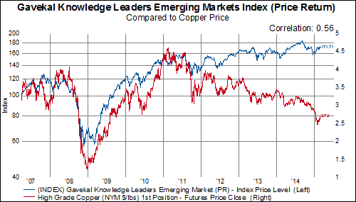
Is there a better investment approach to investing in the emerging markets? Yes, in the chart below we show the performance of our Gavekal Knowledge Leaders Emerging Market Index (KNLGEX), an index of the 165 most innovative companies in the emerging economies, compared to copper prices. There has been a huge divergence in the emerging markets in the last five years--toward companies with significant stocks of intangible capital.
The KNLGEX has the following measurements relative to the MSCI Emerging Markets Index:
1) 80% active share, making it a high active share strategy.
2) 56% correlation, offering good diversification opportunity.
3) 7% alpha, which can add to portfolio efficiency.
Click here for more information on the indexes.
Stay tuned for more news on our strategic beta-style indexes.
Please email info@gavekal-usa.com for more information.
Wednesday, March 18, 2015
Fed Lowers Real GDP, Inflation Expectations and Interest Rate Expectations
In the few minutes since the release of the FOMC statement and since the Fed dropped the word "patient" as expected, the S&P 500 has risen by 30 points.
Here are a few takeaways from the latest Fed projections and interest rate dot plot.
Latest Fed Economic Projections
Latest Dot Plot
December's Dot Plot
Here are a few takeaways from the latest Fed projections and interest rate dot plot.
- Real GDP expectations have again been lowered. Real GDP projections are now lower for 2015, 2016 and 2017
- The unemployment rate projection has been lowered for 2015, 2016, and 2017 as well.
- The projections for the headline PCE have been cut nearly in half for 2015
- Core-PCE projections have been lowered slightly for 2015 and 2016.
- The interest rate dot plot is forecasting lower rates in 2015, 2016, and 2017 than previously projected in December based on where the majority of dots are congregating. A majority of dots are huddled between 50-75 basis points for 2015. In December, A majority of dots were huddled around 75-125 basis points. Similarly, 2016 interest rate expectations have been lowered from around 200 basis points to 150-175 basis points.
Latest Fed Economic Projections
Latest Dot Plot
December's Dot Plot
What Can the ZEW Survey of Economic Expectations for Switzerland Tell Us?
If past relationships between the survey conducted by Credit Suisse and ZEW to determine economic expectations in Switzerland hold, the outlook is not very bright. From retail sales to unemployment to GDP, history would suggest a rough patch ahead.