The percent of stocks in the MSCI World Index that have had positive EPS revisions compared to six months ago currently stands at 45%. Over the past 7+ years, the average level of this statistic is 56%. So it currently stands below average levels but encouragingly it has improved from a low of 30% set on January 14th. Given the extent to which we have seen this earnings season affected by a stronger USD, one is not surprised to see a fairly strong negative correlation (-0.72) between revisions and the year-over-year change in the USD. The story holds for sales revisions as well. In fact, the percent of companies with positive sales revisions compared to six months ago and the USD has an even stronger negative correlation (-0.79) over the past 7+ years. The question facing investors then is where do we go from here? Will the strength in the USD moderate and consequently, the year-over-year rate of change will converge with our revisions statistic? Will revisions turn back over retest the lows made in January? Or will we have a several month period where these series diverge from one another such as in 2010 or 2012? One thing's for sure, as this bull market continues to mature all eyes will be on earnings and this will be a relationship worth monitoring.
Friday, April 24, 2015
"Innovation Boom" - A Quarterly Strategy Update with Steve Vannelli
In this video, Steve summarizes his quarterly update on the Gavekal Knowledge Leaders Strategy. With corporate R&D investments accelerating to levels last seen during the 90s tech boom, we are in an innovation boom. Learn how a market inefficiency came to exist among highly innovative companies, how Gavekal tries to capture this inefficiency, what the outlines of the current innovation boom look like and how the investment team will capitalize on this trend. Download slides.
Thursday, April 23, 2015
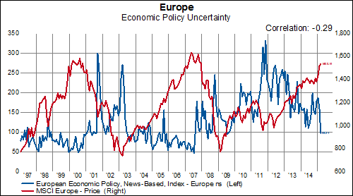
The Plunge in Policy Uncertainty
The consistent decline in Economic Policy Uncertainty*, as measured by the indexes presented here, would seem to serve as evidence supporting a continuation of the positive trend in European equities. After all, one might reasonably assume that better defined policies and, therefore, less ambiguity, should be good for growth in general and the stock market, in particular.
However, when we look at a simple correlation of the overall Economic Policy Uncertainty index for Europe and the performance of MSCI Europe stocks, we find only a slightly negative correlation-- meaning that declines in uncertainty provide only minimal support for equities. As we can see in the following chart, significant gains seem more assured when the index remains in a tight range below 100 on a consistent basis:
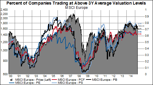
Perhaps we would be more optimistic about the potential for large gains in European equities if it appeared that there was more room for multiple expansion? The fact that two-thirds (or more) of stocks in MSCI Europe continue to trade above their three-year average valuation levels (no matter which one you choose) remains a concern.
*Economic Policy Uncertainty
Unbelievably, Chinese Companies Massively Increased Leverage Ratios in 2014 to Highest Ever
Not to take anything away from what has become a bona fide bull market in China, but we have been pretty skeptical that the rally in domestic Chinese shares has anything to do with corporate fundamentals. It more likely has to do with central bank stimulus. And a review of the most recent financial statistics on the CSI 300 reinforces our view because Chinese companies have never, ever been more levered.
The below table shows various financial statement ratios in aggregate for the CSI 300 excluding all financial and utility companies. Here are a few highlights:
Just when you thought Chinese companies couldn't get more levered, they have, and now it's in the face of a rather noticeable deterioration in the domestic economic situation.
The below table shows various financial statement ratios in aggregate for the CSI 300 excluding all financial and utility companies. Here are a few highlights:
- Total liabilities as a percent of equity increased by 14% to 162%, an 80% increase since 2002
- Financial leverage increase to 2.7x, a 42% increase since 2002
- Inventories increased again as a percent of total capital and sales
- Inventories as a percent of total capital have increased 105% since 2002
- Net profit margin and cash flow from operations margin remained near the decade lows
Just when you thought Chinese companies couldn't get more levered, they have, and now it's in the face of a rather noticeable deterioration in the domestic economic situation.
The Right Tool For The Job of Active Management
Market-cap weighted indexes such as the MSCI global equity indexes are commonly used reference points for investment benchmarking. In these indexes, the market cap of the top 10% of the stocks is generally 50% of the market cap of the index. If we looked a normal distribution of the market cap of stocks in the global markets, we would see a tremendous amount of skew. The bell shaped curve would look like it got hit from a blast of wind from the left, exhibiting negative skew, where the left tail is much larger than the right tail. An easy way to spot negative skew in a distribution is to note if the mean is larger than the median. For the MSCI World index, the weighted mean market cap is $96 billion and the median is $11 billion. The skewness of this distribution is huge.
Why bring this up? Because, we invest our portfolios on a more or less equal weighted basis, where each position is roughly the same. In other words, the distribution of weighted market cap in our portfolio has much less skew. So, when we think about managing portfolios and identifying the data we need/want to try to beat the market, we want our data to fit our style of management. For us, data representing an index with a tremendous amount of skew is somewhat unhelpful when managing a portfolio with relatively little market cap skew. We think of it from a probabilistic standpoint. We want to know information relevant to our odds of picking a stock from a certain industry that will outperform the index. Information about the performance of the market weighted index isn't so helpful in determining whether or not the odds of a picking an outperforming stock are high or low.
How about an example? In the chart below is a picture of the market cap weighted MSCI World Household & Personal Products Index relative to the (market cap weighted) MSCI World index.
One would look at this chart and not be impressed with year-to-date performance. But, the interesting thing is that the equal weighted average household and personal products company is up 8.4% YTD, outperforming the MSCI World index by 4%.
MSCI World Industry Group Performance (equal weighted)
MSCI World Industry Group Performance (equal weight) Relative to MSCI World Index
If we look at the breadth of performance in the industry, we can see that household/personal products industry exhibits the second best breadth of all industry groups, with 76% of the companies outperforming. This suggest that our odds of a picking an outperforming stock are very high in this group. This should be an obvious area of interest for investors.
MSCI World Industry Groups Percent of Companies Outperforming the MSCI World Index
Drilling down to the individual names, we can easily that the outlier is Proctor and Gamble. P&G is down 4.4% YTD.
MSCI Household/Personal Products Performance
Since P&G alone is roughly half the market cap of the industry with 11 members, this is a great example of how the top 10% of an index represents roughly 50% of the market cap.
MSCI Household/Personal Products Market Cap
Market cap weighted indexes are great for some applications but not so great for others. If your goal is to actively manage a portfolio of stocks with the aim of beating the market, then a market cap weighted index isn't so useful. One has to have the right tool for the job.
Wednesday, April 22, 2015
Where Banks Are Performing Well In The World
There is an old belief that when bank stocks are doing well, the economy must be doing well also. With this in mind, we decided to take a look how the banking sectors have performed in seven different countries: USA, Germany, United Kingdom, France, Japan, China, Brazil. Since 3/31/2008 ( which is as far back as we have industry group data from MSCI), only China and Brazil have managed to make back all the gains that were lost in the financial crisis. German banks were knocked to the mat and have remained there as they have lost nearly 90% of its value since 2008. Over the past two years, however, the banks in Europe have been far better performers. French and German banks are 50-65% higher over the past two years. Interestingly, UK bank's have been laggards during this time
Five Reasons to Stick With (Growth) Counter-Cyclicals
With all the churning underneath the surface of the stock market lately, it is a bit difficult to separate the signal from the noise when analyzing leadership trends and asset allocation. On balance, we think the evidence still supports an overweight position in counter-cyclical stocks, but we would really focus mostly on health care and consumer staples--the growth counter-cyclicals. Looking at our equal-weighted sectors, calculated from the bottom-up, we can see that health care and consumer staples are still the number one and two on the global equity leader-board.
MSCI World Performance
Below we outline our five reasons why we think an overweight stance in counter-cyclicals still makes sense.
Reason #1: Over the last five years, cyclicals only outperform counter-cyclicals when the Federal Reserve's balance sheet is growing. Currently the three month change in fed assets is negative $30 billion.
Reason #2: The four year old USD bull market has not been incorporated fully into the relative performance of counter-cyclicals. Yes counter-cyclicals have outperformed, but they should have outperformed more.
In particular, the USD strength has not been fully factored into growth counter-cyclicals.
Reason #3: Counter-cyclicals outperform when TIPS rates are falling. TIPS are 5bps away from taking out one year lows.
Reason #4: The outperformance of MSCI World counter-cyclicals relative to cyclicals is highly correlated with the relative outperformance of the S&P 500 (total return) relative to the JPM Government Bond Index (total return). Bonds have been outperforming stocks for over a year.
Reason #5:Counter-cyclicals tend to outperform when the CRB Commodity Index underperforms the overall CPI level. In other words, when headline inflation is less than core inflation, counter-cyclicals outperform. The CRB has underperformed the CPI by 17% since May 2014.
Tuesday, April 21, 2015
Is Volatility Making a Comeback in Europe?
Having fallen from the recent highs earlier this year, various metrics of volatility in Europe have risen abruptly in the last few days-- especially when viewed in the context of a rather subdued VIX (a measure of expected market volatility conveyed by S&P 500 options prices; represented by the light blue line below):
Compared to month-ago levels, both the VStoxx (a measure of expected volatility in European shares; dark blue line) and the VDAX (the implied volatility of the German DAX; red line) have had double-digit increases:
Taking a look at the spread between the VStoxx and the VIX , we can see that, while the overall trend is slightly down over the last five years, the recent widening is approaching levels not seen since the crisis in 2011/2012.
Monday, April 20, 2015
Something To Keep In Mind During Earnings Season...
As we enter the heart of the S&P 500 1Q earnings season, and the CNBCs of the world focus on the number of companies that (surprise) beat earnings expectations once again, remember this fact: earnings expectations have been beaten down over the past six months. Let's take a quick tour of the developed world to illustrate this point.
In North America , the average stock has seen its FY1 EPS estimate fall by 12% and its FY2 EPS estimate fall by 11%. In this case, however, the average stock is a poor representative of the market. On an equal-weighted, USD basis, by sector, FY1 EPS estimates have been downgraded between 2.5% (financials) to a whopping 62% (energy). All 10 sectors have seen its FY1 EPS decline over the past six months. FY2 estimates haven't fared much better, with the bar lowered by 0.4% to 60%.
MSCI North America Change In EPS Estimates
In Europe, while the most extreme drop (again its energy) isn't quite as extreme as the fall in North American energy earnings expectations, the degree and breadth of the fall in earnings expectations is worse than in North America. The average stock has seen its FY1 EPS estimate crater by nearly 16% and FY2 EPS estimates have fallen by nearly the same amount. The consumer discretionary sector held in as the best as earnings fell by "only" 9.8% for FY1 EPS estimates. All of the other sectors experienced at least double-digit declines over the past six months.
MSCI Europe Change In EPS Estimates
Finally, EPS estimates in Asia have actually fared the best of the three developed regions (who would have guessed that given a strong dollar environment?). The average stock has seen its FY1 EPS estimate fall by 9.3% and its FY2 EPS estimate fall by 7.5%. The sector hit hardest was once again energy (-46% FY1, -23% FY2). However, there are actually two sectors (utilities and information technology) in Asia that have experienced an improvement in its FY1 EPS estimates over the past six month.
MSCI Pacific Change In EPS Estimates
In regards to the breadth of earnings revisions, only 1 sector out of the 30 regional sector has had a majority of its stocks experience positive FY1 EPS revision over the past six month. That sector is the North American health care sector. Breadth of revisions has been by far the weakest in Europe as no sector has more than a 1/5 of its companies with positive FY1 EPS revisions over the past six months.
MSCI North America EPS Revisions Breadth
MSCI Europe EPS Revisions Breadth
MSCI Pacific EPS Revisions Breadth
The good news, especially for the energy sector, is it seems that the beat down of FY1 EPS estimates has subsided.
Momentum In The Global Manufacturing Sector May Be Turning Positive
From a momentum standpoint, global manufacturing peaked in September 2013 and has been steadily slowing, at least in terms of breadth, since then. In order to understand the global manufacturing sector we have created a variety of diffusion indices using the Markit Manufacturing PMI Data. In each of the first three charts below, we are tracking 15 different country manufacturing PMI indices. If a PMI series is positive over the time frame we are looking at, it registers a +1 in our diffusion index. If it is negative, it registers a -1. Consequently, the maximum value of our diffusion index is +15 and the minimum value is -15. In September 2013, all 15 PMI series were higher than they were one year early. As of 3/31, the 1-year diffusion index stands at only -7 (11 are lower and only four are higher). This is a slight improvement from 2/28 when the index stood at -9.
The good news is that there are early indications that the negative momentum is abating. The one-month diffusion index moved to +9 in March, which is the highest level since August 2013. In addition, the six-month diffusion index is back on the right side of 0.
We also track 13 new order series and momentum looks like it is improving here as well. The one-year diffusion index stands at -5. However, the three-month diffusion index is positive at +3 and the six-month diffusion index is at +7.
Overall, global manufacturing has been slowing for nearly two years according to these PMI series. However, there are a few signs that we may have reached the bottom of this cycle and manufacturing may pick up from here.
Financial Conditions Tighter Now Than At Any Point Since 2009 According To Chicago Fed
We won't know how the first quarter officially ended for another nine days but the Chicago Fed just gave us a hint that it will be below trend growth. According to the Chicago Fed National Activity Index, the three-month period ending in March just posted the slowest growth since October 2012. Also, economic growth looks like it slowed from February to March as March posted the lowest level in over a year. The 3-month moving average of the CFNAI pretty much spent all of 2014 indicating above-trend growth. It seems that 2015 has gotten off to a slower start. The employment component also dipped below trend for the first time in nearly two years. Lastly, financial conditions significantly tightened according to the adjusted index. Financial conditions are tighter now than they have been at any point since 2009.