Every day we count the number of stocks that
were up and the number that were down. From there, we create a ratio of
advances/declines (stocks up and stocks down). Importantly, the a/d line
is measure of breadth. If the a/d is 2/1, then 66% of the stocks were up
and 33% of the stocks were down. If the a/d ratio is .66, then 40% of stocks
were up and 60% were down. We then take that daily calculation and perform
various additional calculations, such as looking at the
200 day moving average or the 1 year cumulative sum. For the cumulative
sum, we just keep a running total of the daily a/d calculation for 252 trading days
(1 year).
It is important to note that we calculate our own stats for equal-weighted
market indices. Equal-weighting is an important first step in analyzing
market internals. Whether it’s a/d ratio, net advances, or new highs, the calculations are based the number of companies, not the size. North
America is about 44% of the equal-weighted MSCI World index.

Looking more closely at Europe (but keeping in mind that trends between regions are mostly similar right now), we see that there are 442 companies in the MSCI Europe Index. Below is the (equal-weighted) sector breakdown:

The 200 day a/d line has fallen from 9/1 in
early 2012 to 2.5 today. That means as of December 2012, over the previous
200 days, 90% of the stocks were up and only 10% down. Currently, with a
reading of 2.5/1, roughly 71% of the
stocks were up and 29% were down over the last 200 trading days. If, for the sake of argument, the a/d ratio was
1/1 (50% of stocks were up and 50% were down) every day for 1 year, the 1 year cumulative
a/d ratio would be 252. The current reading is about 1,000 (which means
the a/d ratio averaged roughly 4.3/1 over the last year).


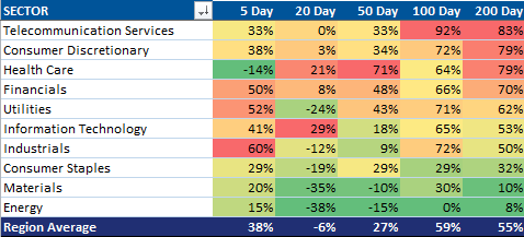
Breadth is clearly deteriorating-- and a few more data points reinforce this observation. Over the last 200
days, a net 83% of European telecom stocks rose. At the same time,
only a net 8% of European energy companies experienced positive
performance. The deteriorating breadth in Europe is due largely to three sectors: energy, materials, and staples.

An important complement to breadth is to measure
the percent of days that stocks are up and down. While breadth has been
deteriorating over the last year, this effect has been overwhelmed by the fact
that stocks have experienced more days up than down. We measure the
trailing 88 days of returns and calculate the percent of days stocks were up
and the percent of days they were down. The current reading is 50%, so
over the last 88 days, European stocks were up 44 days and down 44 days.
Notice that all year so far this metric has been above 50% (1 year moving average is
59%, green line) meaning that there were more days when stocks were up than down. 2013
is the first year since the March 9, 2009 low where the percent of up days has
been over 50% all year long. As one can see in the chart below, the last
time stocks were this detached from a “random walk” was 2006/2007, and
importantly this metric started sliding almost 1 year prior to the 2007 peak in
prices. It sort of looks like mid-2007 according to this metric…

So, to sum up, underlying the rise in European stocks over the last year were two factors:
1. Declining breadth-- fewer stocks are going up relative to those going down.
2. Statistical run-- almost 60% of all trading days have been up over the last year.
