Thursday, January 23, 2014

What Would Underperformance in Construction & Farm Machinery Stocks Imply for Other Asset Classes and the Economy?

Yesterday we highlighted here the weak technical chart patterns developing for most stocks in the Construction & Farm Machinery sub-industry that seem to be telegraphing further underperformance for the group. Today we'd like to take a look at the group as a whole and see what more underperformance might portend for related variables.

In the first chart below we plot the price in USD of the MSCI World Construction & Farm Machinery & Heavy Trucks sub-industry relative to the MSCI World Index (blue line, left axis) against the price of copper (red line, right axis). A few things pop out on this chart. First, the Construction & Farm Machinery index has been underperforming the MSCI World Index since the beginning of 2011. Second, that relative underperformance is closely related to the price of copper, a widely used tool to gauge the pace of global growth and pricing pressure. Therefore, more underperformance of the Construction & Farm Machinery stocks would probably coincide with more weakness in the price of copper and might cause investors to give a second thought to the accelerating global growth thesis.

image

This next chart plots the relative performance of the Construction & Farm Machinery index (blue line, left axis) against the MSCI Emerging Markets index (red line, right axis). Comparing these two variables makes intuitive sense since EMs are the largest marginal buyer of construction equipment and rely heavily on fixed asset investment for growth. The two series have been closely related since 2009 and tell us that we should expect further weakness in EM stocks if Construction & Farm Machinery stocks continue to underperform as we expect.

image

The final chart we'll post compares Construction & Farm Machinery index (blue line, left axis) to producer prices in the US (red line, right axis). This chart hints that more underperformance for this economically sensitive group should mean pricing pressure in at least the US will remain subdued.

image

Herbalife - Look Out Below!

Herbalife is down 12% after Massachusetts Senator Edward Markey  asked the SEC and FTC for an investigation into Herbalife's business practices. HLF is up over 240% over the past four years and 54% over the past year. However, over the past month (including today's decline) the stock has underperformed the MSCI World Index by about 21%. If the stock finishes today where it is currently at then HLF will decisively break through a bullish support line that has been in place for about a year.

image

Game Over For Early Cyclicals?

We divide the MSCI World index into region-sector baskets in order to understand larger shifts in relative performance.  One consistent theme for the last few years has been the outperformance of North American early cyclicals, which is basically an observation that US consumer discretionary stocks have been outperforming (think retail, autos, homebuilding, etc.).  In addition to the well publicized problems at Sear's and JC Penney, recently Best Buy, Gamestop, Coach, and LuluLemon, to name a few, have pulled up lame. Given that this North American early cyclical basket has outperformed the MSCI World index by 40% over the last three years, and also given the 91% correlation between this basket and 10 year TIPS yields (which have risen over 1.5% in the last year), it could be game over for the relative outperformance of North American early cyclicals in 2014.

image

Wednesday, January 22, 2014

Fundamentals Suggest Yen Could Strengthen in 2014

We've noted on several occasions over the past few weeks the fact that trader positioning and sentiment towards the yen is pushing the most extreme negative levels in a decade. The chart below demonstrates that large speculators (blue line, the folks who are usually wrong at major turning points) have the largest net short position since 2007 while the commercials (green line, the "smart money") have the largest net long position since 2007.

image

What we'd like to focus on in this post, however, is the fundamental backdrop that suggests the potential for significant upside in the yen should the current calm in financial markets turn into something a bit more interesting and create 1) deflationary fears and/or 2) a bid for safety.

The first data we'll look at is the already announced monetary policies of each central bank and what that implies for the relative size of the Fed and BOJ balance sheets and thus value of the the JPY/USD. In the table below we show the likely 2014 asset purchases of the Fed and BOJ in trillions of USD based on an exchange rate of 100 JPY/USD. It is clear that the BOJ will be far more aggressive than the Fed in its 2014 purchases as the BOJ will increase it's balance sheet by 11% of GDP while Fed will only increase its balance sheet by 2.7% of GDP.

image

This much has been the focus of countless news articles and research pieces. What has been somewhat under analyzed is the projected value of the yen based on the relative size of the two central bank balance sheets. In the chart below we plot the ratio of total assets of the BOJ in USD terms relative to total assets of the Fed and then overlay the JPY/USD exchange rate (dark blue line, right axis). For 2014 we have created a range of this ratio. The low estimate (red line) is based on previously announced policies and assumes the Fed tapers its purchases by $10bn per meeting throughout 2014. The high estimate (light blue line) assumes the BOJ will double it's already planned 2014 purchases from ¥70tn to ¥140tn and that the Fed will continue to taper by $10bn per meeting. What we find is that not only has the taper been fully discounted, but the market is now discounting a doubling down of bond purchases by the BOJ in 2014. This may come to pass if as seems probable Japan finds itself in recession in the second half of this year thanks to the country's own fiscal cliff (the consumption tax hike in April combined with fiscal stimulus turning into fiscal drag). We have our doubts about the operational feasibility of doubling asset purchases with a stagnant or improving budget deficit, but that is a conversation for another day.  

image

Next, we'll focus on more market oriented data that suggests significant upside for the yen in the midst of any market turmoil. The first chart below shows the relationship between the US 10Y treasury yield and JPY/USD (red line, left axis). The current JPY/USD exchange rate is implying 10Y treasury yields north of 3.5% vs the current 2.85%. A 10 year treasury yield of 3.5% was last seen in 2011 and seems a universe away. In any case, the tight correlation in these two series implies that a bid in the treasury market will likely be accompanied by a rapidly rising yen relative to the dollar.

image

This next chart shows the differential in 2 year treasury bond yields in the US and Japan and compares it to the JPY/USD exchange rate (red line, right axis). All else equal, this chart suggests that the JPY/USD cross is discounting not only a fully carried out tapering, but an almost 2% increase in short rates in the US. Given Fed guidance we should expect any increase in interest rates until at least 2015, and even then only a minor increase.

image

The final data item we'll discuss is the current real effective exchange rate of the yen. The real effective exchange rate calculates the effective value of a currency relative to its trading partners while taking into account the impacts of inflation. In this case a lower number implies a weaker currency. The takeaway from the below is that Japan's real effective exchange rate has never been lower over the last 24 years. Based on the mean reverting nature of real effective exchange rates, we'd expect Japan's real effective exchange rate to be biased higher in the years to come.

image

Based on the above information and more, we are not convinced that a rapidly falling yen in 2014 is a given. On the contrary, we can even make a fundamental case as to why the yen is likely strengthen vs the dollar to somewhere in the mid 90s in the case of any bid for safety in the markets.

Why Are There Still So Many Long-Term Unemployed Workers?

The unemployment rate in the US has fallen from 9.1% to 6.7% in three years. In fact, the number of workers who have been out of work for less than five weeks (as a % of the labor force) is at all-time lows (1.46%). This must be a sign of a healthy labor market, right? Well, we aren't so sure. What concerns us is practically no matter how you slice the data, the number of long-term unemployed workers (defined as out of work for 27 weeks or more) are STILL at record pre-Great Recession levels. Anyone that has taken undergraduate economic courses know there are many negative socioeconomic problems that arise when workers are structurally left out of the labor market (permanently lower future wages, worse mental and physical health, hurts future generations earnings potential, etc). It comes as somewhat surprising to us that there hasn't been a more focused attempt to get these discouraged workers back to work.

image

image

image

Construction & Farm Machinery Stocks Look Dangerous

When see the majority of companies in any given industry showing similar technical chart patterns we take note. Usually when this occurs there is a bigger force at play which may or may not be obvious at the time. In the case of the Construction & Farm Machinery sub-industry we observe two general chart patterns in our proprietary relative strength point & figure charts: 1) the company has experienced a period of strong relative performance but the trend now shows signs of reverting to a downtrend or 2) the company has been in a tight trading range for several years and is now attempting to break through the bottom of the trading range. This is concerning trend behavior for a group of stocks that are soo sensitive to global, and particularly emerging market, growth. We also note that the average stock in this sub-industry trades at 17.4x cash flow, which is 130% the 10 year average cash flow multiple at a time when EM growth (ex China) seems persistently weak.

image

image

image

image

image

image

image

image

image

image

image

Current Valuation: 
image

Global PMI & US Monetary Policy

An easy way to track the health of the overall global economy is by analyzing the global purchasing managers index data (PMI) offered by Markit.  We go one step further and compile all the data from the various countries into a diffusion index.  In this way we can see the breadth of global economic activity.  A positive number indicates more countries expanding than contracting, while a negative number indicates more countries contracting than expanding.  Recently our 1 year diffusion index has rolled over (falling to 13, after peaking at 17 in September 2013), and this is validated by our one month and three month diffusion indexes.

image

image

When we overlay the Fed's asset purchases over the last three years, an interesting relationship emerges. The one year diffusion index lines up very well with the three month increase in the Fed's total asset purchases. With tapering already in motion, and the three month rate of change in Fed assets on a glide path to zero through the course of 2014, we suspect 2014 could see a slow deterioration in the breadth of global activity.

image

Beware Biotech?

As noted by the folks at SentimenTrader, the Nasdaq Biotechnology Index has already risen 11% so far this year-- a strong move, especially in light of 32% and 66% gains in 2012 and 2013, respectively.

image

As sustainability comes into question, we thought we would take a quick look at the companies in the MSCI World biotech sub-industry that qualify as knowledge leaders.
The lone Asia Pacific biotechnology company began a correction early last year but has not (yet?) violated important support:

image

European biotech companies do not seem too far from support just yet:

image
image

However, quite a few of the North American companies look extended:

image
image
image
image

The picture presented in our point-and-figure charts is mirrored (for the most part) when we look at our intangible-adjusted valuation data with North American companies trading at a premium:

image

Tuesday, January 21, 2014

Quick Overview of MSCI Europe Market Internals

Of the three developed MSCI World regions, Europe continues to have the highest beta--led by the financial sector (a common theme across all regions).

image

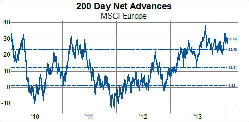
MSCI Europe remains quite overbought, in spite of a slight pullback more recently.  In contrast, MSCI North America and MSCI Pacific have fewer companies making persistent new highs:

image

image

image

Volume turnover in Europe is the highest among the three regions, led by the Financial and Health Care sectors:

image

Followed closely by North America, Europe has the highest 65-day correlation with the MSCI World Index-- a measure that has, however, declined since the beginning of this year:

image

image

Performance in MSCI Europe has been better than the World average over the last 1- and 3-month time periods:

image

Putting together a number of our technical variables, we calculate a statistic to approximate the risk building in a particular system.  For the MSCI Europe, the trend has been gradually up over the last couple of years.

image

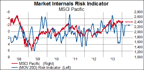
Conversely, our risk indicators for the Asia Pacific and North American regions have remained relatively stable or started trending down.

image

image

Is LKQ Corp's Run Finally Over?

LKQ is up nearly 180% over the past four years for an impressive 100% greater gain than the MSCI World during that time. However, the stock has shown some distribution problems recently as it has underperformed the MSCI World index by nearly 20% over the past 3 moths (-15.8% nominal decline). That brings us to today, where LKQ is down another 7% so far. Is it reasonably to read this as a sign that the entire index is extended because prior stock leadership is now strongly underperforming? Time will tell.

image