The exudes seen in bond funds last year has shown persistent signs of reversal in 2014. Indeed, over the last four weeks about $12.4bn flowed into bond funds (blue line). Meanwhile, equity funds, which saw positive flows throughout most of 2013 and the first few month of 2014, are now beginning to experience outflows. Over the last four weeks about $700mn has been withdrawn from equity funds (red line). This flow behavior goes a long way in explaining the strength in the treasury market so far in 2014 (2nd chart).
Friday, May 23, 2014
US New Home Sales Beats In April While Prices Fall
New home sales came in at 433K annualized in April vs Consensus of 420K. Adding to the good news is that March was revised up by 23K to 407K. Unfortunately, new home sales are still down a little over 4% year-over-year and still haven't been able to break out above 2013 levels.
There has been quite a wide distribution developing based on geography. Strongest region is in the Midwest where new home sales are 35% higher than they were a year ago. Conversely, new home sales in the Northeast are down 31% year-over-year.
Both mean and median sales price are now negative year-over-year while months supply has been slowly creeping higher since the beginning of 2013.
Thursday, May 22, 2014
Largest Two Month Drop In NYSE Margin Debt Since September 2011
The April data for NYSE Margin Debt definitely raised more than a few red flags for investors. We now have had the first 2-month consecutive drop since September 2011. Of course, the most significant difference between March and April of this year and August and September of 2011 is that the S&P 500 was actually nearly 30 points higher in March and April. In August/September 2011, the S&P 500 had already declined by about 170 points by the end of September.
The Percent of Individual Stocks Making New Highs Continues to Contract
It's no secret that we've been concerned about the lack of new highs in individual stocks since at least the beginning of the year. Indeed, we've made note of the divergence between headline stock indices and the number of stocks making new highs here, here, here and here and probably in a few other posts as well.
In the charts below we show that a lower and lower percent of stocks have been making new 20, 50, 65, 100, 200 and 252 day highs at nearly each instance of new cycle highs in the MSCI World Index.
At this point one might wonder why this is important or relevant given that the divergence has lasted for the better part of nine months and stock indices keep going up. It would be a fair question and our response is to say that bull markets which display dwindling participation by individual stocks are built on shaky ground and prone to reversal, as was demonstrated in 2011. To be clear, stock indices don't have to decline to wipe away this divergence - a substantial increase in individual stock participation at the next new all-time high would do the trick - but so far we've yet to see that play out.
Mixed Bag Of US Economic Data Out Today
It has been a very quiet week on the US economic report front but today we finally have a string of high profile releases. We will take them in order of release times...
Jobless Claims snapped back a sharp 28K jobs to 326k during the week of May 17th. However, the widely watched 4-week moving average decreased slightly.
The Chicago Fed National Activity Index fell precipitously in April from 0.34 (i.e. well above trend growth) to -0.32 (i.e. well below trend growth). This indicates a significant slowdown in April occured. Once again, the silver lining is in the moving average. The 3-month moving average actually improved to 0.19 which is the highest level since November 2013. The other piece of good news from this report is the employment series moved up slightly and remains above trend growth.
The Markit Flash PMI Manufacturing series is showing improvement from 55.4 to 56.2 in May. New orders and backlog of orders were both strong, however, export orders were just barely above the accelerating/decelerating line of 50 at 51.5.
Existing home sales had their first monthly improvement in 4 months in April, however, it is still down nearly 7% year-over-year. Prices have started to slow as the median home prices and the mean home price now stand at about 5.2% and 3.7%, respectively compared to double-digit growth rates in the middle of 2013. Number of months supply shot up to 5.9 months, the highest since August 2012. The Pending Home Sales index (with a two-month forward lag) has been a reliable leading indicator for existing home sales and it is suggesting the existing home sales could increase again in May
Last but not least, index of leading indicators rose 0.4%, in line with consensus, in April. Leading indicators are now about 5.9% higher than they were a year ago. March's increase was revised higher from 0.8% to 1%.
Wednesday, May 21, 2014
Investors are Transitioning from Accumulating Stocks to Distributing Stocks
One of the ways in which we can measure whether investors are in general accumulating stocks (bullish) or distributing stocks (bearish) is to track the number of days of skewed market breadth in either direction. Days we would consider to have skewed market breadth would simply be those in which advancing stocks outnumber declining stocks by a wide margin, or vise verse.
In the chart below we track the running total number of days over the last three months in which we observe stock accumulation (advancing stocks outnumbering declining stocks by at least 4:1) and subtract the number of days in which we observe stock distribution (declining stocks outnumbering advancing stocks by at least 4:1). In this way we obtain a net number of days of stock accumulation, with any number below zero indicating stock distribution over the preceding three months. Since we are plotting a running total, the direction of the trend (whether the red line is rising or falling) is just as important as the level.
When we plot our Accumulation/Distribution Indicator for the MSCI World Index (red line, right axis) against the price in USD of the MSCI World Index (blue line, left axis) we observe that generally the Accumulation/Distribution Indicator leads at important market peaks and is coincident with market troughs. This is important because 1) our indicator has been falling since last December while the market has been rising and 2) our indicator is also in negative territory, indicating that we are in a phase of distribution rather than accumulation.
Tuesday, May 20, 2014
Are Corporate Balance Sheets Really That Liquid? Debunking the "Cash Mountain" Myth
We frequently read about the "cash mountain" that has piled up on corporate balance sheets since the global financial crisis. In many cases the level of cash is given as evidence that the the non-financial corporate sector is stronger now than ever before. As we see it, there are typically two problems with this standard argument: 1) it focuses solely on the level of cash as opposed to analyzing cash in relation to the capital structure (i.e. cash relative to total capital or cash relative to total assets) and 2) it assumes what is true for a handful of companies (the Apples and Microsofts of the world) is true in aggregate. In the below analysis we'll try to debunk the "cash mountain" myth. Keep in mind that our analysis covers all MSCI World constituent companies (90% of the investible global market cap) ex the Financial sector.
It is true that the level of cash on the aggregate non-financial corporate balance sheet has increased significantly. Since 2005 the level of cash has risen from $2.1tn to $3.5tn, a difference of $1.4tn, as the table below shows. But total debt has risen by $3.4tn and total assets have risen by $11.7tn.
MSCI World Aggregate Non-Financial Cash Level
When we compare cash to total capital (total capital is debt plus equity), cash as a percent of total capital hasn't really budged. In 2005 cash as a percent of total capital was 15.5% and today it is 15.9%. Meanwhile, debt as a percent of capital and financial leverage (assets relative to equity) are slightly lower than several years ago, but not materially so. Cash has grown as a percent of total assets from 9.6% to 10.3% between 2005-2013, but it's hard to call a jump of 0.7% over nine years anything other than cyclical.
MSCI World Aggregate Non-Financial Corporate Balance Sheet:
But here is where it gets interesting. When we analyze just the top 200 largest companies by market cap (which equates to about 52% of the total market cap of the MSCI World Index), we do indeed see some more material changes over the last few years. Cash as a percent of capital has risen from 14.9% in 2005 to 17% today and cash as a percent of assets has risen almost 2% over the period.
MSCI World Aggregate Non-Financial Corporate Balance Sheet, Largest 200 Companies:
But not soo much for the other 1400 companies in aggregate. Cash as a percent of capital has fallen since 2005 and cash as a percent of assets is almost identical to nine years ago. Debt as a percent of capital and financial leverage are moderately lower than 2005, but higher than in 2010, and the same goes for net debt (total debt minus cash).
In sum, the level of cash has risen a great deal over the course of this economic cycle, but so has the aggregate level of debt, equity and assets. When we analyze cash in relation to the capital structure we find few, if any, signs that non-financial corporate balance sheets are in aggregate any more liquid or robust today then during the end of the previous cycle. Indeed it may be that corporate balance sheets outside of the largest companies in the world have actually deteriorated since 2010.
It is true that the level of cash on the aggregate non-financial corporate balance sheet has increased significantly. Since 2005 the level of cash has risen from $2.1tn to $3.5tn, a difference of $1.4tn, as the table below shows. But total debt has risen by $3.4tn and total assets have risen by $11.7tn.
MSCI World Aggregate Non-Financial Cash Level
When we compare cash to total capital (total capital is debt plus equity), cash as a percent of total capital hasn't really budged. In 2005 cash as a percent of total capital was 15.5% and today it is 15.9%. Meanwhile, debt as a percent of capital and financial leverage (assets relative to equity) are slightly lower than several years ago, but not materially so. Cash has grown as a percent of total assets from 9.6% to 10.3% between 2005-2013, but it's hard to call a jump of 0.7% over nine years anything other than cyclical.
MSCI World Aggregate Non-Financial Corporate Balance Sheet:
But here is where it gets interesting. When we analyze just the top 200 largest companies by market cap (which equates to about 52% of the total market cap of the MSCI World Index), we do indeed see some more material changes over the last few years. Cash as a percent of capital has risen from 14.9% in 2005 to 17% today and cash as a percent of assets has risen almost 2% over the period.
MSCI World Aggregate Non-Financial Corporate Balance Sheet, Largest 200 Companies:
But not soo much for the other 1400 companies in aggregate. Cash as a percent of capital has fallen since 2005 and cash as a percent of assets is almost identical to nine years ago. Debt as a percent of capital and financial leverage are moderately lower than 2005, but higher than in 2010, and the same goes for net debt (total debt minus cash).
MSCI World Aggregate Non-Financial Corporate Balance Sheet, Smallest 1400 Companies:
In sum, the level of cash has risen a great deal over the course of this economic cycle, but so has the aggregate level of debt, equity and assets. When we analyze cash in relation to the capital structure we find few, if any, signs that non-financial corporate balance sheets are in aggregate any more liquid or robust today then during the end of the previous cycle. Indeed it may be that corporate balance sheets outside of the largest companies in the world have actually deteriorated since 2010.
The Persistent Weakness in Lumber Continues
We've noted several times in the last few weeks the ongoing weakness in lumber prices here, here and here. We watch lumber prices because lumber, being a largely domestically produced and consumed resource, can give a good early indication of changes in domestic economic activity. Lumber prices are also closely correlated to stock prices (the S&P 500 in this case) and so we like to see the two price series following each other.
We note this today because lumber is currently down 1.8% and is clearly breaking through the horizontal support line (1st chart below). There is also a a decently wide divergence opening up between the S&P 500 price and lumber prices that we presume needs to be corrected in one way or another eventually (2nd chart below).
Health Care Stocks Have Rallied Nicely In North America But Look Tired
Five weeks ago 64% of the MSCI North America Health Care stocks were trading above their 200-day moving average.This was the fewest number of stocks trading above their 200-day moving average since December 28th, 2012. This slight sell off did not last long as Health Care stocks have now moved back into basically overbought territory at 78% as of last friday. Using this simple measure, we haven't seen a truly oversold signal in Health Care stocks since November 2011.
% of Issues Above 200-Day Moving Average
This latest move has pushed stocks from about 2% over their 200-day moving average to almost 6% above. We have also seen the percentage of stocks outperforming the MSCI World Index move from 44% (lowest level since April 25th, 2012) to 56%.
Price Relative to 200-Day Moving Average
Somewhat surprising given the move, the 200-day Net Advances has actually fallen over the past 5 weeks and the Net New 200-Day Highs haven't really expanded. This may be a sign that the this was more of a bounce (at least for the moment) rather than a resumption of the multi-year advance.
Monday, May 19, 2014
Homebuilders Characteristic Of Rotation Out Of Early Cyclicals
We divide all stocks into baskets in an attempt to understand market internals. All stocks are divided into four groups: 1) early cyclicals, late cyclicals, hyper-cyclicals and counter-cyclicals. The early-cyclical basket is comprised of consumer discretionary stocks, while the late cyclical basket is comprised of industrial and material stocks. Generally, as a fed tightening cycle begins, early-cyclicals underperform late cyclicals. In the chart below we map the relative performance of early-cyclicals vs. late cyclicals, alongside the 3-month increase in the Fed's balance sheet. As the Fed expanded its balance sheet over the last few years, early-cyclicals outperformed, but since early March they have significantly underperformed.
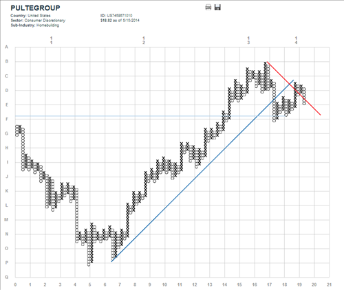
The homebuilders are great example of the rotation out of early cyclicals. Below is our point-and-figure chart of PulteGroup that tracks relative performance compared to the MSCI World index. After a strong run, off the lows of 2011, PulteGroup has broken the uptrend line and appears to have entered a new downtrend compared to the MSCI World index.
Last Week The Focus Was On Liquid Balance Sheets
According to our Factor Scoring Model, net debt as percent of capital had the highest R-squared of any fundamental factor that we track. Long-term debt as a perecent of capital had the second highest correlation to the market as well at 0.61. This is contrast to the trend over the previous year where the focus seems to have been on EPS growth by a wide margin (R-square value of 0.95). Factor relationships by week and year for the MSCI World are below.