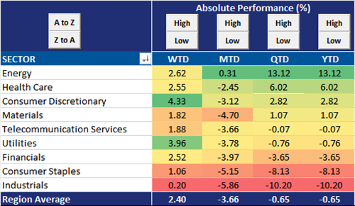
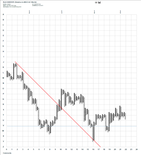
Sales and earning growth expectations for energy stocks are still pretty awful for the next fiscal year (FY1). Sales are expected to drop by 17% and earnings by a whopping -29%. However, earnings are expected to make a V-shaped rebound. Analysts expect sales to grow by an average of 12.3% per year over the next three years (FY2-FY4). The rebound in earnings is expected to be even stronger. Earnings are expected to grow by an average of 32.5% per year over the following three years (FY2-FY4). These expectations are setting a high bar for the energy sector for 2016-2018.
MSCI World Index Sales and Earnings Growth Expectations
The best news on the expectations front for the energy sector is the second derivative (i.e. the change of the change) has moderated. FY1 sales estimates have fallen by over 18% over the past three months and over 28% over the past six months. However, over the past month FY1 sales estimates have only dropped by -2.4%, just slightly more than than the materials sector (-1.7%). The story hold true for FY1 EPS estimates. Over the past month FY1 EPS estimates have fallen by over -8%. A significant decrease but when put into the context of the fall that has taken place over the past three (-47%) and six months (-57.2%), the rate at which EPS estimates are falling has slowed.
MSCI World Index Change In Sales and Earnings Growth Expectations
Breadth in estimates has slightly improved as well. Over the past three and six months, only 2-3% of energy stocks experienced positive FY1 sales revisions. However, over the past month month 26% of energy stocks of experienced positive FY1 sales revisions. Same story for FY1 EPS revisions. Over the past three and six months only 5-7% of energy experienced positive FY1 EPS revisions but over the past month 25% of energy stocks have experienced positive FY1 EPS revisions.
MSCI World Index Breadth Of Sales And Earnings Revisions
Friday, March 27, 2015
Thursday, March 26, 2015
1/4 Of All MSCI World Stocks Are Trading Above 30x PE and 4x BV
Way back in August, we blogged about how not a single sector in the MSCI World Index was trading below 20x P/E. Well, seven months later that still holds true and valuations in the developed markets have only trended high. Back in August, two sectors (information technology and health care) had an average P/E ratio over thirty. Today, four sectors (health care, information technology, telecommunication services, and consumer staples) have an average P/E ratio over 30x and materials (29.4x) is just a small hop from reaching the 30x threshold. Amazingly, excluding the stocks that have a 0 or negative P/E, of which there are 128 stocks, almost exactly one quarter of the stocks in the MSCI World Index are trading at or above 30x P/E and another 30% of stocks are trading between 20x-29.9x earnings. Only about 6% of all stocks are trading at a P/E ratio below 10x. In that vein, only 11% of stocks are trading below 1x book value. Meanwhile, just over 1/4 of all stocks are trading above 4x book value.
MSCI World Index Valuations By Sector
Runs, Slumps & Tactical Allocation
Similar to a basketball player with a "hot hand", stocks go on statistical runs. And similar to a player with a "cold streak", stocks have slumps. Over time, with a proper perspective, it is easy to measure the extent to which these runs and slumps play out in the market and invest accordingly.
There are two components to the movements of all stocks: 1) the number of days up/down and 2) the average magnitude of the those daily moves. Over time, as the random walk hypothesis would project, stocks mean revert and are up 50% of the days and down 50% of the days. But, within this longer term mean reversion, stocks spend most of the time either above or below this 50% threshold, and this is the essence of measuring runs and slumps. Identifying stocks, sectors or countries that have deviated significantly from a random walk, and are expected to mean revert, can be helpful in making tactical allocation decisions.
We take the trailing 88 trading days (4 months), measure everyday whether stocks were up or down for the day and accumulate this data into an 88 day running total. So, if a stock was up 50 out of the last 88 trading days and down 38 of those days, then it was up a net +12 days, or 57% of the days.
In the charts below, we show an example to demonstrate the methodology and how to use it to make tactical allocation decisions. In the first chart, we show the slump that MSCI US equities have been in lately. The current reading of -12 net days has only been met or exceeded twice in the last decade--in August 2010 and August 2012. Each time, this marked an intermediate low for US stocks.
Looked at on a percentage basis, MSCI US is only up 43% of the last 88 trading days. There is not one example over the last decade where the net percent of up days has fallen by over 20% in a six month period of time.
Given this huge statistical slump US equities have been in lately, perhaps it is time to tactically add to US positions. Mean reversion can be a powerful force to capitalize on in portfolio decisions.
Wednesday, March 25, 2015
Latin America Is Blowing Up Your EM ETF Performance
On an equal-weighted, USD basis, the MSCI Emerging Markets Index is up just 0.99% YTD compared to MSCI World Index which is up 5.65%. So is this just a simple continuation of the trend of emerging market underperformance that has been in place over the last 4 years ? Yes, but with a caveat.
Performance in the emerging markets has been highly differentiated so far in 2015. Similar to the developed markets, EM Asia is by far the best performing region in the emerging markets. The average stock in the EM Asia index is up an impressive 4.22% YTD. The health care and technology sectors are both up nearly 10% and only one sector, utilities, is down for the year. Contrast this positive performance with the carnage currently (quietly?) taking place in EM Latin America. The average stock in EM Latin America is down nearly 10% YTD. All 10 sectors in the EM Latin America index are negative on the year. Half of all the sectors are currently in a correction (down 10%) and the health care sector is in a full on bear market (down 27% YTD). The stronger dollar is undoubtedly affecting EM Latin America more than other areas in the emerging market (see chart below).
MSCI EM Asia Performance By Sector
MSCI EM Latin America Asia Performance By Sector
MSCI EM EMEA Performance By Sector
A Checkup on the Yen & Leaderhisp Trends Among Japanese Stocks
After two years of devaluation, the Japanese Yen is quite undervalued by our work. In the first chart below, we show the JP Morgan broad and narrow Japanese Yen relative to long-term trendlines. By these measures, the yen is around 25% below the 25 year average.
In this next chart, we show our purchasing power parity measure of the Yen. Here again, we calculate that the Yen is roughly 25-30% undervalued relative to the USD.
Historically, the Yen/USD has had a pretty good correlation with 2 year interest differentials. The spread in 2 year bonds tends to lead currency movements by roughly 18 months. Given the still small interest differential, this would suggest the possibility of Yen strength.
Since the beginning of the year, the open interest in JPY/USD derivatives has fallen by roughly a one-third.
The positioning story is similar if we look at CFTC Commitment of Traders data. Net long positions on the USD/JPY have fallen by around 30% since the beginning of the year.
For the last few years, Japanese stocks have been joined at the hip to the Yen. That is until this year, where now Japanese stocks (in USD) are moving up in the absence of currency depreciation. This is a new dynamic.
In this new dynamic, growth counter-cyclical stocks are the leadership group. In the chart below, we show Asia-Pacific growth counter-cyclicals relative to the MSCI World Index.
Of all the country-sectors in the MSCI World Index, the top two are Japanese health care and consumer staples.
MSCI Japan Sector Performance
Perhaps helping to explain the appearance of shifting drivers of Japanese stocks, we show below the relationship between Asia-Pacific counter-cyclicals relative to cyclicals compared to US 10 year bonds. With a 15 year correlation of 92%, it is clear that US long rates are more important for Japanese stocks than the Yen. With a new move down in US long rates, it is easier to understand the move in Japanese counter-cyclicals this year. If US rates continue to drift down, even in the absence of further Yen weakness, it seems likely that Japanese health care and consumer staples will continue to outperform.
Tuesday, March 24, 2015
Look to Asia for the Strongest Under the Surface Market Trends
Even though US stocks as gauged by the S&P 500 are near their all-time highs, trends under the surface are deteriorating ever so slightly. In Europe and especially in the Pacific, however, the opposite is happening.
Below we show three charts per MSCI developed market region showing various measures of breadth and momentum. The first chart in each group is the percent of stocks making new 65-day highs in USD terms (an intermediate term indicator of participation in new highs in the overall stock market), the percent of stocks whose 50-day moving average is higher than the 200-day moving average (a momentum indicator) and the percent of stocks above their own 200-day moving average (another breadth indicator).
From a quick perusal of the charts we can easily see that breadth and momentum among North American stocks has deteriorated a bit while those same trends in Europe and the Pacific have improved a bit. In Europe, stocks are recovering modestly from the sharp selloff in the second half of 2014. European stocks in USD terms are still well below their old highs. In the Pacific region, stocks appear to be breaking out to new cycle highs while accompanied by strong breadth. This is a very positive combination. YTD the MSCI Pacific has outperformed the MSCI World Index by 5.6% and the MSCI Pacific Health Care sector has outperformed by 16.3%.
North America:
Pacific:
Europe:
Country Allocation Matters
The MSCI All Country World Index, with nearly 2500 constituents representing 23 developed and 23 emerging market countries, covers about 85% of the investable equity universe world-wide. It is, then, perhaps surprising to note that sustained outperformance over the last five years has been limited to only three countries from the developed market and just one from the emerging markets. Put another way, on a country basis, stocks have only outperformed (on a USD basis) the most broad equity benchmark in less than 10% of the world.
Developed Market Winners
Emerging Market Winner
Link to charts for all countries
Developed Market Winners
Emerging Market Winner
Link to charts for all countries
Monday, March 23, 2015
Assets At US Fed Are (Finally) Declining
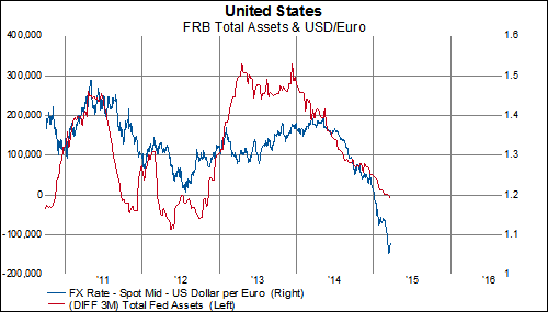
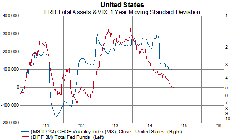
Throughout QE3, one of our favorite charts to look at was the three-month change in total fed assets. You could overlay this series with bonds or stocks or other economic indicators and find some interesting relationship. On March 6th, for the first time since November 2012, the three month change in total Federal Reserve assets declined.
If this trend continues, then we would probably expect to see a lower 30-year treasury yield in the US...
And a higher Fed Funds Rate...
And a lower Euro...
And a pickup in equity volatility...
And a further slowdown in global manufacturing...
And an increase in long-term macro risks
If this trend continues, then we would probably expect to see a lower 30-year treasury yield in the US...
And a higher Fed Funds Rate...
And a lower Euro...
And a pickup in equity volatility...
And a further slowdown in global manufacturing...
And an increase in long-term macro risks
From 5-Years To 30-Years, TIPS Implied Inflation Expectations Are Under 2%
Inflation is falling and so are inflation expectations. We and the majority of the rest of the financial community have been highlighting this for most of 2015. Tomorrow, we finally will get the latest US CPI release (for February) to see what is driving consumer inflation but in the mean time we wanted to give an update on what the bond market is telling about inflation. Spoiler Alert: the bond market believes in lower inflation as well.
In fact, for the first time since 2009, TIPS implied inflation expectations for the US are all below 2% on a 5-year, 7-year, 10-year and 20-year basis. The 30-year TIPS implied inflation expectation is also below 2% (this series started in 2010). Inflation expectations have been on a steady decline since last summer. Over the past nine months, inflation expectations have fallen between 41-51 basis points. The declines have moderated somewhat in 2015, however, the downward trend doesn't look like it has reversed. The question facing investors now is has 2% inflation become a ceiling, not a target? (h/t F. Hale Stewart)
Bottom Fishing The MSCI North America Index $BBRY $TRQ
Some of the greatest quotes in finance relate to finding investment opportunities by going against the grain such as this quote by the great Benjamin Graham: "buy when most people...including experts...are pessimistic, and sell when they are actively optimistic."
With that in mind, we thought we would look at a couple of stocks where investors are undoubtedly incredibly pessimistic, Turquoise Hill Resources (ticker: TRQ) and Blackberry (ticker: BBRY). (Note: bottom fishing individual companies is always inherently more risking than bottom fishing industries or sectors because individual companies can always go to zero, while it would be incredibly unlikely for an entire industry or sector all goes bankrupt at the same time)
TRQ and BBRY have been the worst performing stocks in the MSCI North America Index over the past four years. Their stock prices have declined by 84-85% during this time period (while the average stock, is up an impressive 75%).
20 Worst Performing Stocks In The MSCI North America Index
TRQ falls in the diversified metals and mining sub-industry, which is in the materials sector. TRQ currently trades at a 5-year normalized intangible-adjusted price to book ratio of 0.8x. Shockingly, TRQ isn't trading at the lowest P/B in its sub-industry (Teck Resources takes that honor at 0.6x). TRQ traded at a 5-year normalized intangible-adjusted P/B ratio of over 10x from 2008-2010. TRQ basically has zero net debt, however, it also has a negative ROA and ROE.
5-year Normalized Intangible-Adjusted Price To Book Ratio
Net Debt As A % Of Capital
Return On Equity
The strongest reason for bottom fishing TRQ is a technical one. TRQ is down "only" 11.6% in the past year. Of the 20 worst performing stocks over the past four years, only BBRY has had better performance over the past year. Most importantly, TRQ has finally broken through the down trend line that has been in place since 2012. It is too early to say whether or not this breakthrough is here to stay, however, this is the first step towards forming a base and a sign that the persistent downtrend of the last few years could be over.
BBRY falls in the technology hardware storage & peripherals sub-industry, which is in the information technology sector. Blackberry currently trades, on a intangible-adjusted 5-year normalized basis, at the lowest P/CF, P/S and P/B value of any of its competitors. It currently trades at just 0.6x intangible-adjusted book value and just 0.5x sales. HP is the only other company that trades at a normalized P/S ratio less than 1. BBRY used to trade at normalized P/S ratio between 14x-50x in the period from 2003-2008. Blackberry's balance sheet is still strong. They have negative net debt (like most of the sub-industry) and 20% of its assets are in cash. They currently have an operating cash flow yield of 23%.
Intangible-Adjusted Normalized Valuations
Intangible-Adjusted Normalized P/S Ratio
Intangible-Adjusted Balance Sheet
From a technical perspective, BBRY is further along than TRQ. BBRY's stock price was actually up 90 basis points last year. BBRY has put in a relative performance base for over 2 years. This stock is undoubtedly volatile but for deep value, long term investors it could be worth taking another look at.