Friday, May 8, 2015

The Knowledge Effect Leads to Excess Stock Returns

In a new white paper released today, we identify a stock market anomaly. The Knowledge Effect is the tendency of highly innovative companies to deliver excess returns for investors. Academic researchers first discovered an association between a firm’s knowledge capital and its stock performance. Our research and index results suggest there is an opportunity for investors to capitalize on this market anomaly.


1) Why companies that choose to pursue an innovation strategy generate abnormal returns, 

2) The root causes of this market inefficiency, and

3) The results of our indexes that track the Knowledge Effect in the developed and emerging markets.

Thursday, May 7, 2015

Amazon and Apple: Two Approaches To Capital Investment

With Apple's (ticker: AAPL) announcement that are selling more debt in order to buy back more shares and pay out dividends, a client posed an interesting question to us: Do you think Amazon (ticker: AMZN) will announce something similar soon? Our short answer is most likely no since Amazon tends to reinvest earnings, especially in intangible investments, much more aggressively than Apple does. Let's take a quick look at how Amazon and Apple's investment profiles and payout strategies differ (all data refers to Gavekal's intangible-adjusted financial statements).

Amazon spends about twice as much of their sales on total capital investment than Apple. Amazon spends nearly 20% of its sales on capital investment while Apple spends about 11%. This difference in investment rates is almost entirely due to intangible investments. Amazon spends 5.5% of its sales on tangible fixed investment. Apple spends 5.4% of its sales on tangible fixed investment. However, Amazon spends nearly 10% of its sales on research and development (R&D) a rate that is nearly 3x as much as Apple spends (3.3% of sales). Amazon also spends over twice as much on other intangible investments such as firm specific resources (i.e. employee training, codified information, etc) and advertising. Amazon spends 4.4% of its sales on other intangible investments while Apple spends 2% of its sales.


image

Given these investment profiles, it is not surprising to see that Amazon has a much higher level of intellectual property assets on its balance sheet than Apple (31% of assets vs 8% of assets). When we look at several balance sheet ratios, we can see how Apple has added leverage in order to return capital to investors through buybacks and dividends. Apple has about 8% of its asset in property, plant and equipment which is financed using long-term debt. However, over 18% of its capital is in long-term debt. Meanwhile, Amazon has nearly 21% of its assets in property, plant and equipment but only has 25.8% of its capital in long-term debt. Lastly Amazon also has a much greater portion of its capital in cash (36%) than Apple does (16%). This makes complete sense since Amazon invests heavily in intangible assets and we know that intangible investments are equity financed.

image

Historically neither Amazon or Apple have been focused on returning capital to shareholders. Steve Jobs was famously against returning capital to investors through dividends because he preferred the flexibility of having tremendous amounts of cash on hand. In February 2010 he responding to a question about why Apple doesn't pay dividends like this:

"We know if we need to acquire something -- a piece of the puzzle to make something big and bold -- we can write a check for it and not borrow a lot of money and put our whole company at risk. The cash in the bank gives us tremendous security and flexibility."

However, Apple under Tim Cook's leadership has changed course on this belief and now uses nearly 2/3 of its operating cash flow for stock buybacks and 17% of its operating cash flow for dividends. Amazon, on the other hand, doesn't pay out any dividends and occasionally buys back shares but hasn't for the past several years.

Dividends as a % of Operating Cash Flow - Apple
image

Share Buybacks as a % of Operating Cash Flow - Apple
image

Dividends as a % of Operating Cash Flow - Amazon
image

Share Buybacks as a % of Operating Cash Flow - Amazon
image

Overall, you can see in the data that Amazon and Apple have very different strategies when it comes to what to do with operating earnings. Amazon is constantly reinvesting, which can lead to disappointing quarterly earnings if you don't adjust for intangibles, while Apple has moved to a much more investor-friendly strategy in recent years. One thing to keep an eye on for Apple is if by choosing to increase shareholder distributions rather than increasing investment will this lead to lower growth in the future. There are early indications that this may be happening. Growth in sales per share, EPS, BV per share, and cash flow per share has averaged an astonishing 36% or more  per year over the past 10 years. However, over the past three years growth in these metrics has slowed to a more pedestrian (but still impressive) 20% growth rate as the amount distributed to shareholders has increased. We acknowledge there might be other factors other than just simply investment rates (such as the sheer size of Apple now versus 10 years ago) but it is something to keep an eye on nonetheless.

3-Year Least Squared Growth Rate
image

10-Year Least Squared Growth Rate
image


Wednesday, May 6, 2015

Two Desirable Characteristics Of Innovative Industries

The most innovative companies in the world tend to exhibit two highly desirable characteristics: high return on invested capital (ROIC) and low long-term debt as a percentage of total capital. There are fundamental reasons for these characteristics. First, innovative companies are very profitable because they invest heavily in an knowledge, or intangible, investments such as R&D, employee training, brand building, and codified information. Knowledge investments, which are not accounted for on traditional balance sheets as an asset, help to deliver above average profitability over the long-run. In addition, knowledge investments are almost always entirely financed by equity since banks are conservative institutions that prefer to lend against physical collateral. Consequently, innovative firms tend to have less debt on its balance sheet.

In the two scatter plots below, we are using data from the MSCI All-Country World Index. As we stated, knowledge activities do not show up on traditional financial statements, so we have adjusted financial statements to include intangible assets and investments. To measure knowledge intensity, we look at the level of intellectual property as a percentage of total firm assets. In the first chart, we are plotting the median ROIC (y-axis) of an industry group against the median IP as a % of total assets (x-axis) of an industry group. As the median ROIC increases, we tend to see a subsequent increase in the knowledge intensity of the industry. Industries such as banks and utilities are located on the bottom left side of the chart, while more innovative industries such as semiconductors and household and personal products are in the top right side of the chart.

image

In the second chart, we are plotting the median long-term debt as a percentage of total capital (y-axis) of an industry group against the median IP as a % of total assets (x-axis) of an industry group. Here the relationship slopes downward as firms with greater knowledge intensity tend to have lower levels of long-term debt. In this chart, real estate and transportation companies are at the top left side of the chart while the more innovative industries such as pharmaceuticals, biotech and life sciences are at the bottom right side of the chart.

image

Tuesday, May 5, 2015

Deja Vu All Over Again for the Long Bond?

The 30-year treasury bond has experienced a rather large selloff by historical standards over the last three months. Yields have risen from roughly 2.2% to almost 2.9% in just over three months - a nearly 25% increase in yield - putting it on par with the most significant selloffs we've experienced since 1981.

The important question for investors at this point is whether this is a genuine trend change or a dip that should be bought. Recent history suggests the latter.

In the fist chart below we show the three month percent change in yield for the 30-year treasury bond and lines depicting 3-standard deviations from the mean 3-month change. We can see a number of 3-standard deviation events over the last several years and the recent selloff is near that level.

The second chart below shows the 30-year bond yield over the last five years with reference lines marking every 3-standard deviation selloff. The takeaway is simple. After such a large move in the long bond, the selloff was usually exhausted and yields were at or near a peak. On every occasion yields were lower within a few months time.

image

image

An Investigation Into Corporate Investments

Profitability and investment are inextricably linked through time. A company's investment decisions today will ultimately drive its profitability level tomorrow.  The fruits of a company's investment decisions eventually show up in profitability metrics such as free cash flow margin, operating cash flow margin, and return on equity.  Finally. a company's ability to improve these metrics, year-in and year-out, ultimately dictates how a company's stock will perform over the long run.

The problem most investors face, however, is traditional financial statements only capture one investment aspect, tangible capital expenditures such as property, plant and equipment, of a company's investment profile. Traditional financial statements, due to overly conservative accounting practices that have been in place since 1974, completely miss the innovative investments a company makes in R&D, advertising, employee training and codified information. These intangible investments create the unique capital stock, or moat as Warren Buffet would put it, that produces future profits for companies in a knowledge-based economy. This obfuscation of knowledge investments by the regulatory body FASB has inadvertently helped to create the Knowledge Effect

Grounded in academic literature over the past several decades, we split up the equity universe into two groups: Knowledge Leaders and Knowledge Followers. Knowledge Leaders are industry leading companies that follow a strategic innovation strategy while Knowledge Followers are companies that follow a mimicking strategy. In the data below, we quantitatively show our readers the differences between a innovative strategy and a mimicking strategy. For our discussion today, we have decided to simplify the analysis and look at only intangible investments such as advertising and employee training (also called Firm Specific Resources) and traditional investments in tangible capex. We are looking at over 2400 companies from the MSCI All-Country World Index using Gavekal's intangible-adjusted data. 

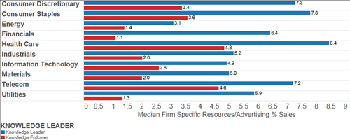
The median Knowledge Leader spends 6.5% of their sales on firm specific intangible investments versus only 2% for Knowledge Followers. Under current accounting practices, these investments are actually treated as expenditures and are immediately expensed on the income statement. However, we adjust the financial statements in order to properly account for the future benefits that this capital brings to the company. We adjust the financial statements by taking a portion of SGA expense, the account where firm specific investments are generally expensed in, and capitalize this asset to the balance sheet as a long-term asset. We treat this long-term intangible asset just as one would treat a long-term tangible asset by carrying it at historic cost and depreciating the asset over time which flows through to the income statement. The second table shows the median % of sales invested in firm specific investments broken out by sector. Knowledge Leaders in the consumer discretionary, consumer staples. health care, and telecom sectors spend the most on this type of intangible investments. There isn't a single sector where the median Knowledge Follower invests over 4.8%. In comparison, nine out of the ten Knowledge Leader sectors invest over 4.8% in firm specific investments.

image

image


Perhaps unsurprisingly, Knowledge Followers tend to spend more of its investment budget on traditional tangible investments.  The median Knowledge Follower spends 5.6% of its sales on traditional capex while the median Knowledge Leader spends only 4.8%. In the second chart below, we break this out again by sector and here we can see where some major divergences occur between Knowledge Leaders and Knowledge Followers. The median Knowledge Follower energy company spends nearly 4x as much as the median Knowledge Leader on traditional capex. In the utilities sector, Knowledge Followers spend about twice as much on traditional capex as Knowledge Leaders. As we will see at the end of this post, this has profound impacts on profitability. 

image

image


Before we look at the profitability of Knowledge Leaders versus Knowledge Followers, let's quickly analyze a balance sheet statement item. As we said above, after removing the intangible investment item from the income statement, we capitalize and create a long-term asset that is carried at depreciated, historic cost. We can see that below as we are looking at intellectual property as a % of total assets. Intangible assets make up nearly 14% of the median Knowledge Leader asset base, while intangible assets make up only 1.9% of the median Knowledge Followers asset base. 

image

image

We began this post by stating that investment decisions and profitability are inextricably linked through time. Let us quantitatively look at this relationship now by measuring the free cash flow margins of Knowledge Leaders vs Knowledge Followers.  The median Knowledge Leader has a FCF margin of 8.2% compared to only 3.8% for the median Knowledge Follower. A higher level of intangible investment leads to greater profitability for Knowledge Leaders. Above, we mentioned the energy and telecom Knowledge Followers invest far greater amounts in tangible investments than Knowledge Leaders in the same sector. The effect on the median profitability in these sectors is apparent. The median Energy Knowledge Leader has a healthy FCF margin of 8.5% while the median energy Knowledge Follower has a negative FCF margin. Similarly, the median utility Knowledge Leader has a FCF margin that is over 5x as high as the median utility Knowledge Follower. 

image

image


At Gavekal we have created the Gavekal Knowledge Leader Indexes to track the most innovative companies in the world. They represent the first indexes to capture the Knowledge Effect. For more information please click here.

Monday, May 4, 2015

Total Assets At The Fed At Six Month Lows

The quiet, subtle decline in the Federal Reserve's balance sheet continued in April. As of May 1st, the Fed's balance was at $4.47 trillion. While undoubtedly still incredibly large, the Fed's balance sheet is about $45 billion less than its peak level on January 16, 2015.  Total assets at the Fed are back to levels last seen on October 17th. Total assets at the Fed have declined by nearly $29 billion over the past three months. On a rolling three-month basis, the Fed's balance sheet has been declining for the last two months.

image

image

As we highlighted before, the three-month difference in total Fed assets has produced some interesting relationships since QE started. Below are some economic indicators that caught our eye.

image

image

image

image


Economic Releases Are "Missing" In The Two Largest Countries In The World

The US and China are not hitting their economic numbers of late according to the Citi Economic Surprise Index. The economic surprise index in China has recently fallen to 10-month lows. In the US, more economic releases are coming in below expectations than are beating expectations over the past few months. This series is basically at three year lows. Disappointingly for the global economy, Emerging Markets have also started to disappoint.

image

image

image

The Eurozone surprise index is still positive, however, it is well off the highs that were put in place earlier in the year. Momentum seems to be slowing in the UK, Sweden, and Norway as well.

image

image

image

Fortunately, there are a few bright spots across the globe. Japan and Canada have both been on a run where they are consistently beating expectations. Lastly, Latin America is still experiencing more negative releases than positive. However, there has still been a sharp improvement in its economic surprise index.

image

image

image