Gavekal Capital: 2014-01-12

Friday, January 17, 2014

Knowledge Leaders: Swiss Materials Stocks

Materials was the second worst performing sector over the last year in the MSCI Europe:

image

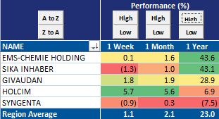
Swiss materials companies, however, have managed somewhat more respectable performance over the same time period:

image

image

When we look at the individual companies on a long term, relative strength basis, some positive (or potentially positive) patterns emerge.
Holcim's stock price is nestled comfortably in a multi-year base of support:

image


Syngenta seems to be re-testing support levels that go back to late 2010-- will it rally back above the 45-degree bullish support line?

image

EMS-Chemie continues in a steady, structural uptrend:

image

In a pattern somewhat similar to that of Syngenta, Givaudan's stock took a quick peek above resistance and appears to be verifying support:

image

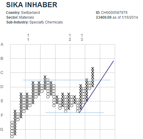
Finally, in what is arguably the most attractive point-and-figure formation among its Swiss Materials peers, the chart for Sika Inhaber shows its price making a definitive breakout above the resistance established two years ago:

image

Perhaps the outperformance of the Swiss stocks has something to do with their average investment in R&D (as a percent of sales) of 4.5%?  The corresponding figure for all of MSCI Europe Materials companies is just 1.3%.

image

Japanese Consumer Confidence Drops to 13-Month Low

Japanese consumer confidence today dropped to the lowest reading since December 2012, signaling perhaps (despite the nearly 100% price gain in the Nikkei over the last two years) not all is fixed in the land of the rising sun. To be fair, the weak consumer confidence reading goes against numerous other statistics showing a continued improvement including bank loans, construction, machinery orders, etc. But we suspect at least some of the improvement is due to demand being brought forward ahead of the April consumption tax increase. In any case, the strong relationship between the consumer confidence index and the Nikkei has our attention piqued.

image

Divergence Between JOLTS and Payroll Data Is Closing

We have noted before the strange divergence between the JOLTS employment data and the monthly nonfarm payroll employment data before. The latest JOLTS data indicates that this spread is closing.

image

In other US economic news, industrial production rose 0.3% MoM in November, in line with expectations. Capacity utilization rose to a 67-month high in December to 79.21.

image

image

TIPS And Inflation Reality

By decomposing a US Treasury bond, we can get a sense of the market's expectations for real rates and inflation expectations.  The inflation component is easy to flesh out by just subtracting the TIPS yield, for the same maturity, from the nominal bond interest rate.  From there, we can compare the implied breakeven inflation rate embedded in long bonds to actual measures of inflation.

When we do this exercise currently, we are left feeling that the interest rate on 10-year bonds could fall materially simply due to a re-evaluation of inflation expectations.  Historically the breakeven inflation rate has closely mirrored actual inflation as measured by the CPI or personal consumption expenditures (PCE) index.
Currently, by either measure, inflation expectations are roughly 75bps above the rate of actual inflation.  This suggests to us that investors are anticipating a strongly rising inflation rate.  Should this expectation change, the breakeven inflation rate has lots of room to fall, leading to rates on the nominal 10-year bond falling in tandem.

image

image


Thursday, January 16, 2014

Weakening Employment Down Under Suggests Chinese GDP Continues to Slow

Labor market data out of Australia today showed another rise in the unemployment rate to 5.85%, the highest level since June 2009. Australia, being at the beginning of of the global supply chain for raw materials, often gives early indications of growth levels in countries like China where fixed investment plays a large part in the economy. Thus, unemployment rising to a 4.5-year high suggests a further deceleration in the pace of growth in the world's second largest economy to somewhere well below 7% in 2014.

image

For what it's worth, the consensus forecast for Chinese GDP growth in 2014 and 2015 is still in the 7.5% range.

image

Further Decline in German Yields Following Tame CPI Data

This morning's release of Germany's final data confirmed previous estimates for sluggish growth in consumer prices:

image

With the decline in inflation, investors seem to be gravitating more towards government bonds.  Though yields remain considerably higher than they were last May, they have declined steadily for the last few weeks:

image


Daily Range & Stock Prices

One of the ways we measure the behavior of the market is by calculating the daily range the S&P 500. To do this measure the spread between the daily intraday high and low as a percent of the index.  So, for instance, if the daily point spread between high and low was 2pts and the index was at 100, the daily spread would be 2%.

Often the really emotional phase of buying or selling occurs before the low/high in prices.  We saw this very clearly for example in 2008/2009, when the daily point spread peaked at 9.5% in October 2008, a month before the interim low in November 2008 and roughly five months before the ultimate low in March 2009.

On December 30, 2012, the daily point spread hit an all-time low (our records go back 25 years) of .31%. This is a smaller spread than witnessed at the peak in 2007.  At good lows, the daily spread should exceed 3%.  This is one more indicator in a long list that suggests a high level of enthusiasm for stocks currently.

image

Best Buy Shares Are Tumbling And Support Is Nowhere To Be Seen

Best Buy is currently down over 27% after news came out that their 2013 holiday sales were weak. Management also foretasted a larger than expected decline in operating margins for the last quarter of the year. From a technical perspective, the news only gets worse for Best Buy as any form of support looks to be a ways off. Best Buy could be in for a period of relative underperformance.

image


Wednesday, January 15, 2014

The Yen is Selling Off Right on Schedule as Stocks & USD Rise

We've noted on numerous occasions the almost eerie relationship between S&P 500 strength and the USD/JPY weakness and so far this year (and today) we have more of the same. The 103 level seems to be line in the sand for now, and the key level we'll be watching on the next bout of stock weakness.

image

Meanwhile, the USD has had a good few days and is up about .5% again today.

image

Shipping Rates & The Taper

There are a multitude of indicators that have moved in mostly lock step with the FRB's asset purchases over the last four years.  One is shipping rates.  Here we compare the 3-month change in FRB total assets to the Baltic Dry Index lagged by two quarters.  The almost 30% drop in the Baltic shipping index so far this year is a negative omen for other indicators that also highly correlated to FRB asset purchases.

image

Positive Economic Surprises Are Back

Recently each day, especially in the US, it has felt as if the economic data has been a bit better than expected. The Citi Economic Surprise Index corroborates that feeling as it has now reached it's highest level since February 2012. Overall, the developed markets has seen more positive surprises in general and emerging markets are battling their way back to positive territory (particularly Latin America). Plenty of charts below: 

image

image

image

image

image

image

Tuesday, January 14, 2014

Japanese Investment Flows Are Driving Spanish and Italian Bond Yields Lower

Spanish and Italian bond yields have lunged lower in recent months and are on the precipice of sporting yields last seen in 2006. With still raging unemployment and yet to be fixed public finances one could certainly make the case as to why the opposite should be true, but a greater force seems to be taking over at the moment, namely massive Japanese investment flows. In the charts below we show on the right axis (red line) the monthly net Japanese investment in Spanish (chart 1) and Italian (chart 2) bonds and on the left axis (blue line) the respective 10 year government bond yields. Over the last few years there has been a tight correlation between Japanese investment flows into these country's bonds and the prevailing government bond yields. The November flows into Spanish and Italian bonds were the largest since 2006 and 2010, respectively, and aggregate weekly Japanese investment flow data point to a further acceleration in December and so far in January.

image

image


Japan Data Roundup

We saw some important Japanese statistics released today that deserved a bit of comment. The most important release of the day was Japan's balance of payments position, which showed a third consecutive month of a current account deficit on a seasonally adjusted basis. Abenomics is supposed to produce an expanding current account surplus, but so far the opposite has happened.

image

Next we have bank loans, which again showed a strong positive reading suggesting that at least some pickup in economic activity is taking place.

image

Finally, the Economy Watchers Survey improved again in December to remain at an already high level. We'd be weary of reading too much into the improved bank loan and survey data as some of the increases could simply be attributed to demand being brought forward ahead of the April consumption tax hike.

image

Will Emerging Market Currencies And Commodities Remain Weak In 2014?

One of the charting "tools" that we like to use are diffusion indices. A diffusion index is a simple, yet effective, way to look at breadth in any market. Below we chart a one year diffusion index of selected commodities vs a year one diffusion index of selected emerging market currencies. The main takeaway from this chart is that over the past 20 years there seems to be a decent relationship between commodities and emerging market currencies. When commodities are generally higher than they were a year ago, emerging market currencies tend to be stronger against the USD (and vice versa). In 2013, both commodities and emerging market currencies were both weak. Could this trend continue in 2014?  From a purchasing power parity perspective (which admittedly is a very poor timing tool), many emerging market currencies remain overvalued versus the dollar so their may be a structural headwind for both emerging market currencies and commodities in 2014.

image

image

image

image

image

image

image

image

GameStop Plunges On Lower 4Q Guidance

GameStop (GME) is down over 18% so far today. The company moved 4Q EPS guidance from $1.97-$2.14 to $1.85-$1.95. This news has sent the stock down as it seemed most analysts believed they would be able to meet the top end of the initial estimate. Sales during the holiday period were actually stronger than expectations as sales were up over 10% year-over-year for stores that have been open at least a year. If GME closes down around current levels, this would take the stock almost exactly to the uptrend line in our point and figure chart below. Will that provide support for GME? Time will tell.

image

Healthcare Looks Extended

While it wasn't the best performing sector in the MSCI World index over the last year, healthcare was near the top of the pack.  Our equal-weighted formulation of the MSCI World  healthcare index was up +33.33% over the last year, placing it in third place behind information technology (+35.68%) and consumer discretionary (+34.99%).

Performance (%)
image

Considering several metrics, the healthcare sector looks somewhat extended.  First, the sector is only 6% below its high over the last year, putting it closest of all sectors to its recent highs.

Price Relative to High
image

Second, healthcare is the sector with most members over their 200-day moving average.

Percent of Companies Above Moving Average
image

And third, with 80% of all healthcare stocks up over the last year, the sector has had the strongest breadth over the last year of all sectors.

Net Positive Performance
image


Monday, January 13, 2014

S&P 500 Makes New YTD Low, Extends Loss

With 15 minutes left in the trading day the S&P 500 has put in a new low for the year and extended the YTD loss to 1.6%.

image

Stock Gaps at Market Open Signal Lack of Emotion/All Information Priced In

We measure stock gaps by counting each day the number of stocks in the MSCI World Index that open at least 2% higher (top chart) or lower (bottom chart) than the previous day's closing price and then take a running sum of those gaps over a 65-day period. The object of the exercise is to measure market volatility and investor sentiment and also to measure how much information is "priced in" at any given time. Presumably stocks in aggregate would exhibit more gaps (both higher and lower) when volatility is high or a high degree of information asymmetry prevails and fewer gaps when volatility is low or investors have discounted all available information (when information about stocks' worth becomes "common knowledge").  Perhaps not coincidentally then, highs and lows in the number of gaps occur with inflection points in the direction of the stock market.

So what are we seeing today? Since the middle of 2013 we have observed a sharply declining number of gaps on the market open to a level not seen since 2007. With VIX trading at about 13.5, we already know that implied volatility is low. But given the lack of stock gaping behavior could it also be that investors have priced in most of the favorable information about stocks in general? Time will tell, but the high correlations we observe in the below charts have our attention piqued.

image

image