Gavekal Capital: 2014-04-27

Friday, May 2, 2014

Europe: Stubbornly High Unemployment

Unemployment in the Eurozone still hovers just under 12%, according to data released earlier today:

image

Unsurprisingly, the highest rates of joblessness remain in the peripheral countries while places like Switzerland, Denmark, and Germany boast rates in the lower single digits:

image

With respect to youth unemployment, we find the largest discrepancy versus total unemployment in Italy, where 3x as many people under the age of 25 are unemployed versus the rest of the population:

image

While that may not be shocking, it is interesting to note that countries with similarly extreme unemployment among the youngest workers are Sweden, Belgium, and the U.K.  In Germany, however, youth unemployment remains relatively low at 7.8%, compared to an overall unemployment rate of 5.1%.


Foreigners Were Buyers of Japanese Stocks for 3 of the Last 4 Weeks - A Positive for the Nikkei

With Japanese equities having horribly underperformed of late (only 25% of Japanese stocks have outperformed the MSCI World Index YTD), we might be seeing the signs of some early bottom feeding by foreign investors (first table below). For three of the last four weeks now we have seen foreign buying of Japanese stocks on net (first chart below). Importantly, the longer term moving average of net foreign purchases of Japanese equities seems to have decisively changed direction and is nearly positive over the last twelve weeks (second chart below). The direction of this trend usually correlates pretty well with the 1-quarter percent change in the Nikkei, meaning that if the trend of foreign buying continues we may see some sort of catch up attempt by Japanese stocks.

image

image

image

NYSE Margin Debt Declines In March - Is the High In Place?

Margin debt declined for the first time since May 2013 the latest data point shows. As we have shown before, NYSE margin debt has historically peaked about 1-5 months before the actual stock market high. There haven't been too many head fakes in the past especially after a period where margin debt rose so sharply. The one month change after the high, however, is far less than what we observed after margin debt peaked in 2000 and 2007. For what it is worth, however, it is larger than the declined observed in 2011 before a nearly 20% drop.

image

image

image

image

image

Thursday, May 1, 2014

Is the Japanese Economy More or Less Able to Absorb a Tax Increase in 2014 vs 1997?

With Japan's consumption tax increase in full swing (sales tax rates rose from 5% to 8% in April) we've seen a lot of speculation as to the effects of the tax increase on the Japanese economy. Most commentaries make some sort of comparison with the last time the consumption tax was increased in April of 1997, when the tax rose from 3% to 5%. Japan's economy experienced moderate weakness immediately following the tax increase and then more acute weakness in 1998-1999 as the Asian financial crisis took hold of the region. Real GDP did not exceed the 1997 peak until Q1 2001. The tax increase is often blamed for the recession from 1997-1999, but it is hard to distinguish the effects of the tax increase from those stemming from the Asian financial crisis. In any case, we thought we'd provide an objective comparison of economic variables between 1997 and 2014 so we can better see the differences in the economic circumstances facing Japan in both periods.

First we'll start with GDP. Both nominal and real GDP growth during the four quarters directly preceding the tax increase are weaker in 2014 than in 1997 (note we are using consensus estimates to calculate Q1 2014 GDP). Nominal GDP growth is not materially weaker, but real GDP averaged almost 1% higher in the period leading up to the tax increase.

image

How does the makeup of GDP today compare with the makeup of GDP in 1997? Private consumption is about 6% higher today as a portion of total GDP than in 1997, and public spending is also higher today by 1.5%. Investment is lower today and trade now subtracts from GDP. 

image

Next we'll have a look at the contribution to GDP growth from the various components from the year preceding each tax increase (i.e. where did the growth come from in 1996 vs 2013). From the table below we can easily see that growth going into 1997 was far more balanced than it has been recently. Growth in 2013 was mainly driven by private consumption and government spending and trade was a big drag. 

image

Of the standard economic indicators we look at, only trade seems to be weaker today than in 1997. Keep in mind though that the recent rise in consumer and producer prices is mostly attributable to the depreciation of the yen leading import prices higher. 

image

Finally, here is a look at the fiscal situation then and now. To say the Japan's fiscal situation has deteriorated would be an understatement. Public debt as a percent of GDP is 3.2x higher today and the budget deficit is 3.8x higher. If the Japanese economy weakens for whatever reason, there is little room for maneuver.  

image

All in all, it appears that Japan is in a less favorable position today to absorb a tax increase than in 1997. GDP growth is weaker and has been boosted unsustainably by government spending. The other area of strength in the economy, private consumption, is now a larger portion of GDP today then in 1997 and was also the largest contributing component to growth in 2013. Private consumption is the area most likely to experience weakness from the tax increase since taxes disincentivize behavior. Note also that the tax increase in 2014 is 3% vs a 2% increase in 1997. Finally, if economic weakness does ensue, there won't be much the Japanese government could do on the fiscal side as an offset. 

Shifting Structure Of Returns In MSCI World Index

The academic literature uses the analogy of a drunk stumbling along as the basis to illustrate the hypothesis that the movement of stock prices is totally random.  The story goes that the drunk is just as likely to take a step in one direction or another, and the direction of that next step is impossible to predict.  This uncertainty regarding the next step is used to suggest that it is impossible to predict which way he he will step next, so why try to guess.  Replace the drunk taking a step with the direction of stock prices tomorrow and the theory goes that it is impossible to predict stock prices.  Fair enough. We agree; it certainly is impossible to predict the direction of stock prices tomorrow. It is assumed that each step the drunk takes is of equal size, so that over time, his steps cancel each other out and he ends back where began.  In other words, the price of a stock will go on a random walk and not necessarily result in gains.  But, what if the steps the drunk takes are of unequal size?  What if every step north is 3 feet, while every step south is 1 foot.  While we couldn’t guess which direction each next step will be, we can measure that over time he is generally moving north at a rate of 2 feet per step on average. The efficient market hypothesis makes a critical assumption that all of the drunks steps are the same size, i.e. that they follow a normal, bell-shaped curve distribution.

A normal distribution is a very common probability distribution.  The term refers to the probability that a set of data or observations will fall between any two real numbers and for which a graphical representation (i.e. histogram) is symmetrical with a single central peak at the mean.  A normal distribution is typically described as ‘bell-shaped’, with half of the distribution to the left of the mean and half of the distribution to the right of the mean.  The spread of the data is dependent on the standard deviation; the smaller the standard deviation, the more concentrated the data.

In contrast to a normal distribution, the histogram for a non-normal set of observations is not symmetrical or bell-shaped.  These kinds of configurations are described with variables such as skew and kurtosis and are frequently (though not always) related to data involving time measurements.  Examples of non-normally distributed data include the waiting time at a doctor’s office, the price movement of an individual stock, or the cumulative earnings associated with a lifetime of work in a given profession.

The skewness of a distribution refers to a lack of symmetry.  A histogram with negative skew has data that is skewed to the left while one with positive skew has more observations in the right tail.   Generally, if skewness is less than -1 or greater than +1, the distribution is highly skewed; skew values between -1 and -½ or +½ and +1 are considered moderately skewed; and skewness between -½ and +½ indicates an approximately symmetric distribution.

Kurtosis is used to describe the extent to which a set of data is more or less “peaked” when compared to a normal distribution (with kurtosis of 0).  Higher kurtosis (>0) is associated with the movement of observations toward the center and the tails of the distribution (i.e. out of the “shoulders”) while the opposite is true for a distribution with kurtosis <0.

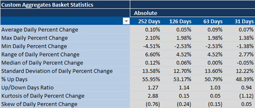
We measure the average daily percent change for all stocks in the MSCI World Index and aggregate the results.  In an upward trending market, we generally observe a negative skew and positive excess kurtosis.  In downward trending market, we generally observe a positive skew and negative excess kurtosis.  In last 31 days, the distribution of daily returns within the MSCI World Index has shifted to a negative configuration of a positive skew and negative excess kurtosis.  This divergence suggests the underlying structure of the equity market is in flux.  The nature of the drunk's steps are changing.  

image


No Need for 'Mayday' in U.K. Economic Data

Today's economic data releases out of the U.K. were largely positive.  While mortgage approvals have fallen back a bit from January highs, many see this as a welcome sign that the housing market is not overheating:

image

Meanwhile, house prices rose the most on a year-over-year basis since 2007:

image

And the manufacturing PMI rose more than expected to 57.3 from 55.3:

image

Wednesday, April 30, 2014

Taper Update

As most market participants are aware, the Federal Reserve has been following a very strict taper schedule which is modeled out in the chart below. What may be underappreciated is the fact that through April 25th, the Fed's balance sheet has risen by nearly $273 billion year-to-date. If the Fed continues on their taper schedule that means the Fed's balance sheet will "only" rise by about $196 billion for the remainder of the year or put another way the Fed's balance sheet will increase by 28% less than what it has already gained year-to-date.

image

China and Japan are in a Horse Race to Win the Financial Repression Award for 2014

With yet another month of data indicating falling real wages in Japan and amid further currency depreciation in China, we got to thinking that maybe these two countries are in a race to win the most exemplar financial repressor award for 2014. Indeed, the below non-exhaustive list of key criterion to be considered a financial repressor are all currently being met by both countries:

image

So there you have it. Both counties are engaging in a set of policies aimed at transferring income from the household sector to the state and/or private business sector. Unfortunately, unlike the Kentucky Durby, it will take a little longer than two minutes to determine the outcome.

Gaming The System = Lower Rates

Many are shocked to learn that the Fed's payment of 25bps of interest on excess reserves (a clear banking subsidy) is available to foreign banks, and they have parked substantial sums with the Fed.  In the chart below we show the total assets of foreign banks with branches in the US, their cash assets and the percent of assets represented by cash assets.  Currently, foreign banks represent 51% of the excess reserves on deposit with the Fed.

To be clear, think of the mechanics this way:
1) BNP in Paris shifts assets to BNP in New York, thereby creating a net debit position from the standpoint of BNP New York.
2) BNP New York takes these deposits and turns around to place them at the Fed to earn 25bps.

image

There has been an over $1 trillion shift in banking positions in the last six years since the GFC.  in 2008, foreign banks had a net debit position vis-a-vis their US branches of around $500 billion.  That has since shifted to the point where now foreign banks have a $600 billion credit position vis-a-vis their US branches.

image

Foreign banks (with US branches) have shifted so much capital to their US branches to take advantage of the 25bps remuneration on excess reserves, that now cash assets are almost 57% of foreign bank assets.

image

The obvious reason why foreign banks (primarily European) have shifted so much capital to their US branches is because the ECB does not pay any interest on excess reserves.

It is interesting to note that this sequence of events has been well correlated with falling US bond rates, though a divergence has appeared over the last year.  Foreign banks are continuing to plow capital into their US branches.  Will this continued capital shift result in lower bond yields?

image

Can The US Realize 3.7% GDP Growth For The Next 3 Quarters?

Today's 1st quarter US GDP report came in much lower than consensus estimates were forecasting and were much lower than we were expecting even though we thought estimates were too high (see US GDP Likely To Disappoint).  1Q14 GDP was barely positive at 0.1% QoQ annualized rate. Consensus estimates were expecting something closer to 1.1% QoQ AR. The cold weather in the first quarter obviously played a very large part in the weak GDP print and most commentary surrounding the release is that we should have a strong snap back quarter in the 2nd Quarter as well as the latter half of the year.  While we agree that this will most likely happen (and the 1st quarter GDP could be revised higher in later releases), we think it will be very difficult for US GDP to meet growth expectations for 2014.

Using Consensus Economics data, which asks the world's leading economists for forecasts on a variety of economic data points, US GDP is expected to grow by 2.8% in 2014. This means that the US would have to average about 3.7% annualized growth for the next three quarters after today's dismal 1st quarter print. Considering that we have only had 5 quarters since 2007 where we have met or exceeded the 3.7% threshold, we think that GDP estimates are once again too lofty for the United States.

image

image

Tuesday, April 29, 2014

Anatomy Of A Topping Formation

We employ a modified point and figure approach as our preferred technical analysis tool.  We take in the price of every security in the MSCI World Index and convert is into USD.  Next we take in the price of all the various indexes and aggregates and convert them into USD.  Next we calculate a ratio of the relative price of every security compared the MSCI World Index.  We then plot the result of this ratio with our Xs and Os.  Each X and O represents a 2.5% relative price change, and the threshold for a reversal is 3 boxes, or 7.5%.

The reversal of a long-term uptrend is an important behavior to spot because it often leads to subsequent losses.  Identifying and removing companies from an investment portfolio that are displaying long-term topping behavior is an important part of risk management--a pulling of the weeds approach.  After all, a portfolio full of underperforming stocks should be expected to underperform.

The following list if drawn from the MSCI World North America Index and it represents the most worrisome looking topping formations.  In all cases, four year uptrend lines are being violated after a period of consolidation.  These are all very classic examples of stocks that should be avoided.

image

image

image

image

image


image


41% of Japanese Stocks are In a Bear Market

It's no surprise that Japanese shares have been hammered lately. Japan is the worst performing major market so far in 2014 and the Nikkei is down about 10% from its recent high in USD terms. That, however, is not the entire story. When we categorize stocks into performance buckets (i.e. how many stocks are with 0-10% from their 1 year high, how many stocks are within 10-20% of their 1 year high, etc.) we find that 41% of Japanese stocks are more than 20% from their 1 year high. The next closest country is Hong Kong with 18% of it's stocks in a bear market. It's becoming apparent that the BOJ will think it has to do more to keep Japanese shares afloat.

image

House Prices Are Still In A Bear Market

While house prices rose a solid 0.8% on a seasonally adjusted basis according to the S&P/Case-Shiller Home Price Index in February, house prices were unchanged according to the not seasonally adjusted series. February tends to have either the largest or the second largest difference between the two series. However, this latest data point shows that this is the largest dispersion for the month of February in the two series's history by nearly 12%. In fact, the dispersion between the seasonally adjusted series and the not seasonally adjusted series has continuously grown wider especially since housing prices peaked in 2006-2007. Expect the difference between the seasonally adjusted and not seasonally adjusted series to set another record in March.

image

If one looks at the not seasonally adjusted series, then house prices are still basically in a bear market (off 19.9% from the top) and have had four straight months of price declines. The good news is the price declines have been very moderate. Dallas house prices made another all-time price high in February and are now over 5% higher than the price highs made in 2007. Las Vegas remains the furthest from their peak price as homes there are still of by nearly 45%.

image

image


Monday, April 28, 2014

M&A: It's Beginning to Look A Lot Like 2007

According to ISI, 132 deals--totaling over $1.2T--have been announced in the last 81 days.  To put this into perspective, we take a look at both the number of deals announced and the transaction value associated with those deals.  While the number of deals isn't wildly off it's average (and has even fallen a bit), the value of those deals appears headed back to extremes last observed just before the global financial crisis:

image

Over 1/2 Of All Stocks Are Underperforming The MSCI World Index

Over the past 252 trading days, only 46% of stocks in the MSCI World Index are actually outperforming the index itself. As the chart below highlights, this is well below the average level for this bull run since 2009.

image

Looking at this statistic from a sector level reveals some interesting observations. First, even with the Consumer Discretionary weakness so far this year, 53% of Consumer Discretionary stocks are still outperforming the MSCI World Index. Amazingly, this sector has had over half of their stocks outperforming for the last five years.

image

On the other hand, Consumer Staple stocks have been leaking performance for over a year now. Over 2/3 of the Consumer Staples stocks are underperforming the index.

image

The Energy sector has seen a nice surge recently in the number of stocks outperforming the index. Over the past five weeks nearly 20% more stocks have started to outperform the MSCI World Index.

image

Finally, Health Care, Industrials, IT and Telecom stocks are seeing over 1/2 of their stocks outperforming while Financials, Materials and Utilities are the sectors with the most underperformers.

image

image

image

image

image

image

image