Gavekal Capital: 2014-08-17

Friday, August 22, 2014

Stock Indexes Break to New Highs on Less Participation from Individual Stocks (Again)

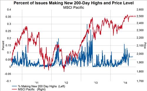
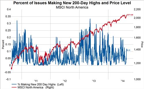
Earlier this week we touched on the fact that new highs in individual stocks have not expanded much despite the continued new highs all year in the headline indices. This phenomenon is seen most clearly in the MSCI North America (the divergence in Europe has been corrected), which made a new all-time high yesterday that failed, again, to be accompanied by a higher level of new highs in individual stocks than occurred at the previous breakout. In our post from Monday we stated, "Time will tell if the MSCI North America catches down to the level of new highs or if new highs finally expand on the next major break to higher prices." Well, with yesterday's action we still can't answer this question as the divergence has been prolonged once again. 

The below charts show the percent of stocks making new 200-day highs (blue line, left axis) overlaid on the price of the index being measured (red line, right axis).

image

image

image

The Battle Of Risk Free Assets And What It Means For Stocks

When it comes to safe haven investments, the world generally invests in two assets: US Treasuries or German Bunds. Recently, bunds seem to be the preferred "risk-free" investment of choice by a wide margin which has historically been a negative signal for stocks .

10-year German Bund yields have fallen by 95 basis points since the beginning of the year and over the past week we have seen German 10-Year Bunds break below 1% for the first time ever. US 10-year treasury yields have dropped this year as well, however, not to the same degree as their German counterpart. US 10-year treasuries have fallen by 63 basis points year-to-date.

image

Because German yields have fallen faster than US yields, the spread between 10-year treasuries and 10-year bunds has reached a 15-year high. Over the past 25 years, a rising yield spread between the two government bonds has coincided with rising equity prices, however, approximately a 150 basis point spread seems to be the historical max between these two government bond yields. The spread between the two yields stands at 142 basis as of the US close yesterday. With limited room left to the upside in this spread, we view this as a warning sign for the equity market.

image

Thursday, August 21, 2014

2 Industries With A Large Disconnect Between Growth And Price

When it comes to stock valuation, it makes sense that the fastest growing industries should command the highest valuations. And as we will show, in general this holds true. However, there are always exceptions and this is where one can find interesting mispricings.

Let's set up the data for a moment. In the table below, the data used for this post is "as reported" and is aggregated on an equal-weighted basis using the entire MSCI World Index. The table shows various metrics based on industry group. We show the 10-year least squares growth rate percentage per share across sales, EPS, book value, cash flow, and dividends in columns 2-6. In columns 7-10 we show current valuation multiples using cash flow, earnings, sales, and book value. Finally, in the last three columns we show current yields such as the dividend yield, operating cash flow yield, and free cash flow yield. The conditional formatting is used to help quickly identify trends. Green is high and red is low. Finally, the table is sorted based on the P/CF column.

image
Source: Gavekal Capital

What quickly becomes apparent based solely on the formatting is in general, the green cells line up with the green cells (high growth with high valuations) and the red cells line up with red cells (low growth with low valuations). However, there are few exceptions and that is what we want to focus on.

The first exception is clearly Real Estate. Real Estate seems insanely overpriced given the past 10 years of growth it has delivered. Granted there was a major boom-bust cycle during this time. However, does 2.2% annualized sales growth really deserve a 4.2x sales multiple? Or how about 1.8% annualized cash flow growth currently being priced at over a 20x multiple! The industry does have a solid dividend yield (3.4%) and on a price to book basis seems more reasonable (1.8x). But overall, it seems to us that Real Estate is trading at unworthy valuations multiples at the moment.

On the other side of the coin, you have the Energy industry. Energy has delivered double-digit percentage book value and dividend growth over the past 10 years. Sales, EPS and Cash Flow have all grown annually at about 8-9% as well. Thus, this is a very solidly growing industry. However, it is currently trading at the third lowest price to cash flow ratio out of the 24 industries in the MSCI World. It's P/E ratio is slightly above the average for the MSCI World but in line with comparably growing industries such as the Media industry. Also in Energy favor is a solid dividend yield (2.5%).

Of course there are many reasons why certain industries can trade at certain multiples. However, when historical growth and current valuations seem very disconnected, we believe that is the perfect time to dig deeper into these areas to find interesting ideas.
The Number of Stocks with Big Daily Price Swings is Lowest Ever

Earlier today we highlighted the absolute collapse in the number of stocks experiencing price gaps at the open of trading. In a similar vein we highlight here the absolute collapse in the number of stocks experiencing big price swings on a given day. For the purposes of this analysis, we define a large price swing as a single day move of 5% or more in either direction (blue line, left axis, inverted).

In the chart below we compare the 65-day running total of the number of stocks in the MSCI World Index experiencing a large price swing in either direction (blue line, left axis, inverted) to the price of the Index (red line, right axis). We note the highly negative correlation as well as the fact that large daily price swings in stocks are at the all-time low going back as far as we have data.

image

The Number of Stocks Gapping on the Open is Lowest Since at Least 2006

We've explored on multiple occasions here and here and here the absolute collapse in volatility in most asset classes so far in 2014. Another way to think about the collapse in volatility other than measuring the standard deviation of daily price changes is to measure each day the number of stocks that either gap up or down at the open of trading. Generally speaking, more volatile markets experience a greater number of stocks gapping at the open of trading than less volatile markets.

In the chart below we measure the 65-day running total of both up and down gaps of 2% or more for individual stocks in the MSCI World Index (blue line, left axis, inverted) and compare it with the price of the index (red line, right axis). What we find is that the cumulative number of gapping stocks over the last 65-days is at the lowest ever going back as far as we have data. A low level of gaps has not necessarily been good for stocks when the trend reverses higher, but it appears that we are not there yet.

image

Leadership in Japanese Counter-Cyclicals

In our last quarterly video (link here) we argued that counter-cyclical stocks in Asia are attractive.  Counter-cyclical stocks are those in the utility, telecom, consumer staples and health care sectors of the MSCI Asia-Pacific index.  Slicing that a little finer, we recommended focusing attention on the growth counter-cyclical components of Asia, Japan in particular.  Growth counter-cyclicals are companies in the consumer staples and health care sectors.

So far this month, ironically as the Yen has weakened some--which usually benefits more cyclically oriented sectors--these growth counter-cyclical companies have been the best performers in Japan.  In the table below, we show performance of our equal-weighted grouping of companies in the MSCI Japan index. Consumer staples and health care are the first and second best performers, with utilities the third best performing sector.  Three out of four ain't bad...

Performance of MSCI Japan Index
image


Global Investors are Still Fancying Japanese Stocks

Global stock investors have continued to purchase Japanese shares despite the relatively lackluster economic statistics coming out of the world's third largest economy. We can speculate on the reasons foreigners might be fancying Japanese shares: perhaps global stock investors are viewing Europe as a source of capital and Japan as a destination of capital, perhaps the they are discounting the BOJ upping the ante on asset purchases, or maybe some Japanese shares have become cheap enough to entice the value investor clientele. Either way, it is clear that Japanese stocks have grabbed someone's attention, which if history is a guide is both good for the Nikkei and bad for the yen.

The first chart below shows the twelve week moving sum of foreign purchases of Japanese stocks. The second chart overlays that series on the Nikkei and the third chart overlays the same series on the yen. From these charts we can surmise that any acceleration of foreign buying of Japanese stocks will have a positive effect on the Nikkei at the expense of the yen.

image

image

image

MSCI North America Is Overbought....Again

It sure didn't take long for stocks in North America to snap back into overbought territory once again. The number of stocks that are trading above their 200-day moving average hit a six month low on August 7th at at relatively still elevated level of 59%. In just two short weeks, the number of stocks trading above their 200-day moving average has rocketed back up to 77%. We are now three years out from the last reading of a truly oversold market according to this metric.  In contrast, even with a slight bounce, MSCI Europe is approaching oversold status for the first time since 2012.

image

image

Digging into the sectors, we see that the most impressive reversal has been in the Consumer Staples Sector. Two weeks ago only 50% of stocks were trading above their 200-day moving average. As of yesterday, this stands at an overbought level of 80%. The Utilities sector also had an amazing reversal, however, there are only 37 companies that make up this sector so it's extremely volatile. The Consumer Discretionary sector, Industrial sector, and the Financial sector also had impressive snapbacks.

image

image

image

image

image

The Health Care sector remains the strongest in terms of breadth of the 10 sectors. 88% of stocks are trading above their 200-day moving average.

image

Last and in this case the least interesting, the Materials sector and Telecom sector charts.

image


image


Wednesday, August 20, 2014

Fed Revises Down Potential GDP In More Hawkish Minutes

In our latest quarterly presentation in July, we noted how spare capacity in the economy may be much smaller than is generally perceived. We found out today the FOMC came to similar conclusions in their latest FOMC meeting.

From the FOMC Minutes released today:

"To reconcile the downward revision to real GDP growth for the first half of year with an unemployment rate that was now closer to the staff's estimate of its longer-run natural rate, the staff lowered its assumed pace of potential output growth this year by more than it marked down GDP growth. As a result, resource slack in this projection was anticipated to be somewhat narrower this year than in the previous forecast and to be taken up slowly over the projection period." (emphasis is our own)

In our presentation, we noted that this recovery has had a very unique characteristic. The output gap has been narrowing due to declining potential real GDP rather than due to robust real GDP growth as is the norm in previous recoveries.  The chart below from the Congressional Budget Office (CBO) identifies this characteristic.

image

We also highlighted other measures of spare capacity that suggest a much smaller output gap may be at hand. For example, when we look at economic utilization, which is simply the capacity utilization rate minus the unemployment rate, there seems to be less resource slack in the economy than one would otherwise conclude if they only looked at the official output gap. 

image

image

We would also point out that structural factors, such as a declining participation rate which according to the CBO is set to decline for many decades aheads, is putting downward pressure on labor force growth and is limiting potential GDP growth. If the unemployment rate continues to fall because there is less slack in the labor market than wages could quickly accelerate and push inflation above the Fed's 2% target. It wouldn't take much to bump core CPI above the 2% trendline as it has been tracking just below that rate for the past four years. Thus, a rate hike that is earlier than is generally expected wouldn't surprise us. 

image

image

image

image


Sharp Decline in European Construction Output

According to data released earlier today, he mini-boom in European construction that began earlier this year came to an abrupt halt in June, as output declined by more than 2% year-over-year (from a multi-year high of more than 7%yoy in April):

image

Growth in building construction and civil engineering projects both turned negative:

image

On a country basis, the unusual spike in Spanish construction output appears to be normalizing while growth in Portugal never managed to pick-up at all:

image

On a company basis, the tentative improvements in many MSCI Europe Construction & Engineering members appear to be weakening once more:

image
image
image
image
image


A Stronger Dollar Is Bringing The Euro Closer To Even Value

The US Dollar has quietly been strengthening lately. As measured by the NYBOT Dollar Index, the USD has increased by 2.6% since the end of June and is at it's highest level since September 2013.

image

On a purchasing power parity basis the overvalued percentage of the Euro has dropped from 10.5% earlier this year to 4.2%. If the dollar continues to strengthen and thus the Euro weakens, this would mark a  big change from the norm of the past 8 years. Over the past 8 years, the Euro has only dipped to undervalued three time with the longest duration at undervalued lasting only about 1 month.

image

Tuesday, August 19, 2014

5 Charts Showing The Taper Effect

We noted yesterday how treasury bond yields keep falling along with the reduction of fed purchases. This inspired us to dig deeper into our chart library to see how other asset classes or economic statistics have performed in relation to our taper model.

Starting with the Federal Funds Rate, it has moved in line with the taper projection so far this year and looks like it could be back in the 12-14 bps range before too long.

image

Junk bond spreads were looking like they were defying the taper model, that is until a relatively minor liquidation in July pushed spreads out by over 100 basis points. This model suggests the liquidation in high yield has more room to go.

image

Our one year diffusion index of PMIs around the world has slowed right along side the reduction in Fed purchases. The one year diffusion index measures the number of PMI surveys that are higher than they were a year ago. This has moved from a max reading where all 17 PMIs we track were higher than a year ago to a more neutral reading of 10 PMIs are higher and 7 PMIs are lower.

image

Inflation expectations, as measured by 10-year TIPS, have been on a steady decline and are at their lowest levels in over a year.

image

Finally, the number of stocks trading above their 200-day moving average has dropped back in line with what the taper model would suggest. If this continues to follow suit, we could see the fewest number of stocks trading above their 200-day moving average in over 2+ years.

image

Japan Coincident Indicator Pointing to Recession

Japan's leading indicator posted a modest gain in June but remains well below the highs set back in January of this year (chart 1). Interestingly though, it's the less followed coincident indicator that gives us pause. Indeed, the six month rate of change in the coincident indicator dipped into negative territory for the first time since the recession in 2012, a condition that has preceded recessions in all but two cases over the last 25 years (chart 2). Furthermore, the six month rate of change in the OECD leading indicator is also an its lowest point since the 2008-2009 recession and portends further drops in the coincident indicator in the months to come.

image

image

Not A Single Developed Sector Is Trading Below 22x P/E

Markets rarely turn on valuation levels alone. Most of the time it takes a case of irrational greed or fear to mark a turning point in the stock market. However, it is always wise to keep one eye on valuations in order to calibrate just how much more greed or fear can be squeezed out of current earnings.

On an equal-weighted basis, the average P/E in the MSCI World Index stands at a lofty 25.2x. As the title of this blog post states, not a single sector is trading below a 22.5x P/E level. In the Emerging Markets, valuations are not too far behind. The equal-weighted average P/E in the MSCI Emerging Markets Index stands at 21.9x. Two sectors in the Emerging Markets are trading below 20x P/E level (Utilities and Financials).

Developed Markets
image

Emerging Markets
image

To get a more nuanced perspective on valuations, let's look at how the valuation distribution currently stands. In our work we cap all valuation ratios at 100x in order to limit outlier effects on aggregates as much as possible. Currently, 44 stocks or 2.7% of the total MSCI World Index is trading at 100x P/E. If we add the companies that have zero or negative earnings then this total moves up to 163 or 10.1%. On the other extreme, we count only 1 company with P/E ratio of less 1x and only 14 or, less than 1%, with a P/E ratio of 5x or less. Overall, 62.5% of all stocks are trading at a P/E multiple of 15x or greater.

Developed Markets
image

Moving on to Emerging Markets, 13 or 1.6% of the total stocks in the MSCI Emerging Markets index are trading at a P/E ratio 100x. If we include stocks that have zero or negative earnings this total increases to 77 or 9.2%. Currently, zero stocks are trading at a P/E ratio of less than one and 21 or or 2.7% of stocks are trading at a P/E ratio of 5x or less. Overall, 51.8% of all Emerging Markets stocks are trading at a P/E ratio of 15x or greater.

Emerging Markets
image