Gavekal Capital: 2015-02-22

Friday, February 27, 2015

On the Long Bond and Why the Widow Maker is Alive and Well


Perhaps one of the most important questions investors need to answer today is whether we've seen the low in the long bonds yields or whether the trend lower is firmly intact. The recent spike in the 10-year bond yields from 1.65% at the end of January to 2.14% just two weeks later has no doubt complicated the situation. In this piece we'll try to layout one case for lower yields still.

As the first chart below shows, bond yields have spiked higher over the last few weeks, but the trend lower has hardly been compromised thus far. Chart two shows that the rise in breakeven inflation expectations played a large role in the rise in rates, but real rates (TIPS) yields (blue line, left axis, inverted) actually rose as well. This tells us that the rise in yields has been due to a rerating in both growth and inflation expectations. The question is whether this is a cyclical rebound from excessively deflated expectations or whether growth and inflation are actually picking up. We have something to say about both.


On Inflation:
As the following three charts show, inflation is clearly not picking up. The first two charts show the Citi Inflation Surprise Index for developed and emerging markets, respectively. Both are headed lower. This confirms the trend lower in actual inflation readings as shown by our proxy of world CPI in the third chart. Indeed, actual realized CPI is at the lowest level since 2009.


image

In the next few charts we'll try to show that market based expectations for inflation are hardly showing firm signs of improving either. Some of the best real time indicators for changes in world growth and inflation are the prices of industrial commodities used in manufacturing, construction, and transportation activities. In the next three charts below we've overlaid the price of copper, lumber, and oil on top of TIPS implied breakeven inflation expectations. We see that the price of copper and oil have bounced in lock step with the rise in breakeven inflation expectations, but the price of lumber (an indicator of housing construction) has ignored the bonds and continued to fall. Furthermore, the rise in both copper and oil for now appears to be more of a rebound from oversold levels than a change in trend. Copper has been trending lower for years and oil stopped going up in 2011. It is not a coincidence that Chinese growth/demand for commodities has slowed over this period. 


On growth:
The next important question to consider is whether world growth is on the precipice of some sort of meaningful acceleration. Given the trends that have been in place for more than a decade and the debt dynamics (we won't go down that rabbit hole here), we think it's unlikely we'll see a sustained period of above trend growth. Indeed, Chinese GDP has been slowing now for several years and that slowing will only accelerate as the economy moves away from capital spending as the driver of growth. Indeed, the price of copper indicates that the move away from capital spending may be taking place in 2015. This mathematically implies much lower Chinese growth in the years ahead since the largest driver of growth will be retreating more than can be compensated for by faster consumption growth.  


While the US and Europe may have experienced cyclical bounces in GDP, year-over-year readings remain stuck in the low growth range that has prevailed for the better part of decade. We doubt the above trend growth in Europe between 2006-2007 will be repeated with China slowing and limited room for fiscal expansion. The rising dollar and the prospect of higher short-term interest rates probably acts as a headwind for the US economy. 


On Positioning:
Despite the move higher in yields, investor positioning still shows that speculative traders carry an historically large short position in treasury bond futures and options. Traders' net short position is indicated by the red line on the right axis and shows that speculators are net short about 208K contracts on the 10-year bond. This is an improvement to the record short position of more than 400K contracts at the beginning of 2014, but it is still far from levels consistent with a cyclical low in yields. Since 2009, lows in yields have not taken place while speculators were net short the long bond. 


Thursday, February 26, 2015

US CPI Makes The Rare Plunge Into Negative Territory

While we recognize that the negative year-over-year change in the US CPI may soon reverse given gas prices have risen by nearly 30 cents, we wanted to highlight how rare a negative year-over-year print is in the US. In the post-war period (since 1948) there have only been four instances when the year-over-year change in the CPI was negative: May 1949- June 1950, August 1954 - August 1955, December 2008 - October 2009, January 2015.

image

image

Core-CPI has remained relatively steady and was actually 18 basis points higher month-over-month in January. The year-over-year core-CPI has remained between 1.50%-2% for the past two years. Unfortunately, the core-CPI series only goes back to 1958 so we can't see how low it got in the first two periods when the headline CPI went negative. In October 2009, however, core-CPI printed a year-over-year change 0.60%

image

The housing component of CPI looks like it should be the headline CPI in the near future. The vacancy rate is at its lowest level since 1995

image

image

Lastly, while headline CPI is at lowest level since 2009. Our CPI diffusion index is actually higher than it was in November. The diffusion index looks at the year-over-year change of each component. If it is higher than a year ago it registers +1, if it lower than a year ago it registers a 0.

image

Pharmaceuticals: Value WIthin The Healthcare Industry

The heatlhcare sector has been the leadership group over the last five years in all geographies of the MSCI World Index.  The most well known industries within the healthcare sector are the biotech and pharmaceutical industry.  Given the performance of the healthcare sector, many are cautious that valuations have gotten extended and the five year bull run may be over.  While this may be true of the biotech industry, we think the pharmaceutical industry still offers tremendous value.

In the table below, we capture the average intangible adjusted price to cash flow ratio for each sub-industry in the healthcare sector.  In our intangible-adjusted valuations we capitalize R&D, advertising and all other intangible capital investments.  While biotech is the second most expensive sub-industry at 22.2x cash flow, pharmaceuticals are the second least expensive at 9.9x cash flow.

MSCI World Health Care Sub-Industries Price/Cash Flow
image

When we dig into individual names, we can also see the current multiples of US pharmaceutical companies are far from the extremes that they experienced in the deflationary boom of the 1990s. Let's start with a look at the last 14 years of annual intangible price to cash flow data.  The latest sub-industry average is 13.6x cash flow, which is surely higher than recent experience when multiples were single digits.

MSCI US Pharmaceutical Price/Cash Flow
image

If we look back a little further in time, we can see that these stocks fetched much higher multiples in the late 1990s.  Here we look at 1994-1999 and see that the industry average multiple was 23x cash flow and most names were 15-20x cash flow.

MSCI US Pharmaceutical Price/Cash Flow
image

In particular companies like Eli Lilly, Johnson & Johnson, Merck, Bristol Myers and Pfizer all currently sell for a 50-65% discount to 1999 valuations.  Many pharma companies still sell for reasonable multiples, especially considering low long rates and the fact that pharma companies are long duration assets.

Wednesday, February 25, 2015

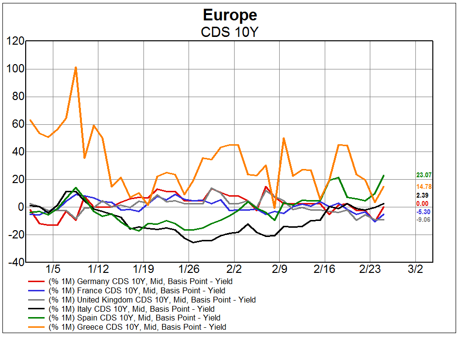
Rise in Spanish CDS Outpaces Greece

Unsurprisingly, the cost of insurance against Greek default (as evidenced by 10-year credit default swaps) has risen since the beginning of the year.  It is interesting to note, however, that the monthly rate at which Spanish CDS are rising is actually higher, increasing more than 20% according to the most recent data point:


The Pop In US Mortgage Apps Was Fun While It Lasted

After starting the year off with a bang (thanks to refinancing activity), US mortgage applications are tumbling back towards the depressed 2014 levels. Mortgage apps fell for the third straight week even as the purchase index rose for the first time in seven weeks. It hasn't taken much of a back up in interest rates for refinancing index to make a 180 degree turn. 30-year mortgage rates hit 3.87% on January 30th and have since moved up 22 basis points to 4.09%. During this time, the refinance index has fallen by 30%. The purchase index just can't get off the mat. It remains near the lows of the past five years. New home sales are nearly 70% higher than they were in the July 2010, however, the mortgage purchase index is only 2% higher.

image

image

image

image

Market Breadth Finally Confirms a New High in World Stocks

It's gone somewhat under the radar that the MSCI World Index is now sitting at a new all-time high. That is usually a good sign for the market, especially when accompanied by improving market breadth. A hallmark of this bull market has been the utter lack of market breadth confirming new cycle highs, but this time is different, and we wanted to point that out.

Chart two below shows the net percent of new 65-day highs for individual stocks in the MSCI World Index. The current reading of 19% is calculated by counting the number of stocks making new 65-day highs minus the number of stocks making new 65-day lows all divided by the number of stocks in the index. 19% is the highest reading since mid-2014, and importantly comes after a period of consolidation.

The third chart below compares the average stock's percent from it's 65-day high to the price level of the index. Here the lower the level of the blue line (left axis, inverted) the more participation of individual stocks in this latest new cycle high.

The last chart below shows a very simple momentum indicator measuring the percent of stocks whose 50-day moving average is higher than the 200-day moving average. This indicator bottomed out late last year and has been improving ever since, though it is still at a rather low level.

All this is not to say we are on the precipice of another 20% pop in stocks. The below could very well be a head fake setting up the next pullback. But, it's worth pointing out the confirmation of market breadth indicators if for no other reason than the occurrence of confirming indicators has been so rare during this bull market.

image

image

image


Long-Term Relative Performance Trends in Europe

In the short-term there has been a decent bounce in European cyclicals, leading many to speculate on further outperformance.  As can been in the table below, early cyclicals have been the leadership group in Europe year-to-date, with late cyclical industrial and material sectors close behind.

MSCI Europe Sector Performance
image

Does this recent burst of cyclical outperformance signal new leadership in Europe? Or, is this just a counter-trend move in the midst of a longer-term structural trend?

In the attached chart package we break the MSCI Europe into 4 basic baskets:
     1) Early Cyclicals - consumer discretionary
     2) Hyper Cyclicals - financials and technology
     3) Late Cyclicals - industrial, material and energy sector
     4) Counter Cyclicals - staples, health care, telecom, utilities
     5) Growth Counter Cyclicals - health care and staples

We show numerous relative performance comparisons of these baskets over the last five years.  We draw trend lines to help illustrate the long-term, structural trends.  It appears to us that, so far, the bounce in European cyclicals is a counter-trend move in the midst of a long-term downtrend.  Early cyclicals are an exception because they have been the one cyclical basket that has been in a long-term trend of relative outperformance; so, the outperformance of early cyclicals is an extension of an existing structural trend.  But, for all other cyclical groups that are in long-term relative performance downtrends, the recent bounce looks more like noise than signal.  Growth counter-cyclicals and early cyclicals are still the areas to focus on in Europe.

Download the charts here: MSCI Europe Baskets Relative Performance.


Tuesday, February 24, 2015

Putting Declining Sales Estimates In Context

We track analyst estimates in a variety of ways. We look at growth rate expectations over the next four years. We also measure the percent change in the level of USD estimates across various time frames. We also track the difference in growth rates now versus three months ago. Finally, we look at the percent of companies that are experiencing a positive earnings revision over various time frames.

Today, let's look sales estimate data from an equal-weighted, industry perspective. There are 24 industries in the MSCI World Index. Currently, only 9 of the 24 industries are expected to have positive sales growth in the next fiscal year. In fact, the MSCI World Index on average is expected to have sales decline by 80 basis points over the next fiscal year (FY1). Two industries stand out in terms of their optimistic sales growth expectations. Semiconductors & Semiconductor Equipment is expected to grow sales by 12.4% over the course of the next fiscal year. Software & Services is expected to grow sales by 11.4%. The growth rates for these two industries are nearly twice as high as the industry with the third highest expected sales growth rate.

Energy continues to have the lowest expected sales growth over the next year. The Energy industry is expected to have sales decline by 9.8% over the next fiscal year. However, analyst currently expect sales to bounce back in a few years as Energy has the highest expected sales growth (9.5%) in three years and the second highest expected sales growth in four years. Therefore, if Energy sales do not rebound (or rebound as strongly) it would seem there is further downside for the Energy industry ahead.

image

The aggregate estimate of sales in USD has been declining significantly over the past six months. This is good spot in our data to identify the effect that a stronger dollar is having on sales estimates for global companies. For example, over the past six months the USD level of projected sales has declined by 10.8% for the Automobiles & Components industry. Similarly, the projected level of sales for the Bank industry has declined by 10.7% over the past six months. Overall, only 1 out of 24 industries have experienced a rise in their FY1 projected sales over the past six months. That industry is the Semiconductors & Semiconductor Equipment industry and their USD level of sales has only increased by 70 basis points.

image

Next let's look at the 3-month difference in FY1 estimated sales growth rates. Let's look at the Media industry. Currently, the 3-month difference in FY1 sales estimates for the Media industry is -1.9%. The current growth rate in FY1 sales estimates according to the first table is -1%. This means that three months ago the FY1 sales estimate growth rate for the Media industry was 0.9%. Again, only 1 out of 24 industries has experienced a positive increase in their expected sales growth rate for next year. 

image

Lastly, let's take a look at the breadth of revisions. We accomplish this by looking at the number of companies that are experiencing positive revisions versus the number of companies that are experiencing a negative revision. Over the past six months, only 17% of all MSCI World companies have experienced a positive FY1 sales revision and no industry has had a majority of companies experience increasing revisions. Amazingly, zero Automobile and Component companies have seen an increase in their FY sales estimate in the past six months.

image 

Most Companies In Most Countries Are Underperforming

For every country in the MSCI World Index, we measure the percent of stocks that are outperforming the index.  The results give us some indication of the breadth in the equity markets.  When more than 50% of the companies in a country index are rising, this indicates stock pickers are experiencing good odds of picking an outperforming stock.  When less than 50% of the companies in a country index are beating the MSCI World Index, it suggests poor odds for active stock pickers.

Currently there are only three countries where the percent of companies outperforming the MSCI World Index over the last 200 days exceeds 50%--the US, Japan and Hong Kong.  An extreme example of underperformance is Austria, where none of its companies are outperforming the MSCI World Index.  Most difficult for active managers is the fact that many large markets are experiencing terrible breadth.  In France, only 19% of the companies have beaten the MSCI World Index over the last 200 days: in Canada, only 28% have outperformed: in Germany, only 19% have outperformed.

Chart package is attached here: Percent of Companies Outperforming the MSCI World Index by Country.

Monday, February 23, 2015

5 Scary Charts In US Apparel, Accessories & Luxury Goods

Savvy investors know that its not always the stocks that you own that make you a good investor but many times it's the stocks that you successfully avoid. Enabling your capital to stay productive (and compounding) is one of the keys to long-term wealth generation and stocks with large drawdowns are poison for long-term compounding  With this in mind, we utilize point and figure charts to help us avoid the type of stocks that can blow up your portfolio (click here for more information on how our proprietary point and figure charts). Point and figure charts do a great job in helping investors identify stocks that are either in a long-term down trend (aka value traps or falling knives) or on the precipice of a large decline after putting in a top. Currently, the MSCI US Apparel, Accessories and Luxury Goods sub-industry looks particularly weak. Five of the nine companies in this sub-industry are either in a clear downtrend or in the midst of a topping formation.

As the charts below show, Coach may be the bellwether for this group as it has fallen completely from support but has consolidated somewhat in recent months. However, Coach may be a good example of a value trap as there is absolutely no sign that the underperformance of Coach has abated (Coach has underperformed the MSCI World Index by 45% over the past year, this includes a 12% outperformance over the past three months).

PVH looks to be a great example of stock that has put in a topping formation and may enter a period of massive underperformance. PVH's relative performance uptrend ended in 2014. PVH is down 6.9% over the past year and has underperformed the MSCI World Index by 13% during this time. However, as the chart below shows, the period of underperformance for PVH looks to be just in the opening innings as there are no clear signs of support until possibly another 50% relative underperformance has taken place (line H).

image

image

image

image

image


Subtle Shift in Factor Importance

Over the last several weeks, there has been a subtle change in the factors that have contributed most to performance trends for the MSCI World universe.

While sales and earnings estimates have been the most important factors over the longer-term...


Correlations of Treasury Bond yields, as well as cash levels, have risen in importance in the last week and month.


With respect to valuation metrics, the dominance of P/B and P/E over a longer time horizon has given way to increased relevance for dividend yield--especially over the last week:


Finally, the relative importance of earnings and sales growth has declined while cash as a percent of capital has become a more important factor in performance:


US Existing Home Sales Drop To 9-Month Low

US existing home sales fell by 4.9% in January to 4.82 million. This is the lowest level since April of last year. The western region remains by far the weakest region while the south remains the strongest. Months supply remained relatively steady at 4.7 months worth of supply in the market. Lastly, a further decline next month may be on the horizon. Pending home sales declined in February and tends to lead existing home sales.

image

image

image

image

image