Our basic proxy for global inflation continues to fall further. The year-over-year change of the CPI of 33 countries (using a simple average) has fallen for eight straight months and now sits at just 1.42%. 11 of the 33 countries that we track now have a negative (or no change) year-over-year percentage rate in its CPI index. Also, another 11 countries have a CPI year-over-year change at or below 1%. Lastly, our world PPI proxy has just broken down below -2%. Other than in 2009, this is the lowest level going back to 2000.
Friday, January 30, 2015
Long Duration Bonds Seem Like The Right Play
The Barclays US Aggregate Treasury total return index is up nearly 6% year-over-year. This index has a modified duration of 5.75 years. Not a bad return considering the on-the-run 5-year treasury is currently yielding 118 basis points. However, when you break out treasury returns by duration buckets, one really gets the sense of what is driving performance.
The Barclays US Treasury 1-4 year total return index has gained 1.19% over the past year. Since the middle of 2012, the year-over-year change in this index has been in a tight range of -43 basis points to 153 basis points.
As we move out further along the yield curve, we see returns improve. The Barclays US Treasury 5-7 year total return index is 5.5% higher than a year ago and the 7-10 year total return index is nearly 10% higher year-over-year.
The returns get even more impressive after 10 years. The Barclays US 10-20 year total return index is up just under 15% year-over-year and the 20+ year total return index is up 30% year-over-year!
The outperformance of the long duration plays doesn't look like it is about to end. Below are point and figure bond ETFs relative to the MSCI All Country World Index. For investors that have the flexibility to move assets between stocks and bonds, this is a useful framework for where one should be invested. Currently, of the ETFs that we track, only the long duration ETFs are in a constructive position relative to equities. Below we show three bond ETFs that are in a positive technical formation relative to equities and three bond ETFs that are in a negative technical formation relative to equities that are representative to the majority of fixed income ETFs out there (including investment grade, high yield, and agency debt).
Thursday, January 29, 2015
Over Half The Stocks In The MSCI World Index Are Outperforming The Index For The First Time In A Year
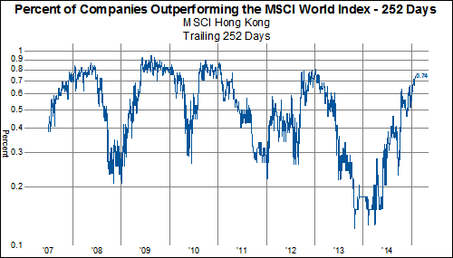
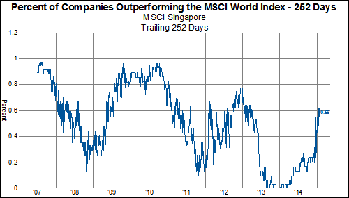
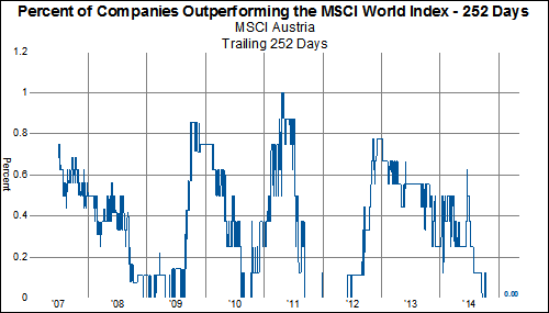
For the first time in exactly one year, over half the stocks (51%) in the MSCI World Index are outperforming the headline MSCI World Index over the past 252 trading days (1-year). This is the highest percentage of stocks outperforming in exactly one year.
A whopping 80% of health care stocks have outperformed over the past year while a miniscule 10% of Energy stocks have.
From a country perspective,investors have increased the likelihood of picking winners by focusing on Hong Kong, Japan, New Zealand, Singapore, and the US. Investors have been smart to avoid Austria, Canada, France, Germany, Greece, Ireland, Israel, Italy, Portugal and Spain.
Global Healthcare: The Alpha Drip Feed Continues
Looking across the global equity markets, it is clear that an asset allocation approach based on sector exposures has worked better than any geographic allocation. In particular, an overweight allocation to the health care sector would have benefited portfolios tremendously. With oil collapsing, the USD soaring and the ECB on the cusp of a massive asset purchase, investors are probably wondering whether it is time to rotate out of the healthcare sector, in pursuit of higher beta companies. Not yet!
In the charts below, we show the YTD performance by sector of various geographies. First, we'll show the aggregate MSCI Developed World and the MSCI Emerging Markets.
MSCI Developed World
MSCI Emerging Markets
While the health care sector is not the top performing sector in the EM, it has still performed better than any developed market sector, up 5.16% YTD.
Next, let's look at the components of the developed world, staring with North America, then Asia and then Europe.
MSCI North America
MSCI Asia-Pacific
MSCI Europe
Now, we turn our attention to the emerging markets. We'll start with EM Asia, then show EM EMEA and EM Latin America.
MSCI EM Asia
MSCI EM EMEA
MSCI Latin America
With the sole exception of Latin America, health care is the first or second best performing sector, with positive performance in all geographies. Investors with lots of health care exposure are experiencing a continuous drip feed of alpha.
Wednesday, January 28, 2015
Relative Strength Breakdowns in Developed Europe
Relative to the All Country World Index (ACWI), only four European countries' constituents have managed to outperform-- Belgium, Denmark, Ireland, and Switzerland (for now):
Country indexes for Germany, Netherlands, and Sweden remain in trading ranges:
In aggregate, stocks in Finland, France, Italy, and Spain have declined on a relative basis for years-- but recently rallied to at least challenge resistance at the long-term downtrend line:
Austrian, Norwegian, Portuguese, and UK constituents, also in multi-year relative strength downtrends, recently accelerated to the downside:
Subscribe to RSS
Posts (Atom)