Gavekal Capital: 2014-11-09

Friday, November 14, 2014

Sales Growth Estimates Continue to Deteriorate

An increasing number of MSCI World sectors are now projected to experience negative sales growth for the next year.  Not long ago, the Telecom, Materials, and Utilities sectors showed the most worrying declines.  Now, they are joined by Industrials and Consumer Staples-- with estimates still positive (but declining) in the remaining half of the sectors:

image

It will likely come as no surprise that estimates in MSCI Europe are the weakest among the three regions, while those in MSCI North America remain the most positive.

MSCI Europe
image

MSCI North America
image

MSCI Pacific
image

The Best And The Rest

There are only a few stock markets in the developed world that are extending to new one year highs, while there are many that are well below one year highs.  Looked at in USD, the US, Sweden, Switzerland and Japan are at one year highs.

image

image

image

image

Most other European and Asian equity markets are either in a clear downtrend or have failed to achieve new one year highs.

image

image

image

image


image


Thursday, November 13, 2014

A Brief Review of Our Factor Scores

What is the most important factor driving performance over the last quarter?  That depends on which region you look at.  While there is some commonality, we find it useful to compare various regions/ indices.

MSCI The World Index

image

MSCI Europe

image

MSCI North America

image

MSCI Pacific

image

MSCI Emerging Markets

image

MSCI EM Asia

image

MSCI EM EMEA

image

MSCI EM Latin America

image

Copper is at a Critical Level Here

We've been highlighting the weakness in the "metal with a PhD in economics" all year so it should come as no surprise that we're keen watchers of copper prices. The reason we pay such close attention to copper prices is that copper in an input in so many construction and manufacturing activities, which then means changes in copper prices offer a clue as to the state of the global economy.

With that being said, copper now finds itself at a fairly critical technical level. Should copper prices fall through support at about $2.98/lbs it would not only mark a 4.5 year low, but would also open the door to much lower prices.

image

As an aside, we should not be surprised in the weakness of copper prices given the continued slow down in Chinese industrial output, which is by most accounts headed still lower from here.

image


Wednesday, November 12, 2014

MSCI Europe Just Can't Keep Up

A little over half of the constituents in the MSCI World Index are within 10% of their 200-day highs, rebounding from the mid-October low of just 22%:

image

We see similar trends in the North American and Pacific regions, with 71% and 47% of their members, respectively, back to within 10% of 200-day highs:

image
image

Investors in European equities, however, do not seem to have the same enthusiasm-- just 26% of MSCI Europe constituents are within 10% of a 200-day high.  On the bright side (we guess), the percent of stocks that are more than 30% away from their 200-day high has managed to remain well below levels seen back in 2011 (though this cohort did spike back to 2012 levels with the recent pullback).  As we discussed yesterday (here), we would have imagined a more powerful rebound from this particular group.

image

Despite New Highs, More Stocks Are Gapping Down on the Open of Trading

While (some) equity markets have gone a long way to erase the October decline or even eclipse the old highs, the number of stocks that are gapping lower on the open of trading is increasing. Why is measuring the number of gapping stocks important? It is a simple way of gauging investor emotional selling behavior.

Gaps as we define them occur when a stock opens at least 2% below the previous day's closing price. They are generated when there are no buy orders at the last closing price, but there are orders to sell at the prevailing market price at the open of trading. As buy and sell orders are matched at the open of trading, the stock price gaps lower to the nearest buy orders.

An increasing number of stocks gapping lower at the open suggests investors are willing to exit positions regardless of the cost. As we can see below, the number of gapping stocks over the last 65 days (blue line, left axis, inverted) is inversely correlated to stock prices and is increasing at a rapid rate in every region of the world and in DM as well as EM.

image

image

image

image

image

Rising US Dollar = Narrowing Market Performance

In our last quarterly investor presentation (see Dollar Dynamics) we highlighted how a strong US Dollar tends to lead to a narrowing market.  For instance, trends like the advance/decline ratio have a strong correlation with the USD as can be seen in the charts below where we compare the 100 day moving average of the A/D ratio to the nominal effective, trade weighted USD.  In the first chart we use the MSCI World index and in the second we use the MSCI EM index.

image

image

Looking back over the last 50 trading days, we can see this story continue to play out.  In the table below, we show the percent of companies in each country outperforming the MSCI World index. Across the entire developed world only 46% of companies have outperformed over the last 50 days, while 69% of US companies have outperformed.  The numbers are similar over the previous 20 days, encompassing last month's sell-off and rebound.

Percent of Companies Outperforming the MSCI World Index by Country

image

In the emerging markets, the trends are comparatively worse.  Here only 29% of companies have outperformed the MSCI World index over the last 50 days, while only 23% have outperformed over the last 20 days.  The trends are getting worse for the EMs.

Percent of Companies Outperforming the MSCI World Index by Country

image

From a sector standpoint, the more defensive sectors like health care and utilities have seen the greatest breadth of outperformance.  Sixty-seven percent of health care and utility companies have outperformed over the last 50 days.  The trends are mostly the same in the emerging markets as can been in the second table.

Percent of Companies Outperforming the MSCI World Index by Sector in Developed World

image

Percent of Companies Outperforming the MSCI World Index by Sector in Emerging World

image

Over the last month:
1) The USD has continued to rise.
2) There has been NO change in leadership off the bounce.
3) The market has narrowed more.

All these signs suggest that investors should continue to focus on North American counter-cyclical companies.  There is no rotation yet, and as long as the USD continues to rise, we should expect a continued narrowing of market performance.

Tuesday, November 11, 2014

Despite Rally, Many Stocks Still in Bear Market

Despite the rally we've seen over the past few weeks there are still a significant number of stocks in bear market territory, defined as down more than 20% off of their 200-day high. As the tables below highlight, the percent of stocks in a bear market has ebbed some from 4 or 5 weeks ago, but is still well above levels from 10 or 11 weeks ago. In all the tables below we are measuring the percent of companies in a bear market with a weekly frequency going back 11 weeks.

Broken out by EM and DM:
image

Countries where more than 20% of stocks are in bear market:
image

Sectors where more than 20% of stocks are in bear market:
image

Exploring the Peculiarity of Lack of Reflationary Signal from this Rally

If we had been on a deserted island in the south Pacific for the past month and a half with no cell service or internet access (doesn't sound so bad!) and upon our return we knew only that that US stocks had dropped nearly 10% and then rallied back to make an all-time high, we would have guessed a few things:

  1. A substantial v-shaped rally in such a short period of time must have been driven by cyclical stocks
  2. The areas of the market that were beaten down the most during the decline (EM, small caps. Europe) would surely have outperformed
  3. World stocks as measured by the MSCI World Index must also be near an all-time high
  4. Following number three, an increasing number of individual world stocks would be at 200-day highs
  5. Government bonds would have massively sold off off of the equity market lows
  6. Inflation expectations would have recovered all of their decline
  7. High yield bond spreads would have confirmed the new highs in stocks
  8. Commodities would have rallied off of the equity market lows
  9. The USD would have gone down off of the equity market lows
Sadly, we would have been wrong about all of these things (as the charts below show), which is what makes this particular rally all that much more perplexing. Indeed, with such a powerful thrust in US stocks we would have expected a rather obvious cyclical/reflationary tilt to this rally, but we've gotten exactly the opposite. This has us scratching our heads and approaching our next moves with caution. Charts below. 


1) Counter cyclical stocks continue to outperform cyclical stocks:

image

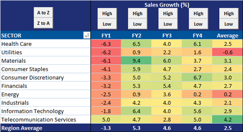
2) EMs, Europe, and to a lesser extent small caps continue to underperform the S&P500:

image

image

image

3) The MSCI World Index has broken its upward sloping trend line, has made a series of lower lows, and has formed a dead cross:

image

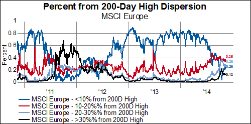
4) The number of world stocks at new highs continues to make lower highs:

image

5) Government bond yields have barely budged higher and the trend lower remains firmly intact:

image

image

6) Inflation expectations have recovered a bit, but remain near the lows:

image

7) High yield bond spreads narrowed off the highs, but are still divergent from stocks and are in a clear widening trend:

image

8) Commodities continue to struggle:

image

9) The USD has shot higher:

image