Gavekal Capital: 2014-04-13

Thursday, April 17, 2014

Cruising Along: European Auto Manufacturers

New car registrations increased more than 10%yoy in March-- the strongest month in every year going back to 2006.

image

The big winner was Renault with registrations approaching +30%yoy, while the PSA Group (Peugeot) followed with a nearly 10%yoy increase:

image

In fact, Auto Manufacturers in the MSCI Europe have had, in general, a decent year so far.

image

A few names even offer a compelling case on the valuation front (reminder: these are are adjusted for companies' investments in intangibles).

image

And, speaking of intangibles, most of the European auto makers invest around 4% of sales in R&D-- a figure that is in-line with competitors in Asia-Pacific and North America:

image

Meanwhile, they have, on average, cash balances approaching 11% of assets and, in some cases (Renault and Porsche), negative net debt as a percent of capital:

image

Finally, it is interesting to note that, unlike counterparts in other regions, all of the European constituents of the sub-industry have managed to generate positive sales growth over the last five years:

image

While none of these names manage to satisfy our requirements to be classified as a Knowledge Leader (mostly due to insufficient gross margins and/or free cash flow margins), the sub-industry as a whole doesn't appear to be a complete wreck.

Sales Expectations For The MSCI World Industry Groups

With recent vibrations in the stock market, we thought it would be time to check in on revenue expectations for the MSCI World industry groups.  We make one small tweak when we look at the data; we equal weight each company within it aggregate, instead of market cap weighting.  This was, each stock impacts the results equally, rather than proportionally based on size.

We take the next four years worth of analyst estimates and then calculate the average over the next four years.  Software and semiconductors--two technology groups--are expected to turn in the best top line performance.

image

Next, we examine the recent changes in those top-line estimates.  We measure the 1,3,6 month change in revenue estimates below.  Over the past six months, pharma/biotech have the best revisions.

image

Focusing just on the past three months, we can see a different perspective on recent revisions.  Here again, pharma/biotech have seen the biggest revisions to the next four years of expected revenues.

image

We then measure the percent of companies with positive revision over various time periods.  Over half the pharma/biotech companies are seeing rising expectations.

image

US Econ Roundup - Initial Claims Improve To 6 1/2 Year Lows and Philly Fed Accelerates

While initial jobless claims were just a bit higher this week than last (304K vs 302K), the widely watched 4-week moving average slid down to 312K which is its lowest level since October 2007. Continuing claims fell to 6-year low as well. Finally, the less looked non-seasonally adjusted initial claims series remains firmly negative on a year-over-year basis. This is important because increases in this series tend to signal higher future levels in the seasonally adjusted series.

image

image

image

The Philly Fed Survey easily beat consensus expectations by posting a 16.6 for April (consensus was 10). The Philly Fed price indices are not pointing to a pick-up in CPI for April.

image

image

Wednesday, April 16, 2014

Cheap Cheap? Pinpointing Value Among MSCI World Regions

In our fundamental analysis, we have developed a system by which companies receive both a quality and a valuation score.  The valuation component is comprised of various different metrics that compare the company's valuation to items that include, but are not limited to, the benchmark's valuation and earnings growth.  Using this tool, we can quickly pinpoint areas in which we might find the most undervalued companies-- a task that is not so easy these days (see here).

MSCI World Index
image

MSCI Asia-Pacific
image

MSCI Europe
image

MSCI North America
image

By this methodology, we see that the constituents of the Telecom and Utilities sectors have an overall valuation advantage.  That is not true, however, in the Asia-Pacific region, where Energy tops the list of sectors where more attractively valued companies may be found.  MSCI Europe stands out with the largest dispersion of scores; it is home to both the most undervalued (Energy) and overvalued (Information Technology, see here) sectors among the different regions.  This is in contrast to the North America region, where valuation scores are in a tighter range.

Don't Hold Your Breath For Chinese Stimulus, GDP Too Strong

China watchers and global investors have been speculating at the prospect of some sort of Chinese stimulus package. With GDP coming in above estimates (7.4% vs 7.3%) and some officials talking down the idea of a new stimulus, we think the odds are low for something substantial. Indeed, any sort of large scale stimulus package aimed at boosting growth would surely have to be accomplished through juicing fixed asset investment, which is exactly what the Chinese want to slow. Anyhow, fixed asset investment is still growing at a healthy clip of nearly 18% YoY, making the necessary rebalancing extremely difficult as is. In order for China to rebalance its economy to something more sustainable and in line with global norms for a country in its stage of development, fixed asset investment as a percent of GDP must fall from around 50% currently to something closer to 30-35%. To accomplish this fixed asset investment, and overall GDP, must slow substantially further. And this is why juicing fixed asset investment to boost growth in the short-term is counterproductive to China's long-term goals, and it seems like policymakers realize this.

image

image

image

Update On The Taper Through The Lens Of Bond And Stock Performance

So far, the Fed is sticking exactly to the taper script.  In the chart below, we model total assets of the Federal Reserve (solid line) and the taper projections (dashed line).  The the Fed has roughly $250 billion more to purchase before this round of QE is over.

image

Another way to look at the accumulation of assets by the Fed is to measure them over a three month period. In the chart below, we show the trailing three month rate of accumulation (solid line) and then the taper projections (dashed line).

image

The bond market has been mostly following the taper script as well.  Below we show the 3-month taper model alongside the 10 year US Treasury bond.  The move from 3% to 2.63% seems perfectly consistent with the taper.

image

Stocks are somewhat the odd man out with respect to the taper.  So far, the Fed has decelerated its three month accumulation of assets by one-third (from $300 billion to $200 billion).  While stocks have flat-lined since the beginning of the year, it is unclear whether the gravitational pull of the taper is having much effect.

image

Though, underneath the surface, stocks seems to be reacting to the taper in a somewhat predictable change in a leadership rotation from cyclicals to counter-cyclicals.  Note the blue is inverted, so when it is falling it represents MSCI World counter-cyclicals outperforming cyclicals.  Counter-cyclicals are outperforming cycliclas by around 4% YTD.

image


US Econ Roundup - IP & Utilization Rates Beat, Housing Starts Miss Again

US industrial production rose by 0.7% in March vs consensus expectations of a 0.4% gain in March. This is even more impressive as February monthly gain was revised up from 0.6% to 1.2%. The 3-month % change, annualized, is now at nearly 7%. This is the fastest three-month growth in IP since July 2010. Capacity utilization accelerated significantly over the first quarter of the year. Capacity utilization is now almost back to pre-crisis levels and is at its highest level since July 2008. Economic utilizations (capacity utilization minus the unemployment rate) continues to improve as well. 

image

image

image

image

Housing starts once again failed to top 1 million. March's number came in at 946K vs expectations of 965K. On the bright side, February's level was revised slightly higher to 920K. On a year-over-year basis housing starts remain negative (-5.9%). After advancing significantly in 2011 and most of 2012, housing starts have now remained relatively stable since the end of 2012. 

image

image

image

image

Tuesday, April 15, 2014

NAHB Housing Market Index Underwhelms In April

The latest reading for the NAHB Housing Market Index came in slightly below consensus again (47 vs 49). The index was particularly weak looking at the traffic of prospective buyers. This component series remains subdued at 32, well below the highs made in September 2013 (reached 46 during this time). We will have to wait and see if the weakens in the HMI leads to weaker house price growth. So far this year these two series have been diverging.

image

image

image

Foreigners Flocked To US Treasuries In February

The always volatile TIC data was released this morning and showed that foreigners bought the most long-term US securities in any month since August 2012. Private parties purchases were focused solely on treasury bonds and notes. They purchased over $75 billion in February which was the most since August 2011. As they were stocking up on treasuries, private foreigners actually were net sellers in agency bonds, corporate bonds and equities.

image

image

image

image

image

image

Copper is Pointing to the Wrong Kind of "Flation"

We've been keeping a close eye on the copper price recently because it has been exhibiting some pretty significant weakness, and weakness in copper is often associated with weakness elsewhere. Last week and again yesterday we commented here and here that copper, after falling precipitously since the beginning of the year, had rebounded right back into an important resistance level at around $3.06. We opined that copper's ability, or not, to break above that resistance point would give us an important insight into which type of "flation" we should be more worried about. Given today's action, we may be closer to an answer. Copper is currently down 2.1% to below $3.00 and it looks like, for now, the $3.06 line in the sand is holding steady.

image

And indeed, when we compare the price of copper to 30 year breakeven inflation expectations derived from 30 year TIPS rates we see a very close overlay.

image

Slowdown In China Money Growth Not A Good Omen for Shanghai Composite

As exports have slowed in China, the accumulation of foreign exchange reserves has slowed, leading to a slowdown in broad money growth.  In the first chart, we can see that foreign exchange reserve growth has recently rolled over, and it appears to be in a sequence of lower lows and lower highs.

image

Foreign trade is the engine of money creation in China and as it slows, it has cascading effects throughout the Chinese economy.  One direct consequence is slowing broad money growth, as represented by M2.  In the chart below, we show the year over year growth of Chinese M2 against the Shanghai Composite Stock Index.  The drop in M2 heightens the odds that the Shanghai Composite breaks down out of a descending wedge that began with the drop from peak prices in 2007.  If it does, the odds are high that it tests the lows of October 2008, which are only 15% away.

image

Monday, April 14, 2014

Dividend Yield (not P/E or Quality) was the Most Significant Factor Driving Stock Returns Last Week

As frequent readers have observed, we are keen track the relationship between individual stock performance and the fundamental and macro qualities of those stocks to help us get a sense of the factors that seem to be most important in driving stock returns. The way we do this is to generate factor rankings for each company and then regress those rankings against each individual stocks' performance over the periods we measure. We are then able to determine the r-squared (a measure of explanatory significance) for each factor and quickly understand which factors have been important and which have not.

The most recent output of our factor work is below and it shows that dividend yield was the most important factor driving stock returns last week as this factor alone was able to explain 96% of stocks' performance. Somewhat surprising is that even as the "MOMO" names have been taken to the woodshed over the last week, valuation measures (such as P/E) and quality measures (such as ROE) were not close to the most important variables driving stock returns.

image

image

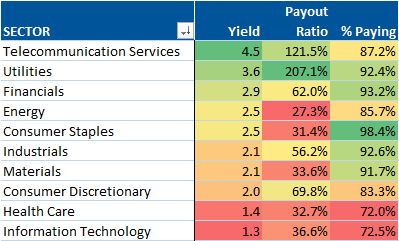
Now we know why utilities, telecommunications, energy and staples outperformed last week...

image