

Friday, October 3, 2014
EUR/USD v Interest Rate Differential (Update)
In June (here) and again last month (here), we noted a curious divergence in two series that have historically moved together-- the EUR/USD exchange rate and the interest rate differential between the respective 2-year OISs. Though the spread has continued to widen some, it has stabilized over the last month or so and it has really been the plunge in the euro that has helped narrow the gap thus far:
Market Breadth Waned Dramatically in Q3 with Health Care the Last Man Standing
GaveKal Capital’s Bryce Coward examines Q3 global stocks
data, his analysis suggesting that a cautionary stance toward stocks may be
indicated. Health care was the only sector in which an investor had a better
than even chance of picking a winner.
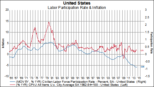
US Participation Rate Falls To 37-Year Lows
While the headline payroll numbers for September were positive, 248k vs 215k expected, and the August payroll number was revised much higher to 180K (from 142k), we are nonetheless very disappointed to see the participation drop to the lowest level since February 1977. The participation rate had stabilized since the beginning of the year. However, the latest reading dropped it to a new a low. We believe the structural decline in the participation rate will continue to depress inflationary forces and will continue to keep deflation on the minds of the Federal Reserve. While we are concerned to see the drop, we are not at all surprised by it. In fact, the CBO has projected that the participation rate is heading below 60% by 2040.


Thursday, October 2, 2014
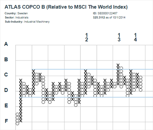
Cyclicals Gone Bust
Last week, we highlighted the deteriorating environment for European Cyclical stocks, in general, and those sectors that belong to the Late Cyclical group, in particular (see here). Indeed, as we review our relative strength point-and-figure charts, more and more companies in the Financial, Industrial, and Information Technology sectors appear rather weak. Industrials, specifically, are showing concerning declines characterized by a combination of the following:
1. continuous, substantial relative underperformance-- by more than 30%, in some cases.
2. little to no warning and in the midst of otherwise positive trend characteristics (breakouts from multi-year bases, strong uptrends that have tested support).
3. there is little support or hope for a quick recovery.
A few examples, keeping in mind that each 'x' or 'o' represents a 2.5% relative outperformance or underperformance, respectively:


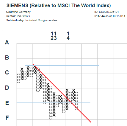


The concern here is that other constituents of the group also begin to breakdown and violate important areas of support in a similarly abrupt fashion. Some candidates to watch for?
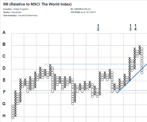
Testing high performance (dark blue line) support here, with quite a bit of room to fall before reaching the 45-degree bullish support line (lighter blue):
This looked like a breakout, until...:

This multi-year trading range seems more likely to resolve its indecision with a move down (see Alfa Laval, above):
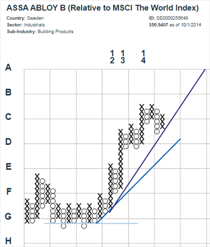
Another failed attempt to sustain an uptrend out of a multi-year base of support?:

1. continuous, substantial relative underperformance-- by more than 30%, in some cases.
2. little to no warning and in the midst of otherwise positive trend characteristics (breakouts from multi-year bases, strong uptrends that have tested support).
3. there is little support or hope for a quick recovery.
A few examples, keeping in mind that each 'x' or 'o' represents a 2.5% relative outperformance or underperformance, respectively:
The concern here is that other constituents of the group also begin to breakdown and violate important areas of support in a similarly abrupt fashion. Some candidates to watch for?
Testing high performance (dark blue line) support here, with quite a bit of room to fall before reaching the 45-degree bullish support line (lighter blue):
This looked like a breakout, until...:
This multi-year trading range seems more likely to resolve its indecision with a move down (see Alfa Laval, above):
Another failed attempt to sustain an uptrend out of a multi-year base of support?:
The Advance/Decline Ratio Has Collapsed Around The World
The 100-day moving average of the advance/decline ratio for the MSCI World Index has collapsed to its lowest level since November 2008. Out of the 46 MSCI country indices, we count 20 countries where the 100-day moving average of the advance/decline ratio is at its lowest level since 2008 or below it. Below are charts for the MSCI World Index and MSCI Emerging Markets Index as well as our top 10 worst advance/decline country charts.


The Average World Stock Is Already In A Correction
While many commenters noted how the Russel 2000 has now entered into a correction after another weak close yesterday, we thought it is noteworthy to highlight that this weakness isn't just in small-caps like most commenters are implying but it is in large-caps as well.
A correction can be loosely defined as a 10% drop from a recent high. Using this definition, the average stock in the MSCI World Index has now entered into a correction. In the first chart below, we show how far off the average stock in the MSCI World Index is from its 50-day day high. The current reading is 10%.

The average stock in the MSCI North America hasn't quite entered correction territory when looking at its distance from the 50-day high (it is off 8%). However, the average stock in North America is in a correction if we look at how far off it is from its 100-day high.


Corrections can also be found in Europe and Asia as well.The average stock in Europe is 11% off its 50-day high and the average stock in Asia is 10% of its 50-day high.


Finally, if we lengthen our view and see how far off the average stock in Europe is from its 252-day (1-year) high than we are almost in bear market territory for the first time since 2012. The average stock in Europe is 18% off its 252-day high.

A correction can be loosely defined as a 10% drop from a recent high. Using this definition, the average stock in the MSCI World Index has now entered into a correction. In the first chart below, we show how far off the average stock in the MSCI World Index is from its 50-day day high. The current reading is 10%.
The average stock in the MSCI North America hasn't quite entered correction territory when looking at its distance from the 50-day high (it is off 8%). However, the average stock in North America is in a correction if we look at how far off it is from its 100-day high.
Corrections can also be found in Europe and Asia as well.The average stock in Europe is 11% off its 50-day high and the average stock in Asia is 10% of its 50-day high.
Finally, if we lengthen our view and see how far off the average stock in Europe is from its 252-day (1-year) high than we are almost in bear market territory for the first time since 2012. The average stock in Europe is 18% off its 252-day high.
Wednesday, October 1, 2014
Look Out Below, Russell 2000 Just Completed a Head & Shoulders Pattern
With another weak performance by the Russell 2000 today (it was down 1.48%), the small cap proxy index has just completed a bearish pattern known by market technicians as a Head & Shoulders pattern. The pattern is formed when the price of an asset makes a high, retraces to some nearby support level, rebounds from support to make a new higher high, retreats again to that same support level, attempts to make a new higher high but fails, and finally retraces all the way back to and through the old support level. In simpler words, the price action goes out of it's way to define support and resistance levels and support is eventually broken to the downside, portending further losses. It is said that the longer the pattern takes to develop the more meaningful it becomes. The Head & Shoulders pattern for the Russell 2000 has been under construction for most of the year, so it's completion is definitely something to watch.

US 10-Year On Track For Largest Daily Decline In Yield Since July
The US yield curve continues to flatten. Currently, 5-year and 30-year are down 7 basis points and the 10-year is down 8 basis points. If 10-year yields stay at current levels, this would be the largest daily decline in yields since July. And if yields fall further from here, we could be looking at the largest daily decline of the year (yields dropped 9 basis points on 1/10). Note, we are only 7 basis points from the low for the year.


Hyperbolic Discounting and Intangible Capital
For most investors, investments in research and development (R&D) and investments in other intangible assets such as brand building, employee training and codified information are overlooked and misunderstood. Current business accounting standards contribute to this misunderstanding by treating intangible investments as current period expenses rather than as the capital investments they truly are. However, there is another more innate, psychological reason that investors often overlook the importance of intangible investments.
Human beings have a problem making correct intertemporal decisions. Humans, and thus investors, consistently overvalue the present value of an asset or profit (or marshmallow) while vastly undervaluing a future asset or stream of profits even if that asset or stream of profits will be realized in the very near future. Put another way, investors show a severe hyperbolic discounting bias. Many investors are scared off by companies investing heavily in R&D because they fail to recognize that by sacrificing current profits today these companies will realize greater future profits and market share in the future. Academic literature, as well as empirical data as we will highlight below, has shown that sacrificing today's profits by investing in intangible assets can bring a windfall of growth, market share and stock price outperformance in the future. Companies that continually make the correct intertemporal decision to invest in long-lasting intangible assets are called called knowledge leaders and those that focus myopically on current period profits are knowledge followers.
In all the tables below, we are looking at MSCI industry groups, constructed on an equal-weighted basis using the MSCI World Index constituents, and we have sorted the table based on our proprietary calculation of total intangible investments. Finally, all the columns have been conditionally formatted to make trends more easily identified by the eye. The highest number in a column is green and the lowest number is red. Total intangible investment is made up of two parts: investment in R&D and investment in advertising and other firm specific resources.
In Figure 1, we are looking at whether or not higher levels of investment in intangible assets actually lead to higher growth rates of sales, EPS and cash flow on a per share basis over the previous 10-year period. Figure 2 looks at the same data except over a 20-year period. What we find is that for the most part, the industries that invest the most in intangibles have had higher 10-year growth rates (i.e. green matches up with green). For example, the Pharma, Biotech & Life Sciences industry has the highest total investment in intangible investments at 24.6% of their sales. They invest 16.4% of their sales in R&D and another 8.1% of their sales in advertising and firm specific resources. Over the past 10 years they have managed to grow sales by 12.2% yearly and cash flow by 10%. Looking at Figure 2, over the previous 20 years the Pharma, Biotech & Life Sciences industry group has managed to grow sales by 10% a year and cash flow by 9.3%. Now bring your eye to the bottom of Figure 1 and Figure 2. Utilities, Real Estate and Banks are the lowest intangible investors. It is not that surprising then to see these industry groups with some of the lowest 10-year and 20-year growth rates in sales, EPS and cash flow.
Figure 1

Figure 2

So have these high investment rates and solid historical growth rates translated into equity outperformance? The answer is yes they have over the past one and four years. The Pharma, Biotech & Life Sciences industry group has been the best performing industry out of the 24 MSCI industry groups . The second and third highest intangible investment industries have also performed well, especially over the last four years. Now, let's move our analysis again to the bottom of the table. The lowest intangible investments industries have had the worst performance over the past four years and are some of the worst performers over the past one year.
Figure 3

Investments in intangible assets do not lead to superior growth or outperformance overnight. If they did every company would focus on them and it would not lead to long-term competitive advantage. Instead, intangible investments, just like tangible fixed investments, must be part of a long-term organizational strategic plan to stay one step ahead of the competition. And while it is very difficult to overcome in innate bias such as hyperbolic discounting, it is to the benefit of an investor to look past current profits and understand what is driving future profits.
Human beings have a problem making correct intertemporal decisions. Humans, and thus investors, consistently overvalue the present value of an asset or profit (or marshmallow) while vastly undervaluing a future asset or stream of profits even if that asset or stream of profits will be realized in the very near future. Put another way, investors show a severe hyperbolic discounting bias. Many investors are scared off by companies investing heavily in R&D because they fail to recognize that by sacrificing current profits today these companies will realize greater future profits and market share in the future. Academic literature, as well as empirical data as we will highlight below, has shown that sacrificing today's profits by investing in intangible assets can bring a windfall of growth, market share and stock price outperformance in the future. Companies that continually make the correct intertemporal decision to invest in long-lasting intangible assets are called called knowledge leaders and those that focus myopically on current period profits are knowledge followers.
In all the tables below, we are looking at MSCI industry groups, constructed on an equal-weighted basis using the MSCI World Index constituents, and we have sorted the table based on our proprietary calculation of total intangible investments. Finally, all the columns have been conditionally formatted to make trends more easily identified by the eye. The highest number in a column is green and the lowest number is red. Total intangible investment is made up of two parts: investment in R&D and investment in advertising and other firm specific resources.
In Figure 1, we are looking at whether or not higher levels of investment in intangible assets actually lead to higher growth rates of sales, EPS and cash flow on a per share basis over the previous 10-year period. Figure 2 looks at the same data except over a 20-year period. What we find is that for the most part, the industries that invest the most in intangibles have had higher 10-year growth rates (i.e. green matches up with green). For example, the Pharma, Biotech & Life Sciences industry has the highest total investment in intangible investments at 24.6% of their sales. They invest 16.4% of their sales in R&D and another 8.1% of their sales in advertising and firm specific resources. Over the past 10 years they have managed to grow sales by 12.2% yearly and cash flow by 10%. Looking at Figure 2, over the previous 20 years the Pharma, Biotech & Life Sciences industry group has managed to grow sales by 10% a year and cash flow by 9.3%. Now bring your eye to the bottom of Figure 1 and Figure 2. Utilities, Real Estate and Banks are the lowest intangible investors. It is not that surprising then to see these industry groups with some of the lowest 10-year and 20-year growth rates in sales, EPS and cash flow.
Figure 1
Figure 2
So have these high investment rates and solid historical growth rates translated into equity outperformance? The answer is yes they have over the past one and four years. The Pharma, Biotech & Life Sciences industry group has been the best performing industry out of the 24 MSCI industry groups . The second and third highest intangible investment industries have also performed well, especially over the last four years. Now, let's move our analysis again to the bottom of the table. The lowest intangible investments industries have had the worst performance over the past four years and are some of the worst performers over the past one year.
Figure 3
Investments in intangible assets do not lead to superior growth or outperformance overnight. If they did every company would focus on them and it would not lead to long-term competitive advantage. Instead, intangible investments, just like tangible fixed investments, must be part of a long-term organizational strategic plan to stay one step ahead of the competition. And while it is very difficult to overcome in innate bias such as hyperbolic discounting, it is to the benefit of an investor to look past current profits and understand what is driving future profits.
Tuesday, September 30, 2014
It's Been a Tough Year to Pick European Stocks and Getting Tougher in Asia
Below we show the percent of stocks in each MSCI developed market region with positive YTD performance in USD terms. One aiming for a high probability of picking a winning stock would have been well served to avoid Europe this year, and this is becoming increasingly true of Asia.


The Percent of Stocks with Positive YTD Performance is Deteriorating Quickly
After a tough start to the year the percent of stocks in the MSCI World Index showing YTD gains rose steadily from less than 30% in February to nearly 80% in July. However, the percent of stocks in positive territory for the year has steadily faded away since July and now appears to be accelerating lower and currently stands at only 57%. Even more troubling is that the percent of stocks showing a QTD gain (as of 9/26) is only 37% and the percent showing a MTD gain (again as of 9/26) is only 23%. To put this into slightly different words, the odds of picking a winning stock this year (to say nothing of keeping up with the benchmark index) are now slightly better than a coin flip and falling while the odds of picking a winning stock for the month of September was only 23%. Indeed, as chart four below shows, September will be the worst stock picking month since May 2012, and September 2011 before that.


Flattest Long-End Of US Yield Curve Since S&P 500 "666" Intraday Low
You all remember March 6th, 2009, right? Some days are easier to remember than others and March 6th, 2009 will not easily be forgotten as that was the day when the S&P 500 made its now infamous "666" intraday low and it also marked the closing price low of 683 for the S&P 500 during the financial crisis. Seems like a very long-time ago as the S&P 500 is roughly 1300 points higher than the intraday financial crisis low.
Interestingly, as of the close yesterday, the spread between the 10-year treasury and the 30-year treasury fell to its lowest level (69 bps) since that infamous day. Since April 2013, the long-end of the yield curve has steadily fallen by 55 basis points.

It is not just the long-end of the yield curve that has narrowed. Inflation expectations implied by both 10-year and 30-year TIPS have fallen substantially since the beginning of August. Breakeven inflation implied by 30-year TIPS has fallen by 25 basis points and breakeven inflation implied by 10-year TIPS has fallen by 34 basis points. The spread between 10-year and 30-year TIPS has also narrowed by 25 basis points since August 13th. If the dollar continues to strengthen, it seems reasonable to expect the spread between 10-year and 30-year TIPS has further to fall.


Interestingly, as of the close yesterday, the spread between the 10-year treasury and the 30-year treasury fell to its lowest level (69 bps) since that infamous day. Since April 2013, the long-end of the yield curve has steadily fallen by 55 basis points.
It is not just the long-end of the yield curve that has narrowed. Inflation expectations implied by both 10-year and 30-year TIPS have fallen substantially since the beginning of August. Breakeven inflation implied by 30-year TIPS has fallen by 25 basis points and breakeven inflation implied by 10-year TIPS has fallen by 34 basis points. The spread between 10-year and 30-year TIPS has also narrowed by 25 basis points since August 13th. If the dollar continues to strengthen, it seems reasonable to expect the spread between 10-year and 30-year TIPS has further to fall.
Subscribe to RSS
Posts (Atom)