The simplest way we know of to measure whether an index is overbought or oversold is to calculate the percent of stocks in the index that are trading above their own 200-day moving average. As a general (and very, very rough) rule, when 80% of stocks are trading above their 200-day moving average the index is overbought and when only 20% of issues are above their 200-day moving average then the index is oversold.
Until just a few days ago EM stocks were on the verge of being "overbought" by this brute metric, which we viewed as an odd phenomenon given the strength of the dollar and weakness in commodities. We mentioned here and here how the strong dollar and weakness in commodities can affects EM stocks, to their detriment.
In any case, it appears that EM stocks are now catching wind of the trend higher in the dollar and lower in commodities. In the two charts below we plot the percent of stocks in the MSCI EM Index that are trading above their 200-day moving average (blue line, left axis). In the first chart we overlay the Nominal Trade Weighted USD Index (red line, right axis, inverted). In the second chart we overlay the CRB Index (red line, right axis). In both cases we observe a very close relationship between the variables (an inverse relationship with the USD in the first chart and a positive relationship with commodities in the second). Thus the breaking out of the dollar and the breaking down of commodities may signal that EM stocks might be ripe for taking a breather, and that more EM stocks may soon be trading below their 200-day moving average.
Friday, September 12, 2014
Long-dated US Treasury Bond Yields at Critical Resistance Level
The 10-year and 30-year treasury bonds have sold off by 27bps and 18bps over the last three weeks, putting into serious question the cyclical downtrend in yields that began at the beginning of the year. As it currently stands, 10 and 30-year yields find themselves at important resistance levels, which should hold if the trend lower in yields is to remain in place.
Which Countries are Likely to Outperform and Underperform in a Rising USD Environment?
As we noted two days ago, a rising USD has some negative implications for commodity prices as well as emerging market stocks. Since commodities are priced in USD, a rising dollar will have a dampening effect on commodity prices generally. It also turns out that many of the big commodity producing countries happen to be emerging markets, many of whom carry a large amount of USD dominated debt. For these companies and countries, a rising dollar and falling commodity prices can have serious implications for both the income statement and the balance sheet, with the usual result of underperforming stock prices in USD terms.
Alternatively, a rising USD has some very positive implications for those countries like the US (whose consumers benefit from lower commodity prices) and Japan (which gains a trade advantage from a lower currency).
With this in mind we show below countries whose stock markets are likely to outperform in a rising dollar environment (admittedly a small list) and then countries whose stock markets are likely to underperform in a rising dollar environment (a much larger list comprised mainly of commodity producing countries and EMs). The first set of charts shows the USD real trade-weighted exchange rate index (blue line, right axis) plotted alongside the performance of the country index relative to the MSCI World Index in USD terms (red line, left axis). The second set of charts shows the inverse of the USD real trade-weighted exchange rate index (blue line, right axis) plotted alongside the performance of the country index relative to the MSCI World Index in USD terms (red line, left axis).
Stock Markets with Positive Correlation to USD:
Stock Markets with Nevative Correlation to USD:
The Asset-Backed Commercial Paper Market Is Still Dead
The volume of asset-backed commercial paper issued in millions of dollars currently sits at 14-year lows (blue line). After reaching levels of $90 billion issued, the ABCP market now sits at below $9 billion.
However, the entire commercial paper market has rebound a little bit from lows made in the beginning of 2013. There has been a noticeable increase in the amount financial commercial paper being issued so far in 2014. After falling to levels as low as about $900 million, financial commercial paper has increased back to about $4.7 billion. This is still only about 25% of what the financial commercial paper market was from 2001-2006.
Thursday, September 11, 2014
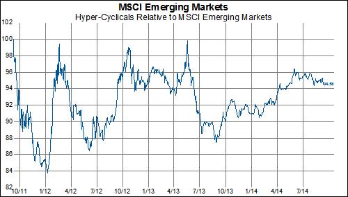
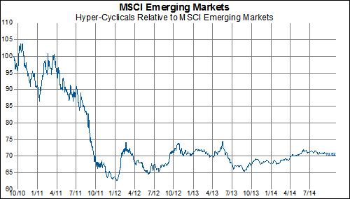
Will EM Hyper-Cyclicals Ever Get Back Into Investor's Good Graces?
We noted early this week that Emerging Markets are strongly outperforming Developed Markets in 2014. It certainly pays to be in the right sector in the Emerging Markets because if you have been in hyper-cyclical stocks (Financials and Information Technology) you are probably shrugging your shoulders at your meager outperformance. On the other hand, if you have been in EM hyper cyclicals longer than three years you are probably doing back flips over the outperformance this year.
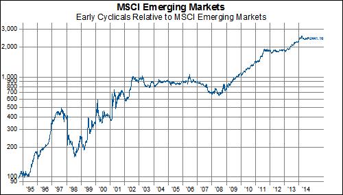
The following charts are going to look at how Emerging Market hyper-cyclicals have performed against the MSCI Emerging Markets Index across a variety of times slices. The punch line is unless you got in during a select few periods over the past few years, you haven't outperformed in a long, long time. In ascending order from year-to-date to 20 years ago.
And just for fun, it pays (BIG) to bet on the consumer...
Rare Minimal Downside Price Action In MSCI Japan
Over the past six months, the MSCI Japan Index has only had 9 days where it has finished in the red by 1% or more. This is the fewest number of 1% down days since January 2006 and well below the average of 22 days over the six years. In addition, the MSCI Singapore Index is also experiencing very limited downside volatility. There has only been on day in the past six months when the MSCI Singapore Index has fallen by more than 1%.
Also, since the MSCI Japan Index accounts for the largest weighting in the MSCI Pacific Index, we are seeing a similar trend for the MSCI Pacific Index. Finally, charts of the remaining countries that make up the MSCI Pacific Index are below.
Wednesday, September 10, 2014
Mind the Gap-- or Absence Thereof!
In spite of recent headlines and developments at the ECB, market action has remained fairly subdued, as evidenced by the number of stocks that jump (in a positive or negative direction) at the open of trading. This particular measure of volatility takes a 65-day running total of gaps up by 2% or more and gaps down 2% or more for each individual stock in the MSCI Europe index (blue line, inverted):
As the number of gaps approaches low levels not seen since 2007, one can't help but notice how poorly the overall index has performed each time the number of gaps has subsequently risen in the past. Compared to the other regions in the MSCI World Index, however, European stocks are not as extremely docile-- both MSCI North America and MSCI Pacific have reached all-time lows for as far back as we have data:
Strong USD has Negative Implications for Commodities and EM Stocks
Given that commodities are for the most part priced in USD, it follows that stronger USD weighs on commodity prices, and vice versa. As we can see from the first chart below, the long-term correlation of monthly price changes between the CRB Index and the USD is -.85. This relationship also has implications for many EM countries, since EMs tend to be large commodity producers and thus generally subject to the pro-cyclical nature of commodity prices. It is thus not a surprise to see that the USD has a highly negative correlation with emerging market stock prices (2nd chart below) and that commodity prices and EM stock prices tend to have a highly positive correlation (3rd chart below). With that being said, we find the recent divergence between EM stock prices and the CRB Index curious and would expect to see the long-term correlation reassert itself in the weeks and months to come.
Subscribe to RSS
Posts (Atom)