Gavekal Capital: 2014-08-24

Friday, August 29, 2014

Another Package of Weak Japanese Economic Data

Today saw another weak package of weak economic data out of Japan. Some highlights were industrial production turning negative year-on-year, real personal income and consumption expenditure posting another round of deep year-on-year declines, and housing starts which continued to plummet year-on-year. As government stimulus continues to be curtailed throughout 2014 more weak data points are likely, which will probably increase the likelihood of more BOJ action.

image

image

image


World Inflation Makes 56-Month Low

Our world inflation proxy, which simply takes the equal-weighted, year-over-year change for 33 different countries CPI, hit its lowest level since November 2009. The proxy stands at 1.72%  which is just lower than the level it hit in February. We identify six countries, all in Europe, where the year-over-year change in consumer prices is basically zero (Switzerland, Sweden) or there is currently outright deflation in consumer prices. Charts of those countries are below.

image

image

image

image

image

image

image

Secular Stagnation & Personal Savings

In his Presidential Address to the American Economic Association in December 1938 Alvin Hanson presented his "secular stagnation" hypothesis.  He argued that US faced a crisis of deficient demand and underinvestment due to declining population growth after the closing of the frontier to new immigrants. One of the main driving forces of the secular stagnation hypothesis was the decline in the birth rate and oversupply of savings.  This hypothesis presented the possibility that no achievable interest rate would balance savings and investment at full employment.

Th secular stagnation argument has received renewed attention lately.  In the words of Larry Summers, "We may have found ourselves in a situation in which the natural rate rate of interest--the short-term real interest rate consistent with full employment--is permanently negative."

Gauti Eggertsson and Neil Mehrotra of Brown University have recently developed a new model that explains the  secular stagnation hypothesis very clearly. "In our model of secular stagnation, however, no such return to normal occurs.  Instead, a period of deleveraging puts even more downward pressure on the real interest rate so that it becomes permanently negative.  The key here is that households shift from borrowing to savings over their life-cycle.  If a borrower takes on less debt today (due to the deleveraging shock), then tomorrow he has greater savings capacity since he has less debt to repay.  This implies deleveraging--rather than facilitating the transition to a new steady state with a positive interest rate--will instead reduce the real rate even further by increasing the supply in the future.

Today's personal income and spending report was interesting through the lens of the secular stagnation argument.  Since the beginning of the year, US consumers have increased their savings rate, saving almost 40% of each marginal dollar of personal income this year.  The savings rate has risen from 4% to 5.7% this year.  A higher savings rate is generally associated with lower levels of consumer credit (deleveraging) as shown in the chart below.

image

It's also associated with diminished levels of demand.  Here we compare the savings rate with residential investment as a percent of GDP.  A rising savings rate is not good news for the housing contribution to GDP.

image

The Fed's extraordinary monetary policy of quantitative easing has tried to counter-act the effects of the secular stagnation the US has found itself in for the last five years.  The New York Federal Reserve did a study a few years ago that equated $800 billion in asset purchases as equivalent to 100bps reduction in the fed funds rate.  In the chart below we integrate that concept alongside the traditional fed funds rate.  We are somewhere around -4.25% using this proxy.  If there is a durable, new turn toward greater savings, perhaps this rate has to further to fall.  Today's report gave the supporters of the secular stagnation hypothesis (perhaps the Fed too) something to think about.

image


Unmatched Month To Month Volatility In Chicago PMI

The headline reading for the Chicago PMI blew away consensus expectations for August. Expectations were for the index to rise to 56.4 and the actual data point came in at 64.3. This is after the headline came well below in expectations in July. The series dropped by 10.04 from June to July. Now, the series rose by 11.73 from July to August. This two month swing is the most volatile two month move ever going back to 1967.

image

image

image

image


Thursday, August 28, 2014

The Modern Day Widow Maker Trade is to Short Treasuries

As treasury yields plunge again today to new 1-year lows (the 10 and 30-year treasury bond yields are both down 3bps to 2.33% and 3.07%, respectively), we are reminded of a popular trade over the last decade to short Japanese government bonds, which has aptly been named the "widow maker" trade. The trade seemed to make all the sense in the world with Japanese government dept soaring to new heights which would, as the logic went, inevitably cause the bond vigilantes to wreak their havoc on the JGB market. Instead, bond yields kept falling (from 2% in 2006 to just .49% today) and many a trader was carried out on a stretcher.

Despite most asset managers and economists declaring at the beginning of the year that US treasury yields can't trade lower and will certainly rise in 2014, the exact opposite has happened, and if anything the trend lower in yields is accelerating. Admittedly, there are big differences between the US today and Japan in 2006, but there are also some similarities: low real growth, low inflation, worsening demographics, etc.

Another similarity is the pervasiveness of traders shorting US treasury bonds. The chart below shows the net position in futures and options contracts on 10-year treasury bonds for all non-commercial traders (i.e. the so-called "dumb money") which is the red line on the left axis. The left axis is inverted and negative numbers indicate a net short position. We observe a highly negative correlation with 10-year treasury yields (blue line, right axis) in that the non-commercial traders seem to up their short positions as yields rise, and vice versa, and thus have usually been wrong at major turning points. At the beginning of the year the non-commercial trader net short position in 10-year treasury bonds was as the highest level over the last six years and today that same group is still net short despite the fall in yields. Over the past six years treasury yields haven't stopped falling until the non-commercial traders adopted a net long position, and that level is still far off from here.

image

image

US Corporate Profits and Margins Bounced Back In The 2Q

The preliminary estimate for corporate profits in the second quarter were released this morning and showed a rebound from the abysmal first quarter profits. Looking at after-tax profits with inventory and capital consumption adjustments, corporate profits 8.4% quarter-over-quarter AR which is the largest gain in three years. However, on a year-over-year basis, corporate profits remain 9% lower. Before-tax corporate profits with inventory and capital consumption adjustments rose by 8% quarter-over-quarter AR and are just slightly negative on a year-over-year basis. The highly watched profit margin measure rebounded from 8.1% in the first quarter to 8.6% in the second quarter. Gross cash flow margin also increased from 15.3% to 15.9%.

image

image

image

image

image

image


Wednesday, August 27, 2014

Flattening Yield Curve and Strong Dollar go Hand in Hand

With today's action in the bond market (30-year treasury yields made new 1-year lows, finishing down 6bps, and 10-year treasury bonds nearly made new 1-year lows, finishing down 4bps), the long end of the yield curve is the flattest it's been since the fall of 2009, with the 30-10 spread at 74bps. This flattening has predictably coincided with strength in the USD as chart 1 below shows. Given that the yield premium for 30s over 10s is still about 26bps above the long-term average (2nd chart below), we could easily conceive a continued flattening of the long-end of the yield curve and with it more strength in the dollar.

image

image

Cash: Differences Between The Largest Companies And Everyone Else

Continuing on our theme from yesterday, let's again look at how company fundamentals have evolved over time. Today, we are going to focus solely on North America and how balance sheet configuration is affected by market cap size.

In the tables below, we are looking at aggregated, company level data. So for example in Figure 1, it is the total level of cash for all companies in the MSCI North America Index (ex-financials) divided by the total level of capital for all companies in the MSCI North America Index (ex-financials).

One of the most striking trends that emerges when analyzing this aggregated data set is the difference in how large companies in North America are financing their balance sheet compared to smaller companies. If you look at only the largest 100 companies based on market cap in the MSCI North America Index out of the possible 713 total companies (the largest 100 account for over half of the total market cap in the index), you find that the largest firms have been accumulating and holding more cash than their smaller counterparts in recent history.

For example, in 2005 15.7% of the largest 100 companies' capital was in cash. Similarly, the other 600 companies had a cash to capital ratio of 13.9% (Figure 1). Nine years later the smallest 600 companies continue to hold about 13.4% of their capital in cash (Figure 1). However, for the largest 100 companies their cash to capital ratio has significantly increased to 22.2% or increased by 41.1% since 2005. Not surprisingly then, their net debt as a % of capital ratio has declined for the largest 100 while for the smallest 600 it has remained relatively the same (Figure 2). Larger companies also have more equity as a % of capital than smaller companies (Figure 3). Finally, larger companies have experienced a significant increase in cash as a % of their total assets (Figure 4) while we have seen no such increase for the smallest 600.

Figure 1
image

Figure 2
image

Figure 3
image

Figure 4
image


The "Cash on the Sidelines" Argument has Run its Course

Nearly five and a half years into this bull market we still sometimes here the "cash on the sidelines" argument as justification for further gains in stocks. The problem is that this argument hasn't really been valid since 2010. As the chart below shows, the combined total assets in equity mutual funds and ETFs is at a record high level relative to money market assets going back to 1990 (as far as we have data). In other words, the amount of cash in money markets is at the lowest level ever relative to the amount of investment dollars being allocated to stocks. Certainly the low nominal rates offered by money market funds has played a role, but we're not sure the reason for the phenomenon is all that important.

image

Tuesday, August 26, 2014

Company Fundamentals - What Has Changed In The Past 10 Years

A lot can happen in 10 years. Elections, World Cups, various government regimes, the Olympics, and Arrested Development have all come and gone several times in a span of a decade. But how much do companies change? That is the question we are attempting to answer today.

Data disclaimer: we are using sub-industry aggregated data based on an equal-weighting of sub-industry constituents in the MSCI World. All of the data is "as-reported". We have excluded financial companies for the same reason that Eugene Fama and Ken French, and many others, do (i.e. high leverage that is normal for financial firm is not normal for non-financial firms). 

The preliminary answer to our questions is this: company fundamentals have changed and mostly for the better. In general, corporations have improved their profit margins, have slightly less geared balance sheets, have increased their cash flow and are distributing a greater percentage of their cash flow back to investors via dividends and share repurchases. 

We all know that based on traditional measures corporate profit margins are historically high. There are many who make the case that profits are mean-reverting while there are others who argue that the popular way of measuring profit margins (corporate profits as a % of GDP in Chart 1) are mismatching "global profits" to "domestic" GDP and thus, may not ever mean-revert to pre-2000 norms. 

Chart 1
image

Analysing our bottom up data, we find is that gross margins and net margins have both increased in the past decade. Median gross margins have increased by 23% since 2003 and the increase has been fairly steady (Figure 2). Median net margins have nearly double during that time as well (Figure 3) but with more year to year variability than gross margins. The most disappointing data point that we came across in our work was the drop in the year-over-year sales growth rate (Figure 4). From 2004-2008, sales grew by at least 10% each year. Since the Great Recession sales growth has slowed by about 50%. Perhaps, this is why we are witnessing such a record high valuation premium being placed on sales right now (Chart 2). 

Figure 2
image

Figure 3
image

Figure 4
image

Chart 2
image

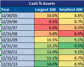
Moving on to the balance sheet. we see that long-term debt as a % of capital has slightly increased over the past decade (Figure 5). Cash as a % of capital has also increased (Figure 6) which in turn has actually brought down net debt as a % of capital (Figure 7). Encouragingly, return on invested capital has moved back to levels seen pre-recession (Figure 8) and contrary to what you may have read elsewhere, corporations are still investing and have held traditional tangible capital expenditures and investments very steady (Figure 9 and 10).

Figure 5
image

Figure 6
image

Figure 7
image

Figure 8
image

Figure 9
image

Figure 10
image

Cash flow generation has also been on the rise. Median FCF as a % of sales has increased by 42% since 2003 (Figure 11). The good news for investors is that management is giving back more of that cash flow than before by increasing both dividends and share repurchases as a % of operating cash flow significantly. Median dividends as a % of operating cash flow has increased by 127% (Figure 12) and median share repurchases as a % of operating cash flow has increased by 186% (Figure 13). 

Figure 11
image

Figure 12
image

Figure 13
image

Overall, even with the Great Recession and the global fianncial crisis, corporate fundamentals have more than weathered the storm and have actually improved over the past 10 years. Have they improved enough to justify the record valuations levels that we are currently experiecing? That is a question left to answer for another day. 

(source: Gavekal Capital)


Margin Debt Is Acting Curiously

The unique behavior margin debt held in NYSE accounts this year continued in July. After looking like it had reached a structural peak in February, margin debt surged back in June. Now the latest data point for July shows NYSE Margin Debt dropped by about $4 billion. Technically, the peak in February still holds as it is about $2 billion higher than the level reached in June. However, if in hindsight February is the peak, margin debt is certainly acting uncharacteristically compared to previous peaks in the equity market.  Lastly, net margin debt reach an all-time high in July 

image

image

image

image

image