Gavekal Capital: 2015-01-18

Friday, January 23, 2015

On Banking Underperformance...

As we noted earlier this week, banks have significantly underperformed to start the year. In fact, on an equal-weighted, USD-basis, the banking industry has been the second worst performing industry in the developed markets (yep, the energy industry is the worst performer YTD) and banks are the fourth worst performing industry in the emerging markets in 2015.*

*Data Note: According to the GICS structure, there are three sub-industries that make up the Bank industry group. They are Diversified Banks, Regional Banks and Thrifts & Mortgage Finance. In total, there are 97 companies that fall in the Bank industry category in the developed markets and 109 companies that fall in the Bank industry category in the emerging markets. 

Developed Markets Performance By Industry
image

Emerging Markets Performance By Industryimage

And over the past four years, the banking industry has been the second worst performer in the developed markets and the third worst performer in the emerging markets.

Developed Markets Performance By Industry
image

Emerging Markets Performance By Industry
image

Part of the recent underperformance in the developed markets banking industry may be due to cratering sales growth expectations. Sales are expected to decline by -7.6% in 2015 for the banking industry. Interestingly, earnings are still expected to grow by a relatively healthy 6.8%. Over the past six months, FY1 sales estimates have dropped by 9.4% and over the past three months FY1 sales estimates have fallen by 4.7%.  The drop in FY2 sales estimates has actually been even steeper. Over the past six months, FY2 sales estimates have fallen by 11.2% and over the past three months FY2 sales estimates have fallen by 6.5%. Lastly, only 5% of developed market banks have experienced positive FY1 sales revisions over the past six months.

Developed Markets Sales Growth Expectations
image

Developed Market Earnings Growth Expectations
image

Developed Markets Change In Sales Estimates
image

Developed Markets FY1 Sales Revision Percentage
image

It is noteworthy that declining sales expectations haven't hit emerging market banks nearly as much. Sales are expected to grow by 2.5% in FY1. Looking at the past six months, FY1 sales estimates have fallen by 7.6%, less than in the developed markets, And FY2 sales estimates have fallen by 9.2%, again less than in the developed markets. Finally, 25% of banking stocks in the emerging markets have experienced a positive sales revision over the past six months. While this doesn't seem like a lot, it is the third highest level among the 24 industries in the emerging markets and significantly above the 5% level in the developed markets.

Emerging Markets Sales Growth Expectations
image

Emerging Markets Change In Sales Estimates
image

Emerging Markets FY1 Sales Revision Percentage
image

From a valuation standpoint, the bank industry looks relatively cheap compared to the other 24 industries in both the developed markets and emerging markets. Developed market banks have a price to cash flow ratio of 11.1x and emerging market banks have a price to cash flow ratio of 12.4x. Both are well below the respective averages in the developed markets and emerging markets universe.

Developed Markets Valuation Multiples
image

Emerging Markets Valuation Multiples
image

These relatively low valuation levels seem likely justified by the poor profitability delivered by the banking industry. The developed markets banking industry has the lowest return equity and the lowest return on invested capital of any industry group. Currently, the ROE of developed market banks is only 6.2% and the ROIC is only 3.1%. In the emerging markets, banks have a more respectable middle-of-the-pack ROE of 13.7% but have the third lowest ROIC at 8.3%.

Developed Markets DuPont Analysis
image

Emerging Markets Profitability
image

Europe is Not Japan: Expensive Financial Stocks may not Rally Hard with QE

Since the ECB announced its open ended QE program we have seen numerous parallels being drawn with Japan's amped-up QE program announced in April of 2013, but telegraphed in late 2012. One of those parallels is that like Japanese financial stocks, Europe's financial stocks should experience a sharp rally in the coming months. While this may end up happening, we want to point out one key difference between Japan's and Europe's financials around when their respective QE programs were announced: VALUATIONS!

As the first chart below shows, when Japan began laying the groundwork for the expansion of QE in late 2012 financial stocks began to rally hard, but the median financial stock was trading at only about 0.8x book value and only slightly above the valuation nadir achieved in 2009.

Turning our attention to chart two, we can see that the median European financial stock is trading at 1.2x book value, which is a seven year high.

So while we may in fact end up seeing European financials stage a rally to correct some of the stark undperformance of late, one can hardly make a valuation case for Europe's financials here, unlike Japan''s financials in 2012.

image

image

Thursday, January 22, 2015

Weak Close Indicator In Detail

Question:
I am an avid reader of your blog site and I commend you on the truly great work. You always identify the bigger picture macro trends and thematics with clarity.

I had a question if I may in regards to your most recent post on the “weak close indicator” (link here)


I was wondering if you could expand on this for me? Are you essentially counting the number of weak closes over time period (say 200days) and then summing them up cumulatively? How does the indicator “fall”? IF there is a STRONG close i.e. close is in the upper 25% of intraday high, does this then lead to a negative value on the day for the “weak close indicator”?

Answer:
Thanks for the good question and kind words from Down Under.

We have two indicators we use here:
1) Strong Close indicator: if stocks close within 25% of the high for the day, we call it a strong close. We record a +1 and sum the total over the previous 130 trading days (26 weeks).
2) Weak close indicator: if stocks close within 25% of the low for the day, we call it a weak close. We record a +1 and sum the total over the previous 130 trading days (26 weeks).

Let's go through them individually.  The first chart is the Strong Close indicator applied to the S&P 500.  We show the the last 20 years of our indicator so the reader can get a feel for how it behaves in bull and bear markets.  The trend toward fewer strong closes has been evident since last August when the indicator failed to take out the May 2013 high reading of 66.  It tested the high again in November and has since come off, currently at 52.

image

Next is our Weak Close indicator, which is the subject of the original question.  Again, we apply the indicator to the S&P 500 over the last 20 years.  Here the Weak Close indicator is inverted (left scale, red line).  At a current reading of 33, the number of negative closes is increasing and has taken out the the November 2012 high of 32.  Generally in equity market corrections/bear markets, strong closes plunge and weak closes spike.

image

Let's now overlay the change in Federal Reserve total assets to provide some context to why we are seeing a rise in weak closes and drop in strong closes.  In the chart below, we invert the Weak Close indicator (blue line, right scale) and compare it to the 3-month change in Fed assets.  

image

There is a pretty strong relationship here that helps illustrate the impact of central bank asset purchases on equity market behavior.  If the Fed begins to contract its balance sheet in preparation to begin raising rates, it is likely we see more weak closes.  To further this logic and conclude, we show the Weak Close indicator with periods of QE identified in the grey shaded area.  For the most past, the experience since the Fed began QE shows how asset purchases bolster stocks.  In each phase of QE, from beginning to end, our Weak Close indicator drops.  When QE ends, weak closes rise again. We saw this in May-August of 2010, again in June-November 2011.  We believe we are seeing this sequence play out again as weak closes have spiked in the months since the taper ended.

image


In Case You Missed It...

The EUR is trading at levels not seen in over a decade, in the wake of the ECB's big QE announcement today.  And, while a weakened currency might not be a surprise to most, the complete lack of support on a technical basis is certainly... interesting:

image

Of course, we can not say with any degree of certainty whether or not the EUR will fall back to lows registered fifteen years ago.  This decisive move below long-term support does raise the question, however.

Swiss Yield Curve Is Negative Out To 10 Years

Has any government debt market ever had such a negative yield curve as Switzerland? One-year Swiss government bonds are currently "yielding" -114 basis points. One week ago, one-year bonds were at -38 basis points and one month ago one-year bonds were at -23 basis points.  Astonishingly, 10-year Swiss government bonds are "yielding" -20 basis points. 10-year yields have narrowed by 90 basis points over the past month. One has to go out to 20-year bonds in order to finally earn a positive yield. But even then, the yield is quite minimal. 20-year Swiss government bonds are yielding 27 basis points and 30-year Swiss government bonds are yielding 34 basis points.

image

Have US Initial Unemployment Claims Bottomed?

New initial unemployment claims fell slightly for the week ending on January 16th from 316K to 309K. However, the four week moving average rose to 306.5K which is the highest level since the week ending on July 11th. Unemployment claims spent the second half of 2014 at relatively low historical levels so the small rise so far is not unexpected or a cause for concern. However, if unemployment claims were to substantially increase from here then that could be a signal that a recession is imminent (or already underway). The blue bars in the second chart identify past recession periods in the US. In each recession over the past several decades, the economy has experienced a significant increase in unemployment claims. Something to continue to monitor...

image

image

Wednesday, January 21, 2015

VDAX Set to Rise?

In recent history, each time the EUR has fallen relative to the dollar, the implied volatility of the German DAX has risen-- sometimes rather sharply.  With the euro's significant decline, it is not much of a stretch to conclude that things could get more interesting (perhaps in light of certain important announcements from the ECB tomorrow?):

image

image
(five-year time horizon)

Knowledge Leaders are Surging Ahead of the Pack in 2015

2015 has so far thrown investors some curve balls in just three short weeks. Fortunately, one trend has remained firmly intact this year which is the outperformance of global Knowledge Leaders. Both of our publicly available indexes of Knowledge Leaders (one for DM and one for EM) have outperformed their respective benchmarks and the trend has even accelerated over the last week or so. Companies and investors are being rewarded, again in 2015, for investing in knowledge capital.

image

image

When The Lead Stock Stumbles

Off the October 3, 2008 low, Priceline.com has outperformed the MSCI All Country World index by roughly 1,100% making it the single best performing stock in the index.  For this reason, PCLN is the leadership stock in the index.

image

PCLN began to underperform in March 2014 and appears to be starting to accelerate on the downside.  Using our point and figure charts, the relative strength breakdown is easier to see.  In this chart below, each X is a 2.5% relative outperformance and each O a 2.5% relative underperformance compared to the MSCI All Counrty World Index.

image

Should present trends persist, PCLN will break the all-important 45 degree bullish support line, suggesting that a major reversal of trend has occurred.  When leadership begins to falter, this is something to be taken seriously.  In our experience, when the lead stock stumbles in a bull market advance, this suggests a change in the overall market trend is taking place.

Appearances Can Be Deceiving

As we noted last week (here), emerging markets' equities are off to a better start so far this year, falling just 0.78% versus the 1.34% decline in their developed market peers.  A quick look at the winners thus far:

By Country


By Sector


Top 10 Companies Overall


Top 10 EM Asia


Top 10 EM EMEA


Top 10 EM Latin America


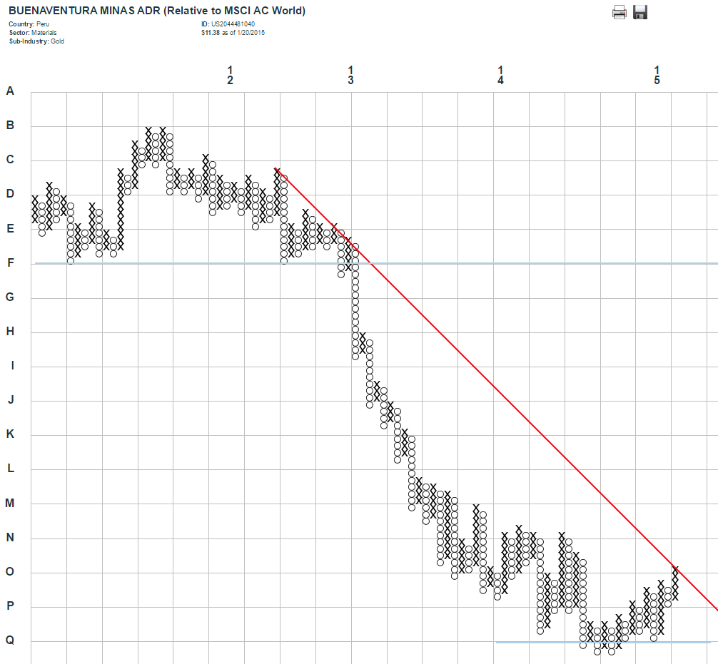
And now, the point-and-figure charts for the leader in each region:


A quick glance at the price performance year to date would give the impression that these companies are off to an amazing (double-digit) start.  When we take a moment to look at performance relative to the MSCI All Country World Index benchmark, we find that, while they have certainly rallied in the first few weeks of 2015, they are all locked into multi-year downtrends and appear to be (re-)testing resistance.  Whether or not the positive start to the year can continue depends largely on the ability of each of these stocks to overcome that formidable hurdle.

Tuesday, January 20, 2015

Advances Continue to Decline

With few exceptions, the 200-day moving average of the daily advance-decline ratio remains close to or below lows not seen since 2008-- in direct contrast to the trend in prices for most MSCI sectors.

MSCI The World Index
image

By Region
image
image
image

By Sector
image
image
image
image
image
image
image
image
image
image