
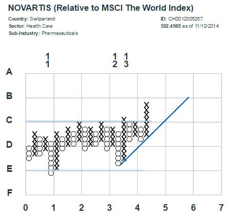
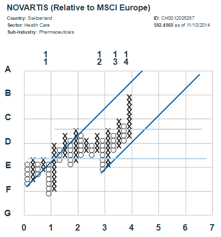
Looking at the chart relative to the MSCI World Index, we are encouraged by the solid base and the reliability of the 45-degree bullish support line (BSL-- in dark blue, above). However, it is important to also take into consideration the stock's performance versus its regional benchmark, MSCI Europe. In the following chart, we see a similar uptrend forming out of a multi-year base-- but we also see previous support that could potentially prove to be resistance (the dark blue, 45-degree BSL on the left side):
Finally, we can look at the absolute version of the chart for Novartis. Here we see only the price of the stock itself instead of plotting it versus a benchmark, as in the two previous examples. In this instance, the uptrend is much more pronounced-- as evidenced by the high-performance support line (the darkest blue line that is more steeply sloped). While we still see a strong base formation, the extended nature of the uptrend gives reason for more caution. In addition, the uptrend seems to be moderating somewhat and could move sideways (or down) for a time, until it reaches an area of support:

Through point-and-figure-- and the various iterations shown here-- we find that we can gain useful insight into the movements in a stock's price performance.